【終了しました】XG 資生堂アネッサブランドミューズ就任記念 購入特典プレゼント&パネル展開催!
【終了しました】
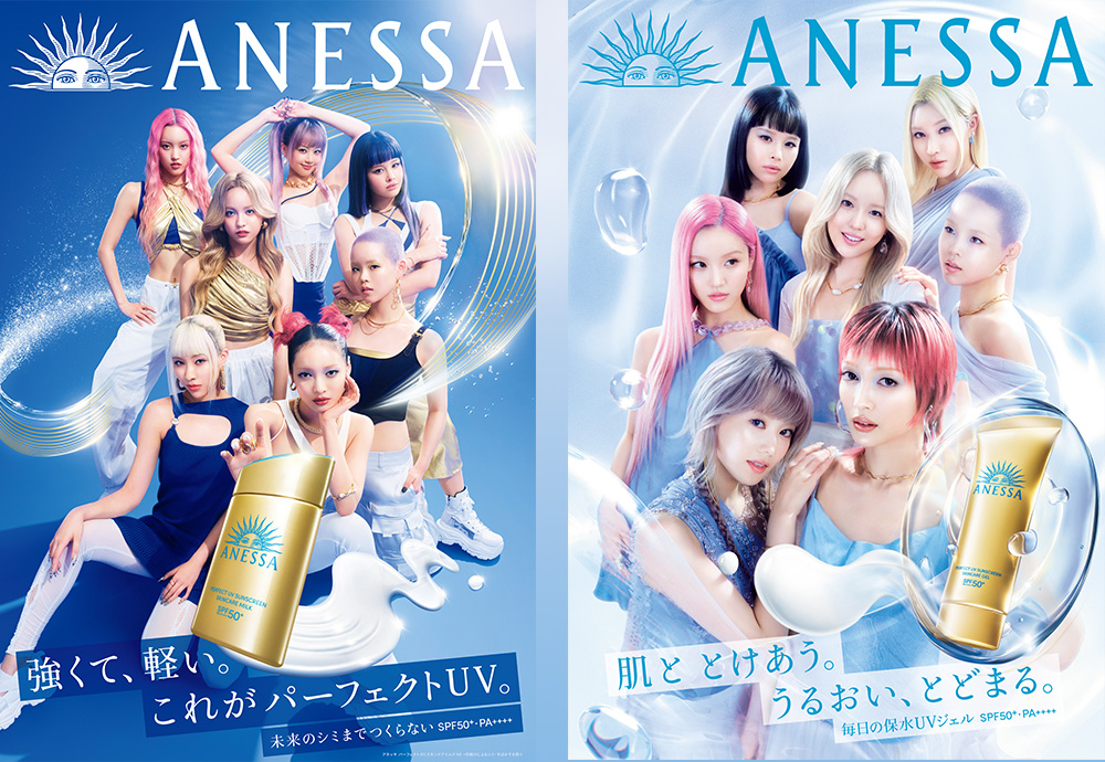
XG 資生堂アネッサブランド
ミューズ就任記念
購入特典プレゼント&パネル展開催!
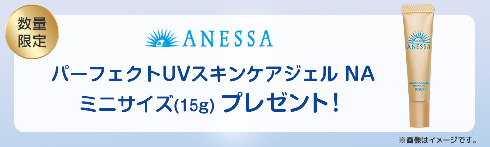
7人組HIPHOP / R&Bガールズグループ「XG」が資生堂 アネッサの新ミューズ就任を記念して、
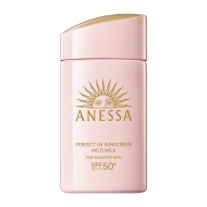
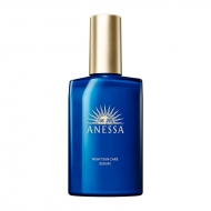
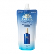
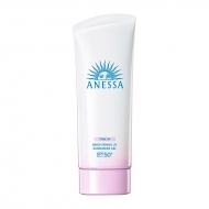
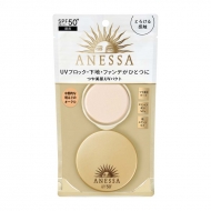
2025年5月27日(火)よりアネッサの対象商品をモアコスで購入していただいた方に先着で 「パーフェクトUV スキンケアジェル NA」の ミニサイズ(15g)をプレゼント!※終了しました
さらに、HMV&BOOKS SHIBUYAではXG記念パネル展の実施が決定いたしました!
⇒詳しくはこちら
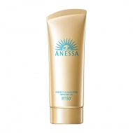
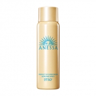
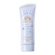
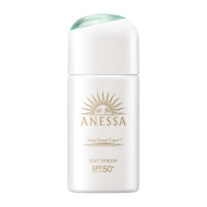
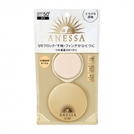
キャンペーン対象商品
パネル展
XGメンバーのアネッサ新ミューズとしてのビジュアルを使用したパネル展を実施いたします。
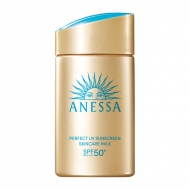
また、店頭にて「パーフェクトUV スキンケアミルク NA」をお買い上げの方に先着で「パーフェクトUV スキンケアジェル NA」の ミニサイズ(15g)をプレゼントいたします。
開催店舗:HMV&BOOKS SHIBUYA 5F
期間:2025年5月27日(火)~6月1日(日)
※パネル展は終了しました
※開催時間は店舗営業時間に準じます。
※会期中、営業時間が変更になる場合があります。詳しくは店舗HPをご確認ください。
※ミニサイズプレゼントは、期間中であっても特典が無くなり次第終了となります。
#item1, #item2, #item3, #item4, #item5, #item6, #item7, #item8, #item9, #item10, #item11, #item12, #item13, #item14, #item15, #item16{
margin-top: -60px;
padding-top: 60px;
}
.topic .topic__heading + time {
display: none;
}
h2.topic__heading {
display: none;
}
.topic__txt--page_read {
border-top: none;
padding-top: 0;
}
.main_mv {
width: 100%;
}
.main_mv img {
width: 1200px;
}
.ttl_h2 {
color:#fff;
padding:3px 3px;
background:#e84388;
font-size:1.5rem;
margin:0px 0px 30px 0px;
text-align: center;
font-weight: bold;
}
.topic__heading--detail span {
font-size: 34px;
}
.font-title {
color: #232323;
font-size: 20px;
text-align: center;
}
.box1 {
background:#ffffff;
padding:15px;
}
.topic__box--recently {
padding: 0px;
margin: 0px;
}
.item_s {
margin: 0 auto;
max-width: 700px;
padding: 14px 20px;
color: #333;
font-size: 13px;
background: #f7f7f7;
}
.movie-wrap {
position: relative;
padding-top: 56.25%;
}
.movie-wrap iframe {
position: absolute;
top: 0;
left: 0;
width: 100%;
height: 100%;
}
p.seotext_00 {
text-decoration:underline;
text-decoration-color:#2fcab0;
}
.sp_br {
display: none;
}
.pc_br {
display: block;
}
.img_box{
max-width:600px;
margin: 0 auto;
padding-bottom: 20px;
}
.img_box2{
max-width:400px;
margin: 0 auto;
display :block;
padding: 30px 0px;
}
.topic__txt {
font-size: 16px;
max-width: 600px;
text-align: left;
margin: 0 auto;
padding: 10px 0px;
line-height: 1.8;
letter-spacing: 0.1px;
}
.p-card__txt--evaluation {
display: none;
}
.p-card__txt--price {
margin-top: -10px;
}
.p-card__txt--product {
display: block !important;
height: auto !important;
}
#hmv .p-card__txt--brand{
pointer-events: none;
}
.item_list {
display: flex;
padding: 0px 0px 20px 0px;
width: 100%;
list-style-type: none;
margin: 0 auto;
flex-wrap: wrap;
}
.item_list p{
font-weight: bold;
font-size: 12px;
text-align: left;
margin-top: 7px;
color: #aa4c4c;
background: url(http://img.hmv.co.jp/hybridimage/news/images/24/0111/501/body_174133.png) no-repeat left center;
background-size: 16px;
padding: 8px 0px 8px 22px;
}
.item_in {
max-width: 1000px;
margin: 0 auto;
}
.fes_btn {
margin: 1.5%;
width: 17%;
}
.fes_btn img {
width: 170px;
}
.fes_ttl {
font-size: 30px;
color: #87632f;
}
.topic__txt--recently ul {
display: flex;
padding: 0px;
width: 100%;
list-style-type: none;
margin: 0 auto;
justify-content: flex-start;
}
.goods_in {
width: 36%;
margin-bottom: 40px;
margin-right: 1%;
}
.goods_in img {
width: 400px;
}
.product__img img {
max-width: 40%;
max-height: 40%;
}
.swiper-button-prev {
left: 25% !important;
}
.swiper-button-next {
right: 22% !important;
}
.btn_cg {
color:#f8f7f5;
padding:5px 5px;
background:rgb(137, 77, 70);
margin:0 auto;
max-width: 340px;
padding: 12px;
border-radius: 20px;
}
.btn_cg p {
text-align: center;
color: #fff;
text-decoration: none;
font-size: 14px;
}
.brand_box {
display: flex;
flex-wrap: wrap;
list-style: none;
padding: 0px;
max-width: 1000px;
margin: 0 auto;
}
.brand {
width: 18%;
margin: 1%;
}
@media screen and (max-width: 980px){
.main_mv img {
width: 100%;
}
.topic__heading--detail span {
font-size: 24px;
}
.sp_br {
display: block;
}
.pc_br {
display: none;
}
.img_box, .img_box2{
max-width:100%;
}
.item_s {
padding: 8px;
font-size: 12px;
margin-top: 30px;
}
.topic__txt,{
font-size: 14px;
}
.topic__txt--product_detail em {
margin: 0px;
}
.c-heading--page {
margin-bottom: 10px;
}
.topic__txt--product_detail strong {
margin: -10px 0px 10px 0px;
}
.fes_btn {
width: 27%;
margin: 3%;
}
.fes_btn img {
width: 100%;
}
.item_list {
justify-content: flex-start !important;
}
.fes_ttl {
font-size: 20px;
}
.topic__txt--recently ul {
flex-wrap: wrap;
}
.goods_in {
width: 49%;
margin-bottom: 10px;
margin-right: 0;
}
.goods_in:nth-child(odd) {
margin-right: 1%;
}
.goods_in img {
width: 100%;
}
.product__img img {
max-width: 100%;
max-height: 100%;
}
.swiper-button-prev {
left: 27px !important;
}
.swiper-button-next {
right: 0px !important;
}
.brand {
width: 29%;
margin: 2%;
}
.brand img {
max-width: 100%;
}
}
@media screen and (max-width: 430px){
.topic__txt--recently ul {
justify-content: flex-start !important;
padding: 0px;
}
.fes_btn {
margin-right: 2%;
width: 29%;
}
.fes_btn:nth-child(3n) {
margin-right: 0px;
}
.fes_btn img {
width: 100%;
}
.item_list p{
font-size: 10px;
}
.brand {
width: 40%;
margin: 5%;
}
.item_list p{
font-size: 10px;
margin-top: 7px;
background-size: 10px;
padding: 0px 0px 0px 12px;
}
}


