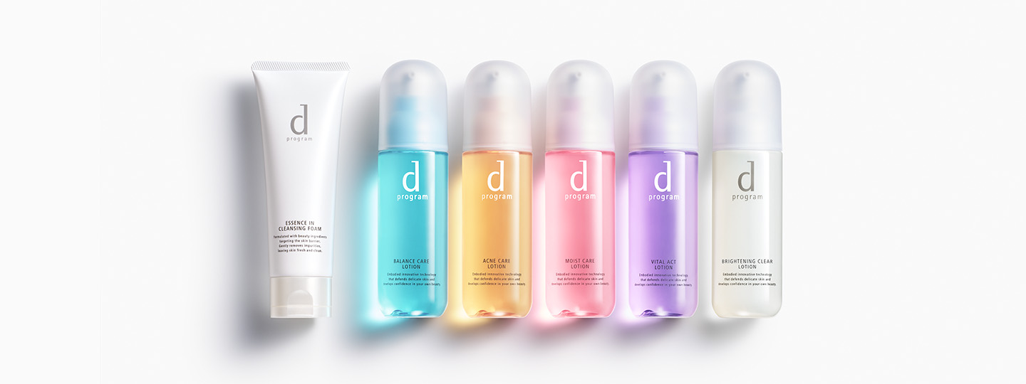
d program(d プログラム)【資生堂】
キャンペーン商品 ※終了しました
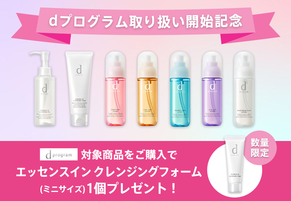
2025年1月3日(金)より、資生堂の人気ブランド dプログラムがモアコスでもお買い求めいただけるようになりました!
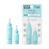
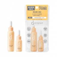
お取り扱い開始を記念して、dプログラムの対象商品をモアコスで先行予約していただいた方に先着で
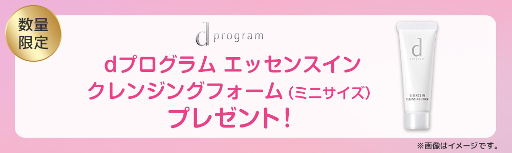
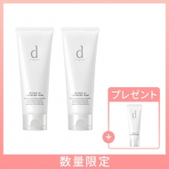
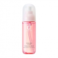
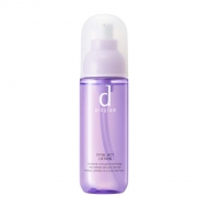
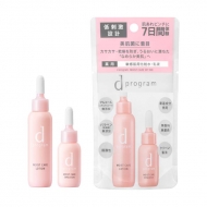
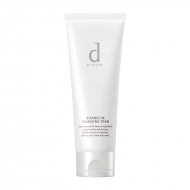
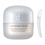
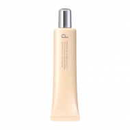
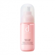
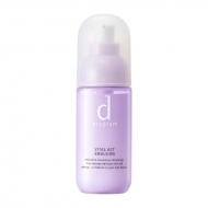
「エッセンスイン クレンジングフォーム」の ミニサイズ(20g)をプレゼント!
無くなり次第終了となりますので、気になる方はお早めにチェックしてください♪
予約期間:2024年12月23日(月)10:00~
無くなり次第終了※終了しました
お届け日:2025年1月4日(土)より順次発送予定
【ご購入に関する注意事項】
※こちらの商品は輸出・空輸不可となります。
※一部コンビニ受取をご利用できない店舗がございます。
※この商品は上限に達した場合は販売終了となります。
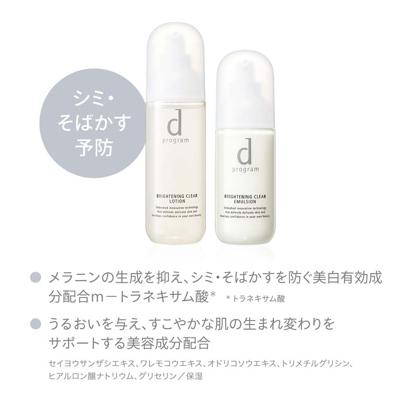
※画像はイメージです。
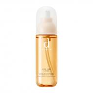
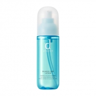
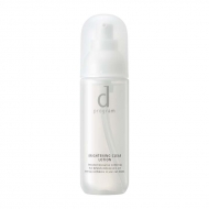
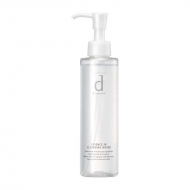
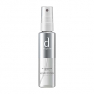
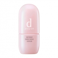
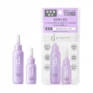
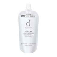
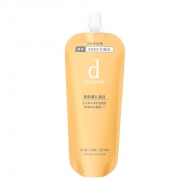
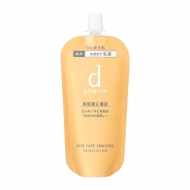
キャンペーン対象商品
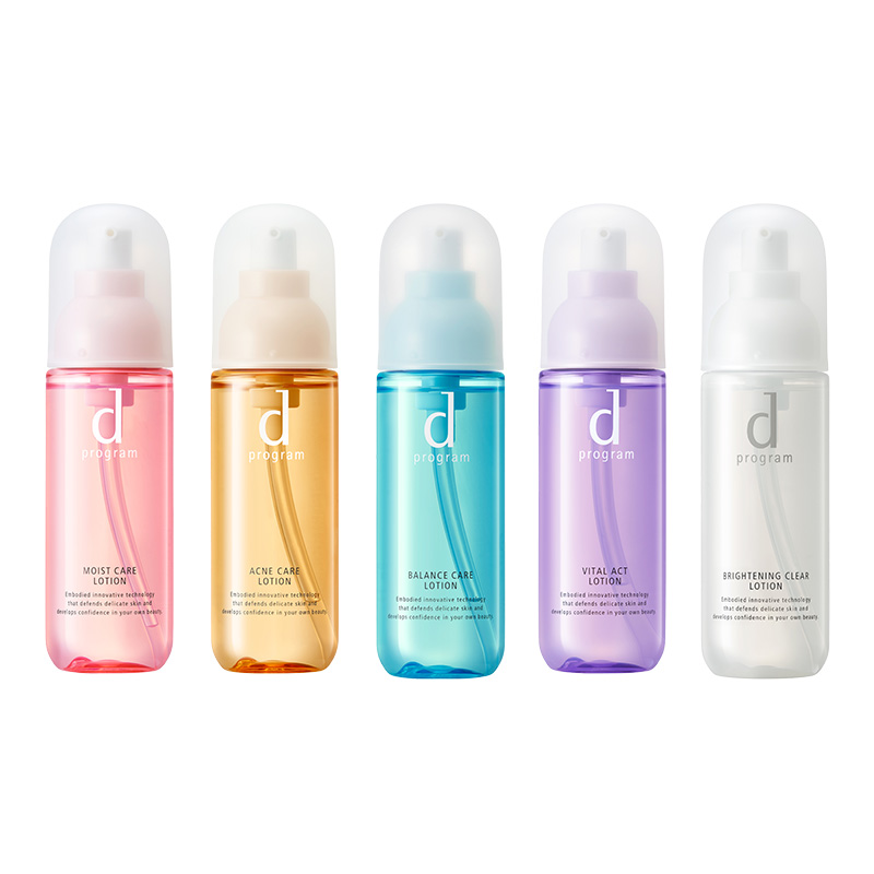
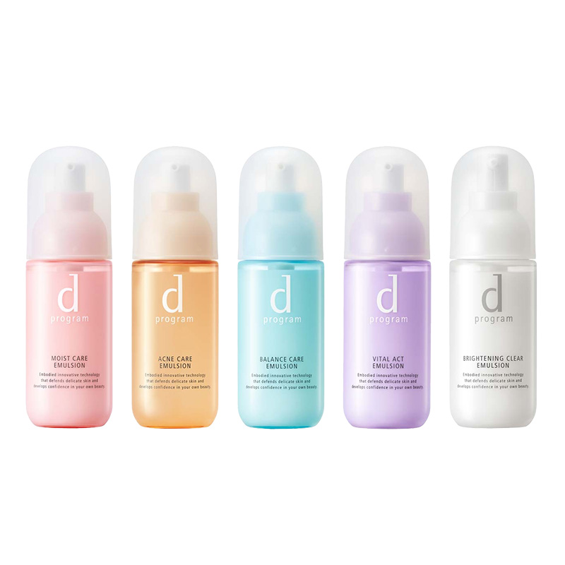
dプログラム 商品一覧
カテゴリから探す
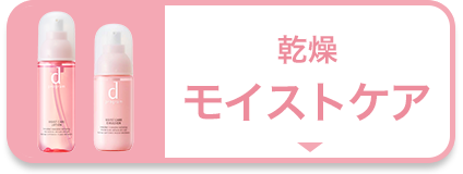
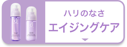
肌悩みから探す
モイストケア
エイジングケア
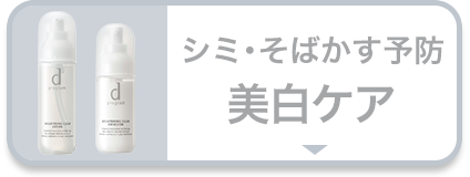
美白ケア
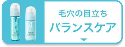
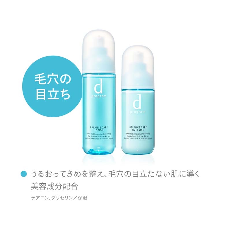
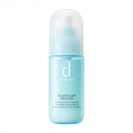
バランスケア
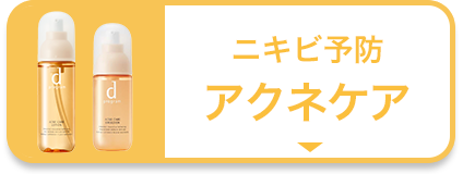
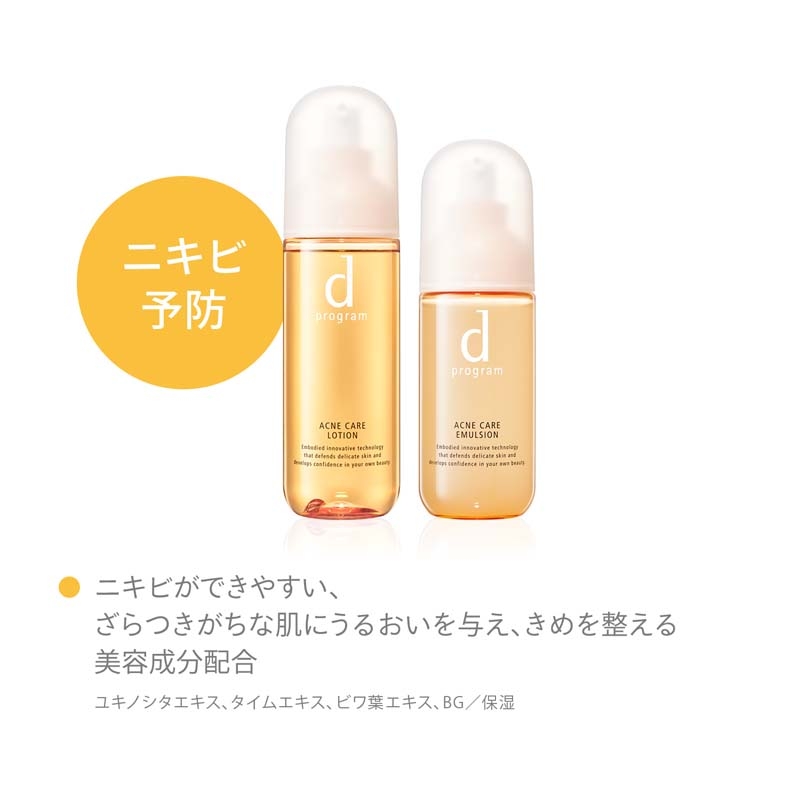
アクネケア
#item1, #item2, #item3, #item4, #item5, #item6, #item7, #item8, #item9, #item10, #item11, #item12, #item13, #item14, #item15, #item16{
margin-top: -60px;
padding-top: 60px;
}
.main_mv {
width: 100%;
}
.main_mv img {
width: 1200px;
}
.ttl_h2 {
color:#fff;
padding:3px 3px;
background:#e84388;
font-size:1.5rem;
margin:0px 0px 30px 0px;
text-align: center;
font-weight: bold;
}
.topic__heading--detail span {
font-size: 34px;
}
.font-title {
color: #232323;
font-size: 20px;
text-align: center;
}
.box1 {
background:#ffffff;
padding:15px;
}
.topic__box--recently {
padding: 0px;
margin: 0px;
}
.item_s {
margin: 0 auto;
max-width: 700px;
padding: 14px 20px;
color: #333;
font-size: 13px;
background: #f7f7f7;
}
.movie-wrap {
position: relative;
padding-top: 56.25%;
}
.movie-wrap iframe {
position: absolute;
top: 0;
left: 0;
width: 100%;
height: 100%;
}
p.seotext_00 {
text-decoration:underline;
text-decoration-color:#2fcab0;
}
.sp_br {
display: none;
}
.pc_br {
display: block;
}
.img_box{
max-width:600px;
margin: 0 auto;
padding-bottom: 20px;
}
.img_box2{
max-width:400px;
margin: 0 auto;
display :block;
padding: 30px 0px;
}
.topic__txt {
font-size: 16px;
max-width: 600px;
text-align: left;
margin: 0 auto;
padding: 10px 0px;
line-height: 1.8;
letter-spacing: 0.1px;
}
.p-card__txt--evaluation {
display: none;
}
.p-card__txt--price {
margin-top: -10px;
}
.p-card__txt--product {
display: block !important;
height: auto !important;
}
#hmv .p-card__txt--brand{
pointer-events: none;
}
.item_list {
display: flex;
padding: 0px 0px 20px 0px;
width: 100%;
list-style-type: none;
margin: 0 auto;
flex-wrap: wrap;
}
.item_list p{
font-weight: bold;
font-size: 12px;
text-align: left;
margin-top: 7px;
color: #aa4c4c;
background: url(http://img.hmv.co.jp/hybridimage/news/images/24/0111/501/body_174133.png) no-repeat left center;
background-size: 16px;
padding: 8px 0px 8px 22px;
}
.item_in {
max-width: 1000px;
margin: 0 auto;
}
.fes_btn {
margin: 1.5%;
width: 17%;
}
.fes_btn img {
width: 170px;
}
.fes_ttl {
font-size: 30px;
color: #87632f;
}
.topic__txt--recently ul {
display: flex;
padding: 0px;
width: 100%;
list-style-type: none;
margin: 0 auto;
justify-content: flex-start;
}
.goods_in {
width: 36%;
margin-bottom: 40px;
margin-right: 1%;
}
.goods_in img {
width: 400px;
}
.product__img img {
max-width: 40%;
max-height: 40%;
}
.swiper-button-prev {
left: 25% !important;
}
.swiper-button-next {
right: 22% !important;
}
.btn_cg {
color:#f8f7f5;
padding:5px 5px;
background:rgb(137, 77, 70);
margin:0 auto;
max-width: 340px;
padding: 12px;
border-radius: 20px;
}
.btn_cg p {
text-align: center;
color: #fff;
text-decoration: none;
font-size: 14px;
}
.brand_box {
display: flex;
flex-wrap: wrap;
list-style: none;
padding: 0px;
max-width: 1000px;
margin: 0 auto;
}
.brand {
width: 18%;
margin: 1%;
}
@media screen and (max-width: 980px){
.main_mv img {
width: 100%;
}
.topic__heading--detail span {
font-size: 24px;
}
.sp_br {
display: block;
}
.pc_br {
display: none;
}
.img_box, .img_box2{
max-width:100%;
}
.item_s {
padding: 8px;
font-size: 12px;
margin-top: 30px;
}
.topic__txt,{
font-size: 14px;
}
.topic__txt--product_detail em {
margin: 0px;
}
.c-heading--page {
margin-bottom: 10px;
}
.topic__txt--product_detail strong {
margin: -10px 0px 10px 0px;
}
.fes_btn {
width: 27%;
margin: 3%;
}
.fes_btn img {
width: 100%;
}
.item_list {
justify-content: flex-start !important;
}
.fes_ttl {
font-size: 20px;
}
.topic__txt--recently ul {
flex-wrap: wrap;
}
.goods_in {
width: 49%;
margin-bottom: 10px;
margin-right: 0;
}
.goods_in:nth-child(odd) {
margin-right: 1%;
}
.goods_in img {
width: 100%;
}
.product__img img {
max-width: 100%;
max-height: 100%;
}
.swiper-button-prev {
left: 27px !important;
}
.swiper-button-next {
right: 0px !important;
}
.brand {
width: 29%;
margin: 2%;
}
.brand img {
max-width: 100%;
}
}
@media screen and (max-width: 430px){
.topic__txt--recently ul {
justify-content: flex-start !important;
padding: 0px;
}
.fes_btn {
margin-right: 2%;
width: 29%;
}
.fes_btn:nth-child(3n) {
margin-right: 0px;
}
.fes_btn img {
width: 100%;
}
.item_list p{
font-size: 10px;
}
.brand {
width: 40%;
margin: 5%;
}
.item_list p{
font-size: 10px;
margin-top: 7px;
background-size: 10px;
padding: 0px 0px 0px 12px;
}
}


