「Pureal(ピュレア)」 HMV&BOOKS HAKATA / HMV仙台 E BeanSにてPOPUP開催決定!
大切な素肌だから特別な贈り物を「Pureal(ピュレア)」
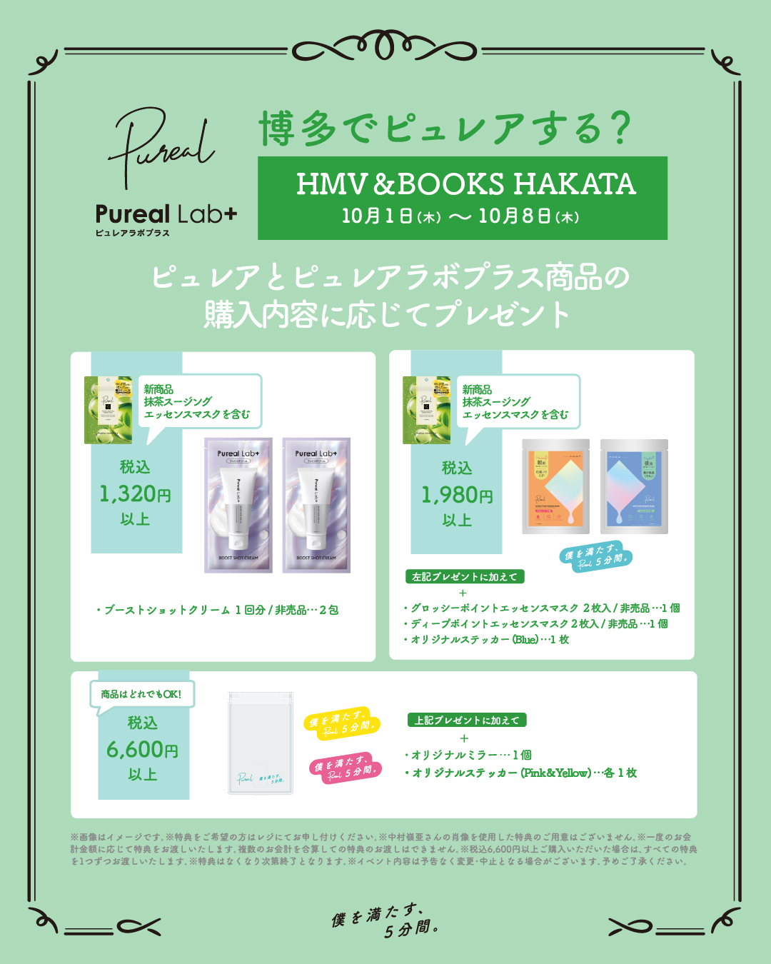
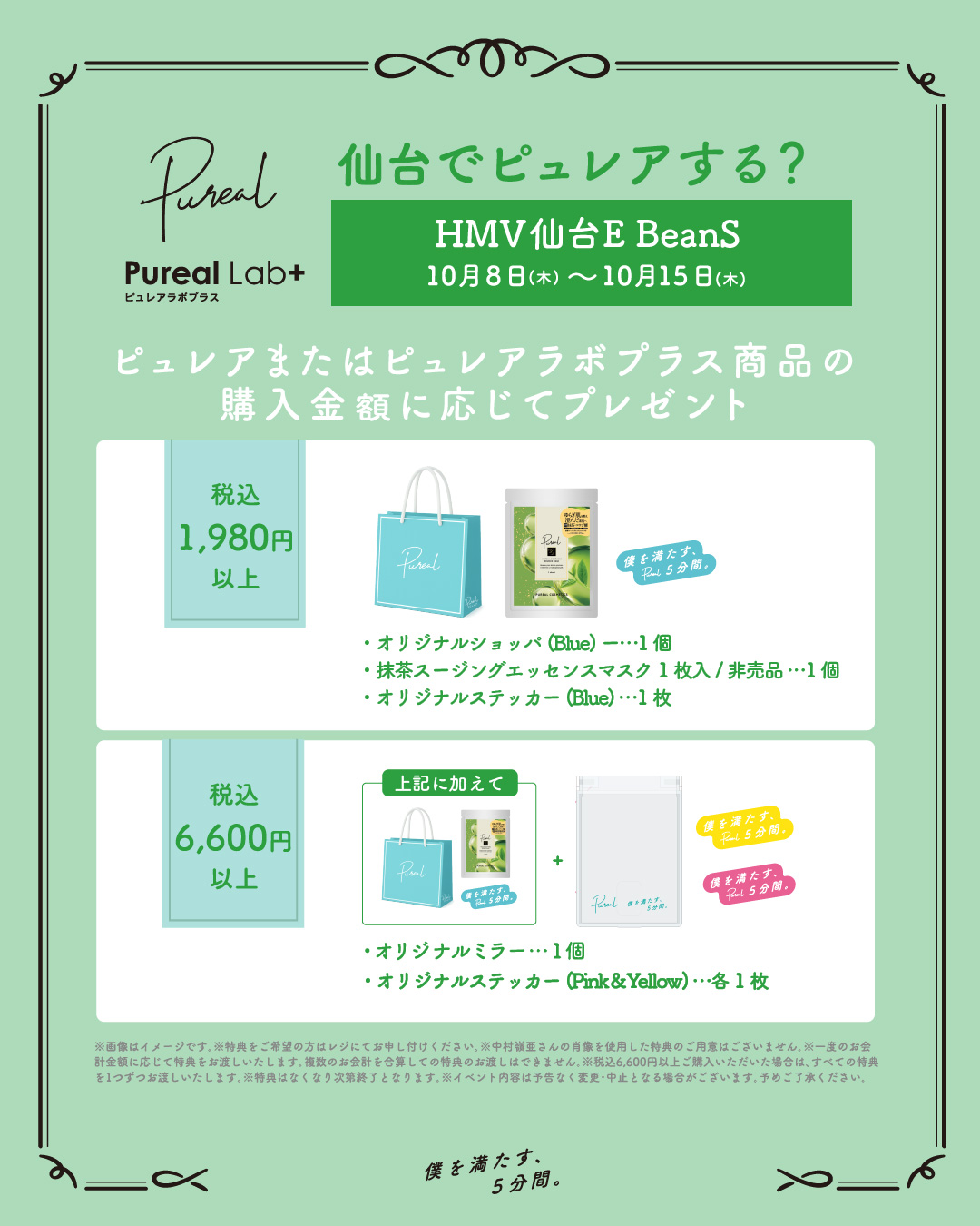
HMV&BOOKS HAKATA / HMV仙台 E BeanSにて
POPUP開催決定!
対象商品ご購入でうれしい特典をプレゼント!
ぜひお立ち寄りください♪
POPUP概要
開催店舗・期間
■HMV&BOOKS HAKATA
〒812-0012
福岡県福岡市博多区博多駅中央街9-1 博多マルイ6階
営業時間:10:00~21:00
開催期間:2026年10月1日(木)~10月8日(木)
アクセス:博多駅博多口直結。KITTE博多内博多マルイの6階にございます。
※営業時間が変更になる場合がございます。
ノベルティ企画
※各商品・特典は、なくなり次第終了となります。
■HMV仙台 E BeanS
〒980-0021
宮城県仙台市青葉区中央4-1-1 E BeanS 5F
営業時間:10:00~20:00
開催期間:2026年10月8日(木)~10月15日(木)
アクセス:JR仙台駅西口 徒歩3分
地下鉄仙台駅 南2出口直結
※営業時間が変更になる場合がございます。
ノベルティ企画
※各商品・特典は、なくなり次第終了となります。
POP UP対象商品
Pureal
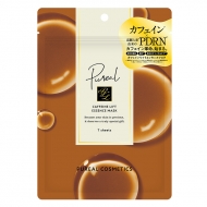
・カフェインリフトエッセンスマスク / 7枚入 660円(税込)
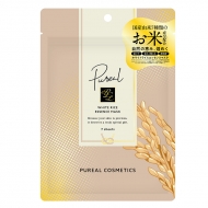
・ホワイトライスエッセンスマスク / 7枚入 660円(税込)
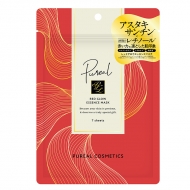
・レッドグロウエッセンスマスク / 7枚入 660円(税込)
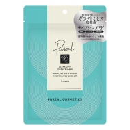
・クリアリポ エッセンスマスク / 7枚入 660円(税込)
・レチビタリポ エッセンスマスク / 7枚入 660円(税込)
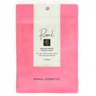
・リジュオンリポリペア エッセンスマスク / 7枚入 660円(税込)
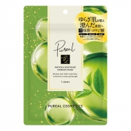
・抹茶スージングエッセンスマスク / 7枚入 660円(税込)
Pureal Lab+
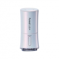
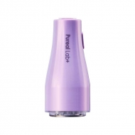
・ダーマブーストショット 6,600円(税込)
・ダーマリフトショット 8,800円(税込)
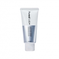
・ブーストショットクリーム / 65g 1,980円(税込)
\ オンラインでも販売中 /
※店頭での特典企画は対象外となります
HMV&BOOKS Onlineにて
関連商品販売中!
body {
font-size: 14px;
background: #fff;
}
a {
word-wrap:break-word;
}
.newsDetailRight {
max-width: 1000px;
margin: 0 auto;
padding: 20px 10px;
}
.newsDetailContent {
padding: 20px 10px;
font-size: 16px;
line-height: 1.625;
}
ul.acordion {
background: #fff;
border: 2px solid #3bbbb6;
padding: 10px !important;
max-width: 500px;
}
.newsDetailsHeadNew_h {
margin-top: 30px;
margin-bottom: 10px;
padding-left: 15px;
border-left: #f65084 4px solid;
font-size: 24px;
line-height: 1.3;
}
.contentsBlock fitTop fitLR {
padding-top: 20px;
}
.widgetBlock {
padding: 10px;
margin-bottom: 20px;
display: block;
border: #dedede 1px solid;
border-radius: 4px;
box-sizing: border-box;
background: #f9f9f9 !important;
}
.freeLink {
font-size: 16px;
}
.freeLink a {
color: #109ad7;
text-decoration: none;
}
.itemBlock08 .box .titleBox {
padding: 10px;
background-color: #f9f9f9;
border-bottom: #dedede 1px solid;
border-radius: 4px 4px 0 0;
}
.arrow:before {
transform: none;
}
.grayItemWide {
display: none;
}
.p-card__txt--evaluation {
display: none;
}
.topic__txt--product_detail strong {
margin-top: -10px;
}
.p-card__txt--price {
margin-top: -10px;
}
.p-card__txt--product {
display: block !important;
height: auto !important;
}
.topic__txt--recently {
font-size: 1.6rem;
}
.topic__txt a {
font-size: 1.4rem;
}
.topic__txt--recently ul {
display: flex;
padding: 0px;
width: 100%;
list-style-type: none;
margin: 0 auto;
flex-wrap: wrap;
justify-content: space-between;
}
@media screen and (max-width: 980px){
.newsDetailsHeadNew_h {
font-size: 18px;
}
.itemBlock08 {
clear: both;
margin: 15px 0 0;
}
.itemBlock08 .box {
display: block;
border: #dedede 1px solid;
border-radius: 4px;
box-sizing: border-box;
margin-bottom: 20px;
}
.itemBlock08 .box .bodyBox {
display: block;
padding: 10px;
border-radius: 0 0 4px 4px;
}
.bodyBox a {
color: #109ad7;
text-decoration: none;
}
.topic__txt--product_detail em {
margin-bottom: 0px;
}
.topic__box--container{
margin-top: -20px
}
}
.img-sp {
display: none;
}
.topic .topic__heading + time {
display: none;
}
h2.topic__heading {
display: none;
}
.topic__txt--page_read {
border-top: none;
padding-top: 0;
}
.main_mv {
width: 100%;
}
.main_mv img {
width: 1200px;
}
.wrap_event {
max-width: 600px;
margin: 0 auto;
}
.ttl {
color:#fff;
padding:5px 5px;
background: #56c3c2;
font-size:20px;
margin:0px 0px 10px 0px;
text-align: center;
font-weight: bold;
}
.font-title {
text-align: center;
font-weight: bold;
color: #56c3c2;
font-size: 20px;
padding-bottom: 5px;
margin: 40px 0px 10px 0px;
}
.box1 {
background:#ffffff;
padding:15px;
}
.topic__box--recently {
padding: 0px;
margin: 0px;
}
.sp_br {
display: none;
}
.pc_br {
display: block;
}
.img_box{
max-width:800px;
margin: 0 auto;
display :block;
text-align: center;
}
.img_box2{
max-width:600px;
margin: 0 auto;
display :block;
padding: 20px 0px;
text-align: center;
}
.img_box3{
max-width:300px;
margin: 0 auto;
display :block;
padding: 20px 0px;
text-align: center;
}
.topic__2 {
width: 46%;
margin-bottom: 40px;
}
.topic__heading--detail span {
font-size: 34px;
}
.p-card__txt--evaluation {
display: none;
}
.p-card__txt--price {
margin-top: -10px;
}
.p-card__txt--product {
display: block !important;
height: auto !important;
}
#hmv .p-card__txt--brand{
pointer-events: none;
}
.item_in {
max-width: 1000px;
margin: 0 auto;
}
.topic__txt__2 {
max-width: 600px;
text-align: left;
margin: 0 auto;
padding: 10px 0px;
font-size: 15px;
color: #333;
line-height: 2.2rem;
}
.topic__txt__3 {
border: #dedede 1px solid;
padding: 14px;
border-radius: 4px;
box-sizing: border-box;
background: #f9f9f9 !important;
}
.topic__txt__3 a {
color: #109ad7;
text-decoration: none;
}
.item_s {
margin: 0 auto;
max-width: 700px;
padding: 14px 20px;
color: #333;
font-size: 12px;
border: 2px solid #efd2d7;
}
.title_icon {
background: #fff;
padding: 1px 2%;
border-radius: 14px;
font-weight: bold;
margin: 0 auto;
font-size: 1.5rem;
color: #f65084;
display: block;
width: 120px;
}
.title_icon2 {
color: #9223bc;
}
.btn_cg {
padding:5px 5px;
background: #e93c1e;
margin:0 auto;
max-width: 340px;
padding: 12px;
border-radius: 20px;
}
.btn_cg p {
text-align: center;
color: #fff;
text-decoration: none;
font-size: 14px;
}
@media screen and (max-width: 980px){
.ttl {
font-size:17px;
}
.font-title {
margin-top: 30px;
font-size: 18px;
}
.img-pc {
display: none;
}
.img-sp {
display: block;
}
.main_mv img {
width: 100%;
}
.topic__heading--detail span {
font-size: 24px;
}
.sp_br {
display: block;
}
.pc_br {
display: none;
}
.img_box{
max-width:100%;
}
.img_box2, .img_box3{
max-width:90%;
padding: 0;
}
.topic__txt--product_detail em {
margin: 0px;
}
.c-heading--page {
margin-bottom: 10px;
}
.topic__txt--product_detail strong {
margin: -10px 0px 10px 0px;
}
.topic__txt a {
font-size: 15px;
}
.topic__img img{
max-height: 180px;
max-width: 180px;
}
.brand {
width: 29%;
margin: 2%;
}
.brand img {
max-width: 100%;
}
.topic__txt__2 {
font-size: 14px;
}
.item_s {
padding: 8px;
font-size: 13px;
margin-top: 16px;
}
.wrap_event {
width: 100%;
}
.title_icon {
margin: 0 auto;
width: 40%;
text-align: center;
font-size: 1.3rem;
}
}
@media screen and (max-width: 430px){
.brand {
width: 40%;
margin: 5%;
}
}
.gtopic__2 {
width: 48%;
}
.topic__2:nth-child(odd) {
margin-right: 4%;
}
.topic__2 img {
width: 100%;
}
.topic__txt--recently ul {
justify-content: center !important;
padding: 0px;
}