SISI アイムユアヒーロー×木村柾哉(INI)5周年コラボ記念POPUP開催決定!
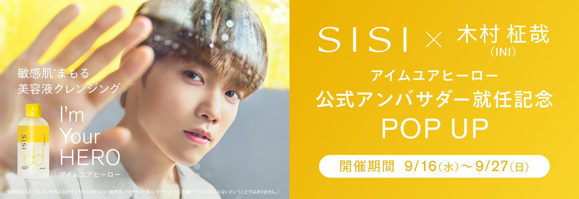
SISI アイムユアヒーロー×木村柾哉(INI)
5周年コラボ記念POPUP開催決定!
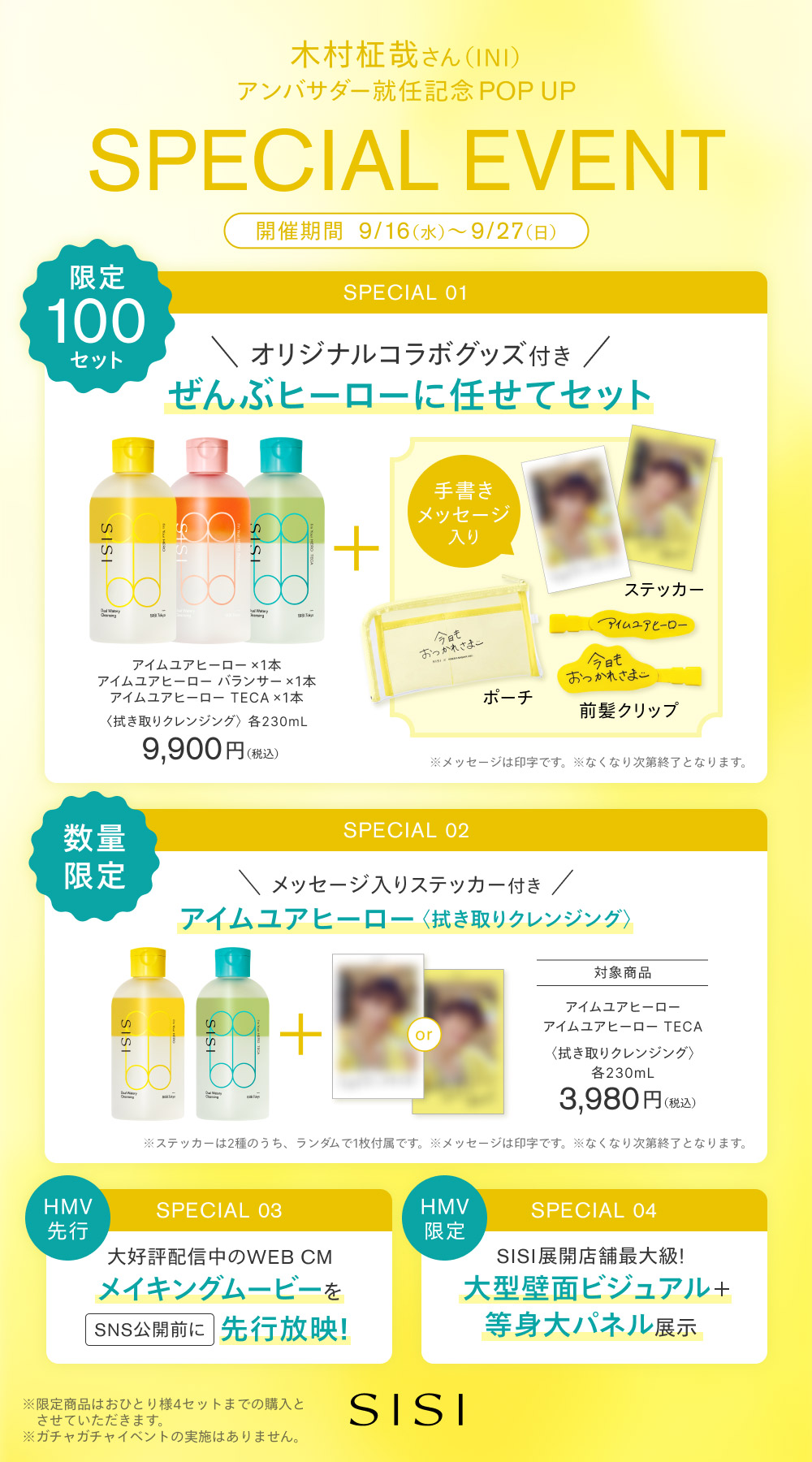
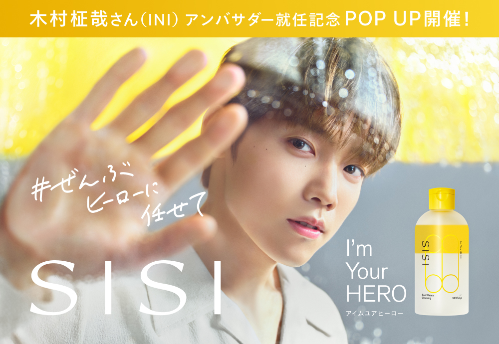
木村柾哉(INI)がアンバサダーを務める「SISI アイムユアヒーロー」の期間限定POPUPを、HMV&BOOKS SHIBUYAにて開催します。
会場では、#ぜんぶヒーローに任せて をコンセプトにした木村柾哉(INI)のビジュアルを展示。さらに、WEB CMのメイキング映像を、どこよりも早くご覧いただけます。
数量限定で、木村柾哉(INI)ステッカー付き商品を販売するほか、ステッカー・オリジナルポーチ・オリジナルヘアピンが付いた特別セットも100セット限定でご用意します。
リーダーとしてINIを支える木村さんと、SISIのスターアイテムとして敏感肌の毎日を支えるアイムユアヒーロー。どちらも今年で5周年。
誰かの力になってくれる存在と、毎日の肌に寄り添うHERO。
いくつもの共通点が重なって生まれた今回の出会い。
そんなストーリーを感じられる、ここでしか楽しめない特別な空間と限定アイテムをぜひお楽しみください。
皆さまのご来場を心よりお待ちしております。
POPUP概要
開催店舗・期間
■HMV&BOOKS SHIBUYA
〒150-0041
東京都渋谷区神南1-21-3 渋谷MODI内 5F レジ前 特設スペース
営業時間:10:00~21:00
開催期間:2026年9月16日(水)~9月27日(日)
※営業時間が変更になる場合がございます。
特典企画
開催期間中、SISI アイムユアヒーロー×木村柾哉(INI)の限定特典が付いた商品を、数量限定で販売します。
※各商品・特典は、なくなり次第終了となります。
POP UP対象商品
・アイムユアヒーロー
拭き取りクレンジング・洗顔
木村柾哉(INI)ステッカー付き
・アイムユアヒーロー TECA
拭き取りクレンジング・洗顔
木村柾哉(INI)ステッカー付き
・アイムユアヒーロー+アイムユアヒーロー miniセット
拭き取りクレンジング・洗顔
・ぜんぶヒーローに任せてセット
拭き取りクレンジング・洗顔
【セット内容】
アイムユアヒーロー 3本
木村柾哉(INI)ステッカー
SISI アイムユアヒーロー×木村柾哉(INI)オリジナルポーチ
SISI アイムユアヒーロー×木村柾哉(INI)オリジナルヘアピン
※本セットは100セット限定です。
※商品・特典は、なくなり次第終了となります。
\ オンラインでも販売中 /
※店頭での特典企画は対象外となります
※POPUP限定商品の取り扱いはございません
HMV&BOOKS Onlineにて
INI商品販売中!
body {
font-size: 14px;
background: #fff;
}
a {
word-wrap:break-word;
}
.newsDetailRight {
max-width: 1000px;
margin: 0 auto;
padding: 20px 10px;
}
.newsDetailContent {
padding: 20px 10px;
font-size: 16px;
line-height: 1.625;
}
ul.acordion {
background: #fff;
border: 2px solid #3bbbb6;
padding: 10px !important;
max-width: 500px;
}
.newsDetailsHeadNew_h {
margin-top: 30px;
margin-bottom: 10px;
padding-left: 15px;
border-left: #f65084 4px solid;
font-size: 24px;
line-height: 1.3;
}
.contentsBlock fitTop fitLR {
padding-top: 20px;
}
.widgetBlock {
padding: 10px;
margin-bottom: 20px;
display: block;
border: #dedede 1px solid;
border-radius: 4px;
box-sizing: border-box;
background: #f9f9f9 !important;
}
.freeLink {
font-size: 16px;
}
.freeLink a {
color: #109ad7;
text-decoration: none;
}
.itemBlock08 .box .titleBox {
padding: 10px;
background-color: #f9f9f9;
border-bottom: #dedede 1px solid;
border-radius: 4px 4px 0 0;
}
.arrow:before {
transform: none;
}
.grayItemWide {
display: none;
}
.p-card__txt--evaluation {
display: none;
}
.topic__txt--product_detail strong {
margin-top: -10px;
}
.p-card__txt--price {
margin-top: -10px;
}
.p-card__txt--product {
display: block !important;
height: auto !important;
}
.topic__txt--recently {
font-size: 1.6rem;
}
.topic__txt a {
font-size: 1.4rem;
}
.topic__txt--recently ul {
display: flex;
padding: 0px;
width: 100%;
list-style-type: none;
margin: 0 auto;
flex-wrap: wrap;
justify-content: space-between;
}
@media screen and (max-width: 980px){
.newsDetailsHeadNew_h {
font-size: 18px;
}
.itemBlock08 {
clear: both;
margin: 15px 0 0;
}
.itemBlock08 .box {
display: block;
border: #dedede 1px solid;
border-radius: 4px;
box-sizing: border-box;
margin-bottom: 20px;
}
.itemBlock08 .box .bodyBox {
display: block;
padding: 10px;
border-radius: 0 0 4px 4px;
}
.bodyBox a {
color: #109ad7;
text-decoration: none;
}
.topic__txt--product_detail em {
margin-bottom: 0px;
}
.topic__box--container{
margin-top: -20px
}
}
.img-sp {
display: none;
}
.topic .topic__heading + time {
display: none;
}
h2.topic__heading {
display: none;
}
.topic__txt--page_read {
border-top: none;
padding-top: 0;
}
.main_mv {
width: 100%;
}
.main_mv img {
width: 1200px;
}
.wrap_event {
max-width: 600px;
margin: 0 auto;
}
.ttl {
color:#fff;
padding:5px 5px;
background: #ecb708;
font-size:20px;
margin:0px 0px 10px 0px;
text-align: center;
font-weight: bold;
}
.font-title {
text-align: center;
font-weight: bold;
color: #ecb708;
font-size: 20px;
padding-bottom: 5px;
margin: 40px 0px 10px 0px;
}
.box1 {
background:#ffffff;
padding:15px;
}
.topic__box--recently {
padding: 0px;
margin: 0px;
}
.sp_br {
display: none;
}
.pc_br {
display: block;
}
.img_box{
max-width:800px;
margin: 0 auto;
display :block;
text-align: center;
}
.img_box2{
max-width:600px;
margin: 0 auto;
display :block;
padding: 20px 0px;
text-align: center;
}
.img_box3{
max-width:300px;
margin: 0 auto;
display :block;
padding: 20px 0px;
text-align: center;
}
.topic__2 {
width: 46%;
margin-bottom: 40px;
}
.topic__heading--detail span {
font-size: 34px;
}
.p-card__txt--evaluation {
display: none;
}
.p-card__txt--price {
margin-top: -10px;
}
.p-card__txt--product {
display: block !important;
height: auto !important;
}
#hmv .p-card__txt--brand{
pointer-events: none;
}
.item_in {
max-width: 1000px;
margin: 0 auto;
}
.topic__txt__2 {
max-width: 600px;
text-align: left;
margin: 0 auto;
padding: 10px 0px;
font-size: 15px;
color: #333;
line-height: 2.2rem;
}
.topic__txt__3 {
border: #dedede 1px solid;
padding: 14px;
border-radius: 4px;
box-sizing: border-box;
background: #f9f9f9 !important;
}
.topic__txt__3 a {
color: #109ad7;
text-decoration: none;
}
.item_s {
margin: 0 auto;
max-width: 700px;
padding: 14px 20px;
color: #333;
font-size: 12px;
border: 2px solid #efd2d7;
}
.title_icon {
background: #fff;
padding: 1px 2%;
border-radius: 14px;
font-weight: bold;
margin: 0 auto;
font-size: 1.5rem;
color: #f65084;
display: block;
width: 120px;
}
.title_icon2 {
color: #9223bc;
}
.btn_cg {
padding:5px 5px;
background: #e93c1e;
margin:0 auto;
max-width: 340px;
padding: 12px;
border-radius: 20px;
}
.btn_cg p {
text-align: center;
color: #fff;
text-decoration: none;
font-size: 14px;
}
@media screen and (max-width: 980px){
.ttl {
font-size:17px;
}
.font-title {
margin-top: 30px;
font-size: 18px;
}
.img-pc {
display: none;
}
.img-sp {
display: block;
}
.main_mv img {
width: 100%;
}
.topic__heading--detail span {
font-size: 24px;
}
.sp_br {
display: block;
}
.pc_br {
display: none;
}
.img_box{
max-width:100%;
}
.img_box2, .img_box3{
max-width:90%;
padding: 0;
}
.topic__txt--product_detail em {
margin: 0px;
}
.c-heading--page {
margin-bottom: 10px;
}
.topic__txt--product_detail strong {
margin: -10px 0px 10px 0px;
}
.topic__txt a {
font-size: 15px;
}
.topic__img img{
max-height: 180px;
max-width: 180px;
}
.brand {
width: 29%;
margin: 2%;
}
.brand img {
max-width: 100%;
}
.topic__txt__2 {
font-size: 14px;
}
.item_s {
padding: 8px;
font-size: 13px;
margin-top: 16px;
}
.wrap_event {
width: 100%;
}
.title_icon {
margin: 0 auto;
width: 40%;
text-align: center;
font-size: 1.3rem;
}
}
@media screen and (max-width: 430px){
.brand {
width: 40%;
margin: 5%;
}
}
.gtopic__2 {
width: 48%;
}
.topic__2:nth-child(odd) {
margin-right: 4%;
}
.topic__2 img {
width: 100%;
}
.topic__txt--recently ul {
justify-content: center !important;
padding: 0px;
}