1. TOP
  2. 特集情報
  3. 宝塚歌劇 加美乃素貸切公演へ抽選で50名様をご招待!

宝塚歌劇 加美乃素貸切公演へ抽選で50名様をご招待!


宝塚歌劇 加美乃素貸切公演へ
抽選で50名様をご招待!

morecos+、HMV阪急西宮ガーデンズ、HMV&BOOKS NAMBAで加美乃素商品を応募条件分ご購入いただいた方の中から、抽選で50名様を宝塚歌劇 花組公演『エリザベート-愛と死の輪舞(ロンド)-』へご招待いたします。


【公演名】
加美乃素 貸切公演 宝塚歌劇 花組 三井住友VISAカード ミュージカル『エリザベート−愛と死の輪舞(ロンド)−』

【ご招待日時】
2026年11月14日(土) 開演時間 15時30分

【会場】
宝塚大劇場(兵庫県宝塚市)

【当選人数】
50名様
※加美乃素 貸切公演における特別招待枠(50名様)のご案内です。

【応募期間】
2026年9月7日(月)17:00〜2026年10月6日(火)まで
※期間中にご注文いただいた場合でも、締め切り間近のご注文は商品がお手元に届かない場合もございます。 応募期間に余裕を持ってご購入いただきますようお願い申し上げます。
※レシート・領収書(ご注文日)は2025年10月6日〜2026年10月6日までのものが有効となります。


キャンペーン対象店舗
【オンライン】
morecos+

【実店舗�@】
HMV阪急西宮ガーデンズ
住所:〒663-8204
兵庫県西宮市高松町14-2 阪急西宮ガーデンズ 4F
営業時間:10:00-21:00
販売期間:2026年9月22日(火)〜10月6日(火)
※営業時間や販売開始期間は変更になる場合がございます。
※なくなり次第終了となりますのでご了承ください。


【実店舗�A】
HMV&BOOKS NAMBA
住所:〒542-0076
大阪府大阪市中央区難波3-8-9 なんばマルイ 7F
営業時間:11:00-20:00
販売期間:2026年9月30日(水)〜10月12日(月)
※加美乃素商品販売は10月12日(月)まで実施しておりますが、貸切公演への応募は10月6日(火)当日消印有効となっております。
※営業時間や販売開始期間は変更になる場合がございます。
※なくなり次第終了となりますのでご了承ください。


当キャンペーンに関するお問い合わせ先
TEL:078-231-6399
受付時間 9:00〜17:00
MAIL:k.invitation@kaminomoto.co.jp
※ご返答までにお時間を頂戴する場合がございます。あらかじめご了承ください。


対象商品


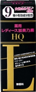
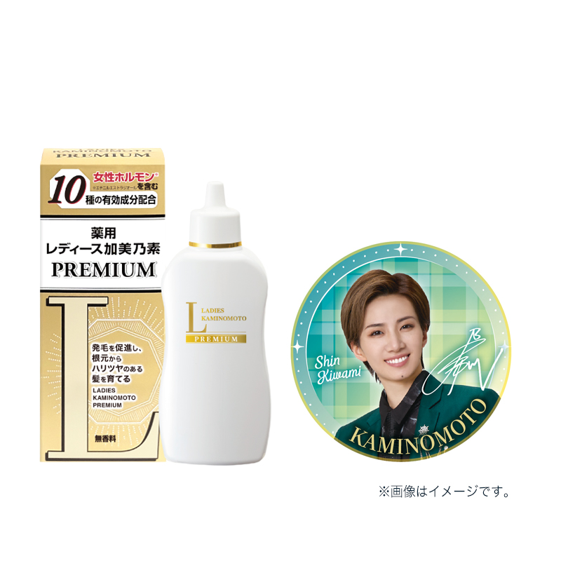
HMV限定缶バッチ付き商品

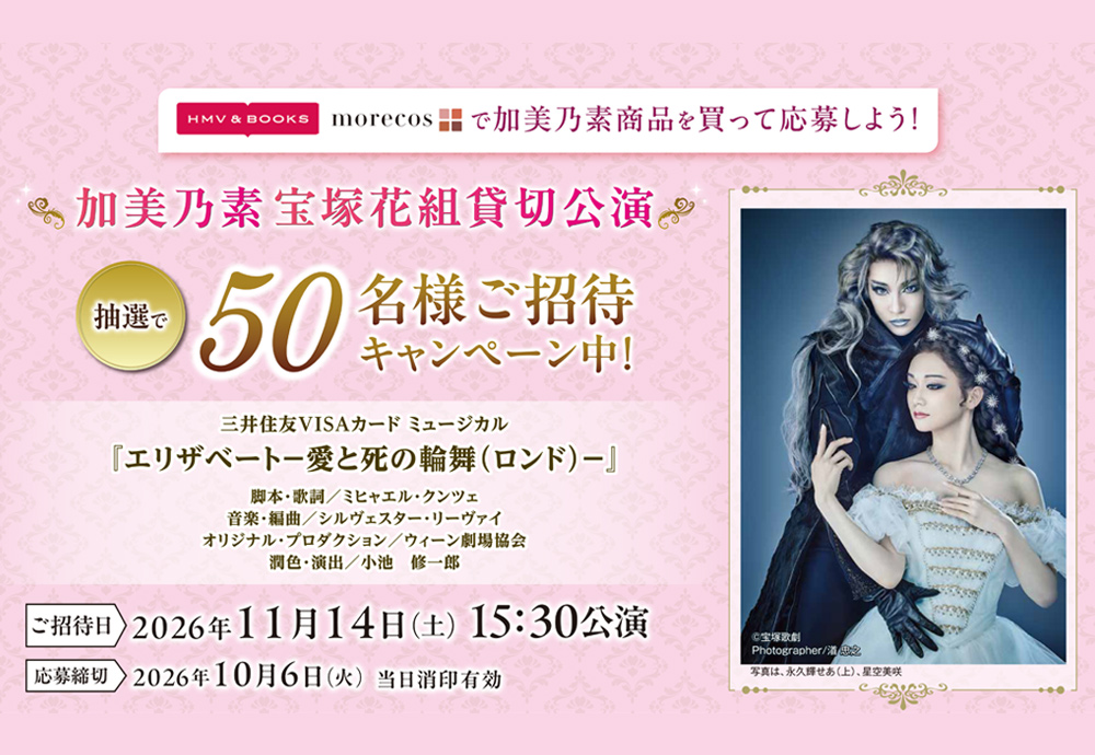
■【数量限定】【HMV限定】レディース加美乃素 Premium(缶バッジ グリーン 付き) 3,520円(税込)

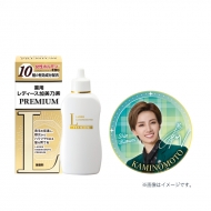
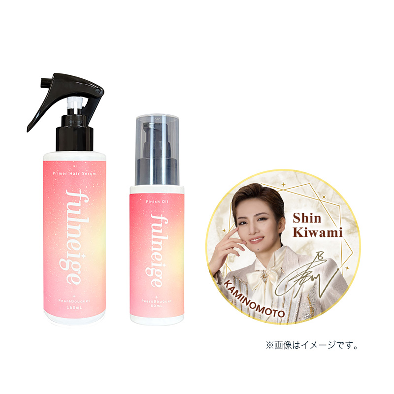
■【数量限定】【HMV限定】フルネージュセラム・オイルセット(缶バッチ ベージュ 付き) 3,410円(税込)

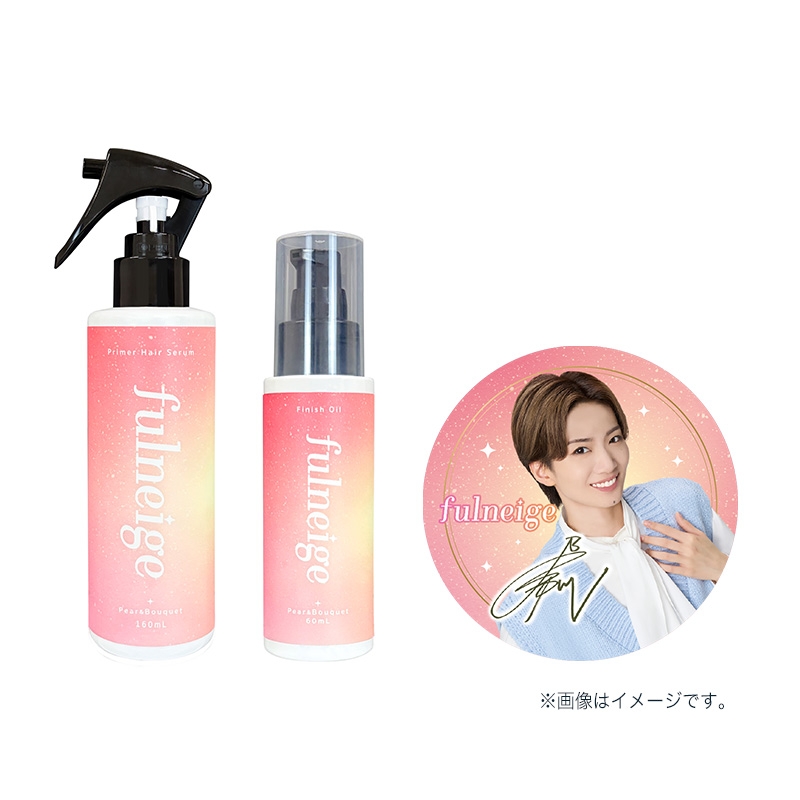
■【数量限定】【HMV限定】フルネージュセラム・オイルセット(缶バッチ ピンク 付き) 3,410円(税込)

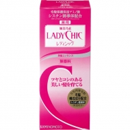
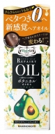
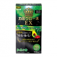
その他 加美乃素商品
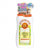
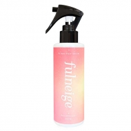
※本キャンペーンの対象商品は全てクーポン付与・利用不可となります。


応募方法・応募規定

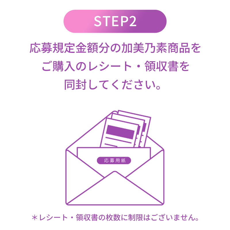
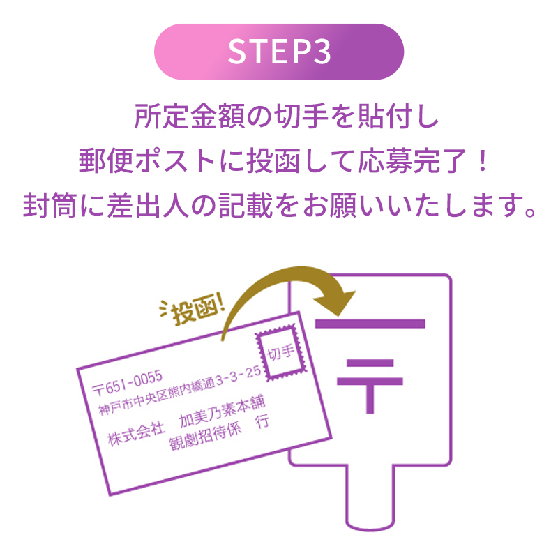
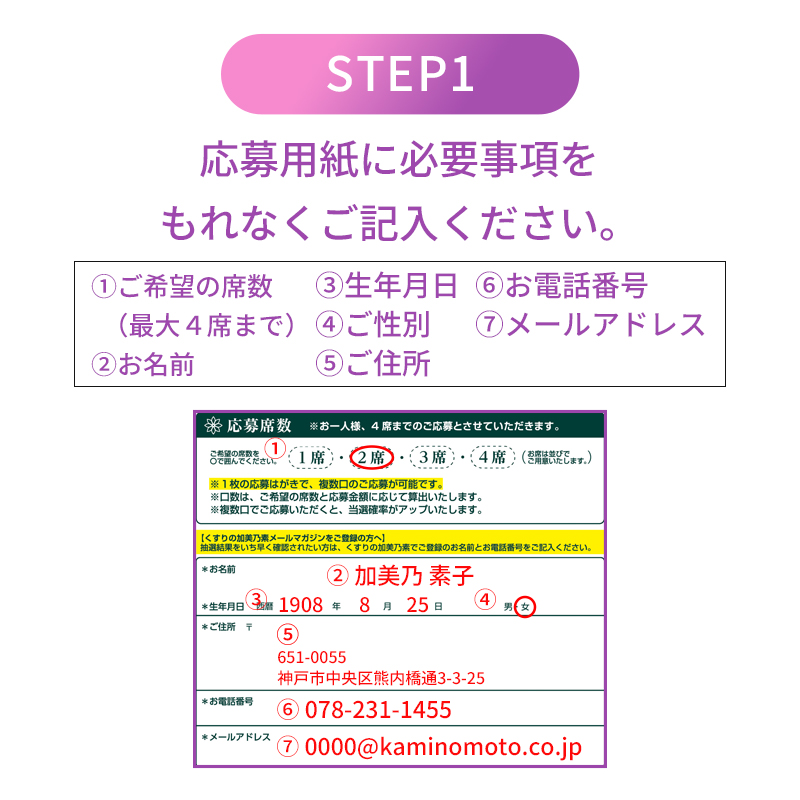
応募方法
arrowLeft
arrowRight


応募締切・抽選発表

■応募締切
2026年10月6日(火)※当日消印有効
■抽選発表
2026年10月20日(火)
※抽選結果はチケットの発送をもって発表にかえさせていただきます。
※チケットは株式会社加美乃素本舗 観劇招待係より発送いたします。morecos+からの発送ではございませんのでご注意ください。

送り先

〒651-0055
兵庫県神戸市中央区熊内橋通3-3-25
株式会社 加美乃素本舗 観劇招待係


※応募用紙がなくても必要事項を記入した便箋等でも応募可能です。


応募規定

morecos+、HMV阪急西宮ガーデンズ、HMV&BOOKS NAMBAでの加美乃素商品お買い上げレシート・領収書でご応募ください。
1席応募 7,000円(税込)、2席応募 14,000円(税込)、3席応募 21,000円(税込)、4席応募 28,000円(税込)を1口とします。
※実際のお買い上げ金額が応募対象金額となります。
※本キャンペーンの対象商品はクーポン付与・利用不可となります。
※レシート・領収書(ご注文日)は2025年10月6日〜2026年10月6日までのものが有効となります。


応募口数について

※口数の記入欄はございませんが、1枚の応募用紙で複数口のご応募が可能です。
口数につきましては、ご希望の席数と応募金額に応じて算出いたします。
・14,000円分(税込)ご購入で1席応募の場合、2口換算とさせていただきます。
・21,000円分(税込)のご購入で、1席・2席に丸をつけていただいた場合、1席×1口・2席×1口でご抽選いたします。
・35,000円分(税込)以上のご購入で、1席・2席に丸をつけていただく場合、【21,000円分は1席、14,000円分を2席】等、ご希望の配分が分かるようにご記入をお願いいたします。


応募に関するご注意

※ご応募は日本国内在住の方に限らせていただきます。
※同公演のご応募は、どの経由からでもご応募が可能ですが、同一住所または同一人物での当選は、1回までとさせていただきます。
※本キャンペーンへのご応募はレシート・領収書のみが有効となります。
バーコード・POPシール・引換金受領証ではご応募いただけません。
※応募対象は加美乃素商品のみとさせていただきます。
※レシート・領収書に記載されている税込価格が応募対象金額になります。
※応募金額はご購入商品価格の合算とさせていただきます。(レシート・領収書等複数枚可)
お値引き『後』の金額:キャンペーン等のお値引き・割引クーポンご利用時
お値引き『前』の金額:ポイントご利用時
※ご応募の際にお送りいただきましたレシート・領収書は返却できません。

※レシート・領収書のコピーは無効となります。
※切手不足等、応募内容に不備のある場合は、ご応募を無効とさせていただきます。
※不正な行為が発覚した場合は、該当者全てのご応募を無効とさせていただきます。
レシート・領収書にお買い上げ店舗名・購入日・加美乃素商品名の記載がない場合、明記してください。尚、フリマアプリ等の個人間の売買による購入は対象外とさせていただきます。


よくある不備理由

下記の場合は不備として無効になりますのでご注意ください
1.郵便料金の不足 切手の貼り忘れ、金額不足の場合は無効となります。
※封筒に差出人の記載をお願いいたします。郵便料金不足の場合、差出人の記載がございますと、郵便物は返送されます。

2.使用済み、または対象期間外に購入したレシート・領収書 対象期間内に購入したレシート・領収書をお送りください。
期間内であっても過去のキャンペーン応募でご使用されたものも無効になります。
2025年10月5日より以前のレシート・領収書は無効となります。

3.規定金額以上の対象商品を購入していない クーポンなどをご利用された場合は、割引後の金額を適用いたします。

4.購入証明の情報が部分的に欠落している �@購入店 �A購入日 �B合計金額※加美乃素商品の合計額 �C購入商品名
※�@〜�Cが欠落している場合は無効となります。

5.morecos+でご購入された商品の納品書または商品発送前の領収書 商品と同梱されている納品書は無効となります。
必ず、morecos+公式サイトよりお客様の操作にて領収書を印刷の上、ご応募ください。
また、発送前の領収書は無効となります。

【加美乃素貸切公演に関する注意事項】

※長期不在やお届け先住所、転居先が不明等の理由によりチケットがお届けできない場合、ご当選を無効とさせていただく場合があります。
※座席はSS席、S+席、S席、A 席、B 席とありますが抽選で予め決めさせていただきますのでご了承ください。
※座席の指定および変更、当選チケットの譲渡・転売・換金はできません。
※3歳以上のお子様の観劇はチケットが必要となります。
※全館貸切のためチケットの追加購入はできません。
※宝塚大劇場までの交通費はご当選者様のご負担とさせていただきます。
※抽選発表後に公演中止となった際は、ご当選されましたチケットは無効となります。 払戻しもできかねますので、予めご了承ください。また、交通費・宿泊代についてもお支払いできかねます。
公演の開催有無について、中止になるタイミングは最悪当日の可能性もございます。ご当選者様へ直接ご連絡はできかねますので、宝塚歌劇公式HPをご確認ください。
※お客様にご記入いただいた個人情報は、当選チケットの発送に利用させていただきます。 また、商品やサービスのご案内(DMやカタログ)や、個人を特定しない方法でマーケティングの統計データとして利用させていただきます。ご記入いただいた個人情報は 厳重に管理し、第三者への提供はいたしません。


.marker_lime { background: linear-gradient(transparent 60%, #eeff5b 60%); } .item_w1, .item_w2 { padding: 10px; padding: 30px; border-radius: 20px; background: #fff; margin-top: 40px; } .item_w1 { border: 2px solid #dd69a0; } .h3_mt_s { font-size: 20px; color: #3e3a39; font-weight: bold; text-align: center; padding: 10px 0px 20px 0px; } .accordion-001 { background-color: #ffffff; } .accordion-001:not([open]) { margin-bottom: 7px; } .accordion-001 summary { display: flex; justify-content: space-between; align-items: center; position: relative; padding: 0.7em 1em; background-color: #777777; color: #fff; font-weight: 600; cursor: pointer; font-size:120%; } .accordion-001 summary::-webkit-details-marker { display: none; } .accordion-001 summary::after { transform: translateY(-25%) rotate(45deg); width: 7px; height: 7px; margin-left: 10px; border-bottom: 3px solid #fff; border-right: 3px solid #fff; content: ''; transition: transform .3s; } .accordion-001[open] summary::after { transform: rotate(225deg); } .accordion-001 p { transform: translateY(-10px); opacity: 0; margin: 0; padding: 10px; color: #000000; transition: transform .5s, opacity .5s; } .accordion-001[open] p { transform: none; opacity: 1; } .product__img img { max-width: 70%; max-height: 70%; } .swiper-button-prev { left: 15% !important; } .swiper-button-next { right: 12% !important; } @media screen and (min-width: 768px){ .pc { display:block; } .sp { display:none; } } @media screen and (max-width: 768px){ .pc { display:none; } .sp { display:block; } } .sp_br { display: none; } @media (max-width: 600px) { .sp_br { display: block; } } 「br-s .arrow{ position: relative; display: inline-block; padding: 0 0 0 16px; color: #232323; vertical-align: middle; text-decoration: none; font-size: 15px; } .arrow::before, .arrow::after{ position: absolute; top: 0; bottom: 0; left: 0; margin: auto; content: ""; vertical-align: middle; } .sample4-5::before{ box-sizing: border-box; width: 12px; height: 12px; border: 1px solid #3bbbb6; -webkit-border-radius: 50%; border-radius: 50%; } .sample4-5::after{ left: 5px; box-sizing: border-box; width: 3px; height: 3px; border: 3px solid transparent; border-left: 3px solid #3bbbb6; } .steps { /* 連番カウンター名の定義 */ counter-reset: step-counter; /* 縦棒との位置関係に必要 */ position: relative; /* 縦棒と連番のためのスペースを左に確保 */ padding-left: 2rem; /* 連番(1.5rem) + 余白 */ } /* 縦棒 */ .steps:before { content: ""; /* 幅と色 */ background-color: #d59533; width: 2px; /* 位置 */ position: absolute; top: 0.7rem; /* 円のwidthの半分 */ left: 0.7rem; /* 円のwidthの半分 */ height: calc(100% - 0.7rem); /* 100% - top */ /* 連番より後ろに表示するため */ z-index: 0; } .steps > h3 { /* 連番カウンターを+1する */ counter-increment: step-counter; /* 連番カウンターを垂直方向に中央揃えで表示する */ display: flex; align-items: center; } /* �@�A�Bなど連番 */ .steps > h3:before { /* 連番カウンターの値を表示する */ content: counter(step-counter); /* フォントと色 */ background: #d59533; color: white; font-size: 0.8rem; font-weight: normal; /* 文字を中央に表示する */ line-height: 1.5rem; text-align: center; /* 円で表示する */ width: 1.5rem; height: 1.5rem; border-radius: 1.5rem; /* .stepsでmargin-left +2rem したぶん左に戻す */ position: absolute; left: 0; /* 縦棒より手前に表示するため */ z-index: 1; } .btn-flat-border { display: inline-block; padding: 0.3em 1em; text-decoration: none; color: #67c5ff; border: solid 2px #67c5ff; border-radius: 3px; transition: .4s; } .btn-flat-border:hover { background: #67c5ff; color: white; } /* パソコンで見たときは"pc"のclassがついた画像が表示される */ .pc { display: block !important; } .sp { display: none !important; } /* スマートフォンで見たときは"sp"のclassがついた画像が表示される */ @media only screen and (max-width: 750px) { .pc { display: none !important; } .sp { display: block !important; } } .resizeimage img { width: 100%; } /* IE */ @media screen\0 { .steps > h3 { position: relative!important; top: 0!important; left: 0;!important; } .steps > h3:before { top: 0!important; left: -32px!important; line-height: 26px!important; } } .box26 { position: relative; margin: 2em 0; padding: 0.5em 1em; border: solid 3px #dd1957; border-radius: 8px; } .box26 .box-title { position: absolute; display: inline-block; top: -13px; left: 10px; padding: 0 9px; line-height: 1; font-size: 19px; background: #FFF; color: #dd1957; font-weight: bold; } .box26 p { margin: 0; padding: 0; } body { font-size: 14px; background: #fff; } a { word-wrap:break-word; } .newsDetailRight { max-width: 1000px; margin: 0 auto; padding: 20px 10px; } .steps { counter-reset: step-counter; position: relative; padding-left: 2rem; } .steps:before { content: ""; background-color: #d59533; width: 2px; position: absolute; top: 0.7rem; left: 0.7rem; height: calc(100% - 0.7rem); z-index: 0; } .newsDetailContent { padding: 20px 10px; font-size: 16px; line-height: 1.625; } ul.acordion { background: #fff; border: 2px solid #3bbbb6; padding: 10px !important; max-width: 500px; } .newsDetailsHeadNew_h { margin-top: 30px; margin-bottom: 10px; padding-left: 15px; border-left: #f65084 4px solid; font-size: 24px; line-height: 1.3; } .contentsBlock fitTop fitLR { padding-top: 20px; } .widgetBlock { padding: 10px; margin-bottom: 20px; display: block; border: #dedede 1px solid; border-radius: 4px; box-sizing: border-box; background: #f9f9f9 !important; } .freeLink { font-size: 16px; } .freeLink a { color: #109ad7; text-decoration: none; } .itemBlock08 .box .titleBox { padding: 10px; background-color: #f9f9f9; border-bottom: #dedede 1px solid; border-radius: 4px 4px 0 0; } .arrow:before { transform: none; } .grayItemWide { display: none; } .p-card__txt--evaluation { display: none; } .topic__txt--product_detail strong { margin-top: -10px; } .p-card__txt--price { margin-top: -10px; } .p-card__txt--product { display: block !important; height: auto !important; } .topic__txt--recently { font-size: 1.6rem; } .topic__txt a { font-size: 1.4rem; } @media screen and (max-width: 980px){ .newsDetailsHeadNew_h { font-size: 18px; } .itemBlock08 { clear: both; margin: 15px 0 0; } .itemBlock08 .box { display: block; border: #dedede 1px solid; border-radius: 4px; box-sizing: border-box; margin-bottom: 20px; } .itemBlock08 .box .bodyBox { display: block; padding: 10px; border-radius: 0 0 4px 4px; } .bodyBox a { color: #109ad7; text-decoration: none; } .topic__txt--product_detail em { margin-bottom: 0px; } .topic__box--container{ margin-top: -20px } } .pr4 { display: flex; list-style: none; max-width: 1000px; margin: 0 auto; padding: 40px 0px; justify-content: space-evenly; } .pr4 li img{ max-width: 220px; } .pr4 li p{ display: -webkit-box; overflow: hidden; -webkit-box-orient: vertical; -webkit-line-clamp: 2; width: 220px; color: #232323; font-size: 14px; letter-spacing: -0.2px; padding-top: 10px; } .img-sp { display: none; } .topic .topic__heading + time { display: none; } h2.topic__heading { display: none; } .topic__txt--page_read { border-top: none; padding-top: 0; } .main_mv { width: 100%; } .main_mv img { width: 1200px; } .wrap_event { max-width: 600px; margin: 0 auto; } .ttl { color:#fff; padding:5px 5px; background: #ef7fb4; font-size:20px; margin:0px 0px 10px 0px; text-align: center; font-weight: bold; } .font-title { text-align: center; font-weight: bold; color: #ef7fb4; font-size: 20px; padding-bottom: 5px; margin: 40px 0px 10px 0px; } .cp_info, .cp_info_2 { max-width: 600px; margin: 0 auto; font-size:17px; color: #333; text-align: center; line-height: 2; letter-spacing: -0.6px; font-weight: bold; } .cp_info_2 { font-size:16px; letter-spacing: -0.6px; } .box1 { background:#ffffff; padding:15px; } .topic__box--recently { padding: 0px; margin: 0px; } .sp_br { display: none; } .pc_br { display: block; } .img_box{ max-width:800px; margin: 0 auto; display :block; text-align: center; } .img_box2{ max-width:600px; margin: 0 auto; display :block; padding: 20px 0px; text-align: center; } .topic__heading--detail span { font-size: 34px; } .p-card__txt--evaluation { display: none; } .p-card__txt--price { margin-top: -10px; } .p-card__txt--product { display: block !important; height: auto !important; } #hmv .p-card__txt--brand{ pointer-events: none; } .item_in { max-width: 1000px; margin: 0 auto; } .topic__txt__2 { max-width: 600px; text-align: left; margin: 0 auto; padding: 10px 0px; font-size: 15px; color: #333; line-height: 2.2rem; } .item_w1, .item_w2 { padding: 20px 10px; } .topic__txt__3 { border: #dedede 1px solid; padding: 14px; border-radius: 4px; box-sizing: border-box; background: #f9f9f9 !important; } .topic__txt__3 a { color: #109ad7; text-decoration: none; } .item_s { margin: 0 auto; max-width: 600px; padding: 14px 20px; color: #333; font-size: 12px; border: #dedede 1px solid; background: #f9f9f9 !important; } .title_icon { background: #fff; padding: 1px 2%; border-radius: 14px; font-weight: bold; margin: 0 auto; font-size: 1.5rem; color: #f65084; display: block; width: 120px; } .title_icon2 { color: #9223bc; } .btn_cg { padding:5px 5px; background: linear-gradient( 90deg, #ee7bcc 0%, #b063d8 100% ); margin:0 auto; max-width: 340px; padding: 12px; border-radius: 20px; } .btn_cg p { text-align: center; color: #fff; text-decoration: none; font-size: 14px; } @media screen and (max-width: 980px){ .ttl { font-size:17px; } .accordion-001 summary { font-size:120%; margin: 0px -10px; } .font-title { margin-top: 30px; font-size: 18px; } .img-pc { display: none; } .img-sp { display: block; } .main_mv img { width: 100%; } .topic__heading--detail span { font-size: 24px; } .sp_br { display: block; } .pc_br { display: none; } .img_box{ max-width:100%; } .img_box2{ max-width:90%; padding: 0; } .cp_info { font-size: 15px; } .cp_info_2 { font-size: 14px; } .product__img img { max-width: 90%; max-height: 90%; } .swiper-button-prev { left: 15px !important; } .swiper-button-next { right: -10px !important; } .topic__txt--product_detail em { margin: 0px; } .c-heading--page { margin-bottom: 10px; } .topic__txt--product_detail strong { margin: -10px 0px 10px 0px; } .topic__txt a { font-size: 15px; } .topic__img img{ max-height: 180px; max-width: 180px; } .brand { width: 29%; margin: 2%; } .brand img { max-width: 100%; } .topic__txt__2 { font-size: 14px; } .item_s { padding: 8px; font-size: 13px; margin-top: 16px; } .wrap_event { width: 100%; } .title_icon { margin: 0 auto; width: 40%; text-align: center; font-size: 1.3rem; } } @media screen and (max-width: 430px){ .brand { width: 40%; margin: 5%; } } .h3_mt_s { font-size: 18px; padding: 0px; } @media screen and (min-width: 961px) .container { min-height: auto; padding-bottom: 0px; } .product__img { max-width: 800px; margin: 0 auto; } .swiper-slide p { font-weight: bold; font-size: 1.2rem; color: #333; } @media screen and (min-width: 961px) { .container { min-height: auto; padding-bottom: 0px; } }