あなたの肌悩み、
どのディビジョンに任せる?
ヒプマイ肌ケアキャンペーン
ヒプマイ×コラリッチとの
コラボキャンペーンがスタート!
“7つ”のサイエンス発想美容液の中から
あなたの肌悩みにあった
対象商品・コースを選択して
ヒプマイと日々のスキンケアを楽しもう!
【ご購入に関する注意事項】
※トレカ(キャラ別)はランダムで1枚配布となります。絵柄はお選びできません。
※トレカ(キャラ別)はA・B・Cコースによって絵柄が異なります。
※ポストカードは先着特典となります。ご購入時、商品ページに特典の記載があった場合においても、特典が付かない場合がございます。あらかじめご了承ください。
※特典はご購入いただいた商品と同梱にて発送いたします。
※数量限定のため、なくなり次第終了となります。
※こちらの商品はクーポン利用不可となります。またキャンペーン対象外となりますので、あらかじめご了承ください。
※画像はイメージです。
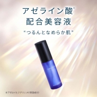
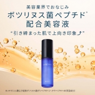
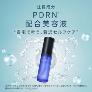
対象商品
特典/関連情報:トレーディングカード1枚をランダムでプレゼント
※ランダムで1枚配布となります。※予定数量に達し次第、配布終了
HMV・morecos+限定ポストカードもプレゼント!
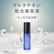
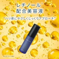
対象商品
特典/関連情報:トレーディングカード1枚をランダムでプレゼント
※ランダムで1枚配布となります。※予定数量に達し次第、配布終了
HMV・morecos+限定ポストカードもプレゼント!
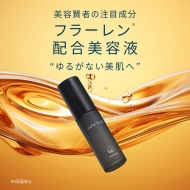
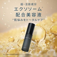
対象商品
特典/関連情報:トレーディングカード1枚をランダムでプレゼント
※ランダムで1枚配布となります。※予定数量に達し次第、配布終了
HMV・morecos+限定ポストカードもプレゼント!
POPUP情報
HMV&BOOKSにてコラリッチ×ヒプノシスマイクPOPUP開催決定!
コラリッチ×ヒプマイ「肌ケア」キャンペーンを記念して東京・大阪・福岡のHMV&BOOKS店舗でのPOP UP開催が決定いたしました!
POPUP会場にて対象商品を1点ご購入で、トレカ(ディビジョン別)2枚セットとHMV限定ポストカード1枚を先着でプレゼントいたします。
是非この機会をお見逃しなく!
【開催店舗/期間】
■HMV&BOOKS SHIBUYA
〒150-0041
東京都渋谷区神南1-21-3 渋谷 modi 内 6F
営業時間:
10:00~21:00
開催期間:
2026年5月8日(金)~2026年5月17日(日)
■HMV&BOOKS NAMBA
〒542-0076
大阪府大阪市中央区難波3-8-9 なんばマルイ 7F POPUPスペース
営業時間:
11:00~20:00
開催期間:
2026年5月12日(火)~2026年5月25日(月)
■HMV&BOOKS HAKATA
〒812-0012
福岡県福岡市博多区博多駅中央街9-1 博多マルイ6F
営業時間:
10:00~21:00
開催期間:
2026年5月8日(金)~2026年5月17日(日)
※イベントは予告なく終了する場合がございます。
#brand1, #brand2, #brand3, #brand4, #brand5, #brand6, #brand7, #brand8, #brand9, #brand10, #brand11, #brand12, #brand13, #brand14, #brand15, #brand16, #brand17, #brand18{
margin-top: -55px;
padding-top: 55px;
}
.c-list--tab_page {
margin: 45px 0px 20px;
}
.topic .topic__heading + time {
display: none;
}
h2.topic__heading {
display: none;
}
.topic__txt--page_read {
border-top: none;
}
.img-sp {
display: none;
}
.main_mv {
width: 100%;
}
.main_mv img {
width: 1200px;
}
h3{
background: #ffef03;
padding: 6px 0px;
margin: 0 auto;
color: #000 !important;
font-weight: bold;
font-size: 24px !important;
text-align: center;
}
h4{
font-size: 28px;
font-weight: bold;
color: #352571;
margin: 0 auto;
text-align: center;
line-height: 1.8;
padding-top: 40px;
}
.topic__heading--detail em {
font-size: 18px;
padding: 8px 0px;
letter-spacing: 0px;
}
.box1 {
background: #fff;
padding:15px;
}
.box3 {
background: #fff;
max-width: 800px;
margin: 0 auto;
}
.item_s {
margin: 0 auto;
max-width: 740px;
padding: 14px 20px;
color: #333;
font-size: 13px;
background: #f9f9f9;
}
.topic__txt__2 {
font-size: 16px;
max-width: 600px;
text-align: left;
margin: 0 auto;
padding: 10px 0px;
line-height: 1.8;
letter-spacing: 0.1px;
color: #3e3a39;
}
.topic__txt__3 {
font-size: 20px;
max-width: 600px;
text-align: center;
margin: 0 auto;
padding: 40px 0px;
line-height: 1.8;
letter-spacing: 0.1px;
color: #3e3a39;
font-weight: bold;
}
.item_s ul {
margin-top: 20px;
}
.item_s ul li {
padding: 5px;
}
.item_s ul li a {
color: #894d46;
text-decoration: underline;
}
.sp_br {
display: none;
}
.pc_br {
display: block;
}
.space {
margin-right: 6px;
color: #373737 !important;
}
.img_box{
max-width:140px;
margin: 0 auto;
display :block;
padding: 10px 0px;
}
.img_box2{
max-width:800px;
margin: 0 auto;
display :block;
}
.img_box_s{
max-width:20px;
margin: 0 auto;
display :block;
padding-bottom: 20px;
}
.p-card__txt--product {
display: block !important;
height: auto !important;
}
.p-card__txt--brand a{
pointer-events: none;
}
.p-card__txt--evaluation {
display: none;
}
.item_in {
max-width: 1000px;
margin: 0 auto;
}
.topic__txt--recently {
border-top: none;
color: #b0988e;
font-size: 20px;
}
.topic__txt--recently ul {
display: flex;
padding: 0px 0px 20px 0px;
width: 100%;
list-style-type: none;
margin: 0 auto;
flex-wrap: wrap;
justify-content: space-between;
}
.pr4 {
display: flex;
list-style: none;
max-width: 1000px;
margin: 0 auto;
padding: 40px 0px;
justify-content: space-evenly;
}
.pr4 li {
background-color: #fff;
padding: 6px;
border-radius: 6px;
box-shadow: 2px 2px 4px rgba(0,0,0,0.10);
}
.pr4 li img{
max-width: 220px;
}
.pr4 li p{
display: -webkit-box;
overflow: hidden;
-webkit-box-orient: vertical;
-webkit-line-clamp: 2;
width: 220px;
color: #232323;
font-size: 14px;
letter-spacing: -0.2px;
padding-top: 10px;
}
.brand_box {
display: flex;
flex-wrap: wrap;
list-style: none;
padding: 0px;
max-width: 1000px;
margin: 0 auto;
}
.brand {
width: 10.5%;
margin: 1%;
background-color: #fff;
padding: 6px;
border-radius: 6px;
box-shadow: 2px 2px 4px rgba(0,0,0,0.10);
}
.btn_cg {
color:#fffff;
padding:5px 5px;
background:#894d46;
margin:0 auto;
max-width: 340px;
padding: 12px;
border-radius: 20px;
}
.btn_cg p {
text-align: center;
color: #fff;
text-decoration: none;
font-size: 14px;
}
.movie-wrap {
position: relative;
padding-top: 56.25%;
}
.movie-wrap iframe {
position: absolute;
top: 0;
left: 0;
width: 100%;
height: 100%;
}
@media screen and (max-width: 980px){
.img-pc {
display: none;
}
.img-sp {
display: block;
}
.main_mv img {
width: 100%;
}
h3{
font-size: 20px !important;
}
h4{
font-size: 22px !important;
}
.topic__heading--detail em {
font-size: 14px
}
.sp_br {
display: block;
}
.pc_br {
display: none;
}
.space {
margin-right: 0;
}
.img_box{
max-width:50%;
padding: 10px 0px;
}
.img_box2{
max-width:100%;
padding: 10px 0px;
}
.item_s {
padding: 8px;
font-size: 12px;
max-width: 94%;
}
.topic__txt__2{
font-size: 15px;
}
.topic__txt__3{
font-size: 18px;
}
.topic__box--recently {
padding: 0px;
margin-top: 0px;
}
.box1 {
padding:10px;
}
.c-heading--index {
margin: 0px;
}
.topic__txt--product_detail em {
margin: 0px;
}
.topic__txt--product_detail strong {
margin: -10px 0px 10px 0px;
}
.topic__txt {
margin-top: 10px;
}
.topic__txt a {
font-size: 15px;
}
.c-list--tab_page {
margin: 20px 0px;
}
.pr4 {
flex-wrap: wrap;
padding: 10px 1%;
justify-content: space-between;
}
.pr4 li {
width: 48%;
margin-bottom: 40px;
}
.pr4 li img{
max-width: 100%;
}
.pr4 li p{
padding: 10px 0px 0px 0px;
width: 100%;
}
.brand {
width: 23%;
margin: 1%;
}
.brand img {
max-width: 100%;
}
}
@media screen and (max-width: 430px){
.topic__txt--recently ul {
justify-content: flex-start !important;
padding: 0px;
}
}


