【800円以下】ちょい足しプチプラアイテム あと○○円足りない時におすすめ!
「あと○○円足りない…!」そんな時にうれしい、
800円以下でちょい足しできるプチプラアイテムを集めました。
キャンペーン条件まであと少しという時に
気軽に追加しやすいおすすめアイテムをご紹介します。
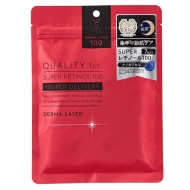
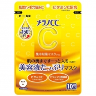
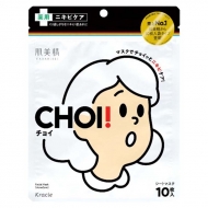
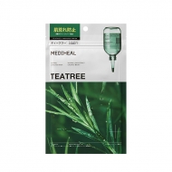
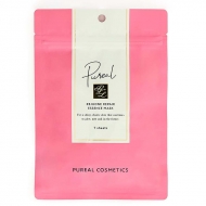
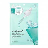
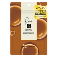
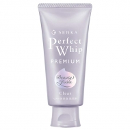
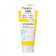
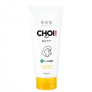
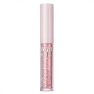
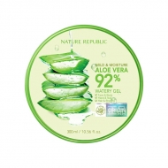
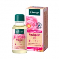
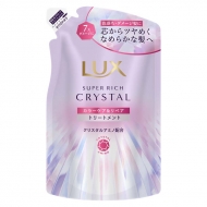
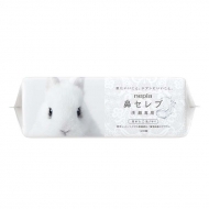
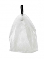
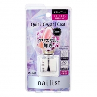
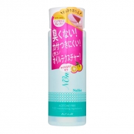
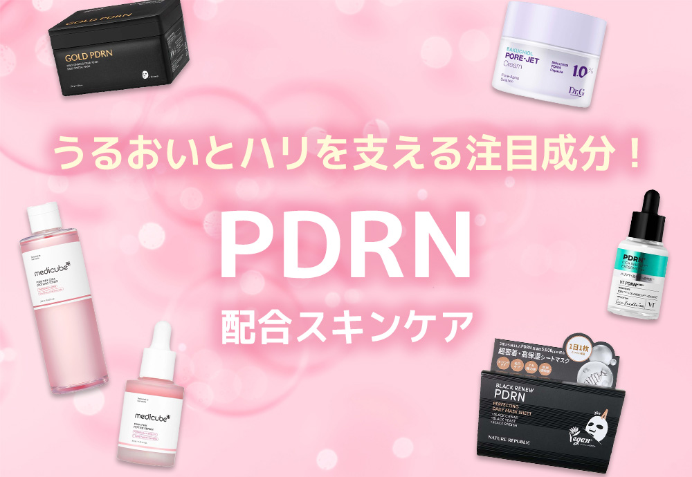
パック
毛穴をはじめとする肌悩みを全方位ケアする理想型ビタミンC集中ケアマスク。
理想型ビタミンC(APPS)を始め4種のビタミンCを高濃度配合し、ナノカプセルで角質層のすみずみまでデリバリーします。
さらに保湿成分としてヒアルロン酸や濃グリセリンも配合。
やさしさを考えた防腐剤不使用。日本製。
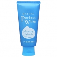
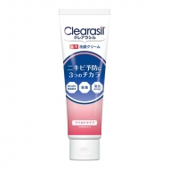
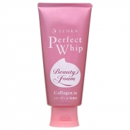
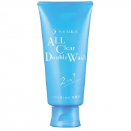
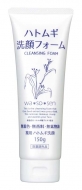
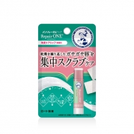
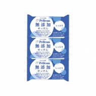
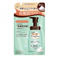
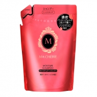
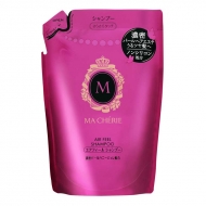
洗顔料
【医薬部外品】
・毎日使えるピーリング洗顔※です。 ※古い角質や毛穴の汚れを洗い流す
・SENKAのミクロ美容泡が、薬用成分サリチル酸※を抱え込んで肌に届けます。 ※ニキビ予防
・ニキビを予防しながら、肌表面の蓄積した古い角質・毛穴のつまり・余分な皮脂汚れを取り除き、ごわつきを抑え、透明感のあるなめらかな肌へ!
・上品で心地よいハーバルフルーティーの香りです。
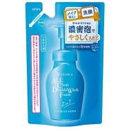
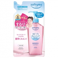
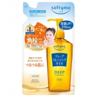
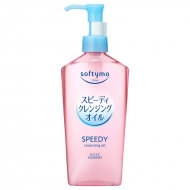
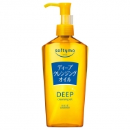
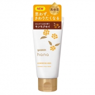
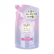
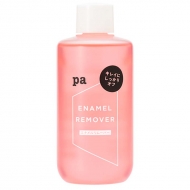
クレンジング
・5種のオーガニック認証ボタニカルオイル(保湿)と3種のボタニカルシードオイル(保湿)を配合した、秒落ちスピーディオイルです。
・スピーディ処方で、素早くすっぴん肌に!
・ぬれた手OK、まつエクOK、洗顔不要!
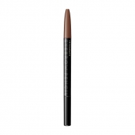
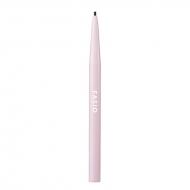
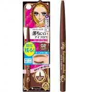
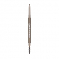
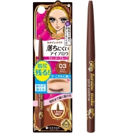
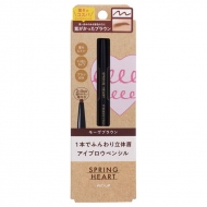
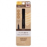
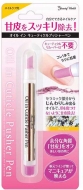
アイブロウ
やさしく描けて、自然に仕上がる アイブロウペンシル
軽いタッチで自然な眉が描ける、くり出しタイプのアイブロウ。
落ちにくく、にじまない、化粧もちのよいペンシルタイプです。
眉を整えたり、ぼかせるブラシ付き。
4色から、髪色にあわせてお選びください。
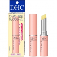
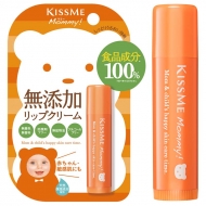
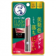
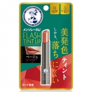
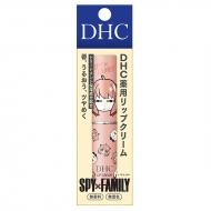
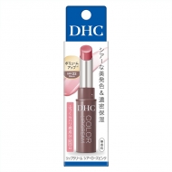
口紅・リップ
医薬部外品
・保湿・保護作用に優れたオリーブバージンオイルやアロエエキスなどを配合しました。
・トリートメント効果によって唇の荒れを防ぎ、ふっくらとみずみずしい状態に整えます。
・なめらかな塗り心地で、しっかりフィット!
・見えないヴェールとなって、うるおいとツヤを持続させます。
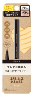
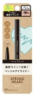
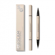
アイメイク
密着力と速乾性に優れた、高発色のリキッドアイライナー。
目元をくっきり際立たせる漆黒ブラック。汗・水・にじみに強いウォータープルーフタイプ。フエルトペンタイプ。
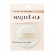
ベースメイク
サラッとすべすべ肌に仕上げるフェイスパウダー。
微細なパウダーがお肌に密着し、メイク崩れを防いでさらさら肌に導きます。
トランスルーセントだから、顔だけでなくボディから口元・髪まで全身に使えます。
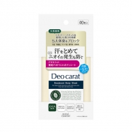
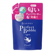
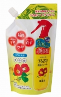
ボディケア
【医薬部外品】
・女性の気になる体臭・汗臭・オトナ臭 ニオイまでキレイに
・ニオイまでキレイに変える、洗うボディケアでニオイの元やくすみ*まで落として、透明感のある肌へ(*古い角質)
・殺菌成分配合し、肌を清浄・殺菌し、体臭・汗臭の発生を防ぎます
・白泥(吸着剤)、ビタミンC誘導体(うるおい成分)配合し濃密な泡が、ニオイの元となる皮脂や汚れを吸着します
・年齢とともに減少する甘い香りを補うスウィートフローラルの香り
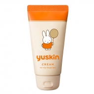
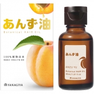
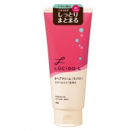
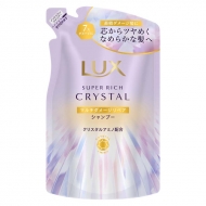
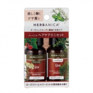
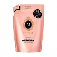
ヘアケア
髪にうるおいとツヤを与える天然あんず油のヘアオイルです。
ベタつかず、さらりと軽やかにまとまる髪に。無添加にこだわる100%植物由来処方。
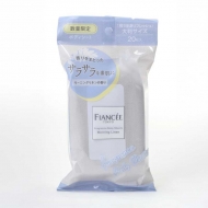
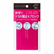
その他
1枚でさっとテカりを修正!持ち運びに最適な紙おしろいにメイクキープするパウダーを塗工。
余分な脂を吸収し、サラサラ肌キープ
.topic .topic__heading + time {
display: none;
}
h2.topic__heading {
display: none;
}
.topic__txt--page_read {
border-top: none;
}
.topic__heading2 {
background: url(http://img.hmv.co.jp/hybridimage_stg/news/images/22/0821/101/body_024301.png) no-repeat left center;
padding: 8px 0px 8px 35px;
line-height:130%;
background-size: 30px;
margin-bottom:12px;
border-bottom: 1px dotted #b5918c;
font-size:130%;
}
.font-title {
color: #000;
font-size: 20px;
}
h3 {
text-align: center;
font-size: 1.3rem;
color: #000000;
padding: 10px 0px;
}
.box1 {
background:#ffffff;
padding:15px;
}
.topic__box--recently {
padding: 0px;
margin: 0px;
}
.item_s {
margin: 0 auto;
max-width: 700px;
padding: 14px 20px;
color: #333;
font-size: 13px;
background: #f7f7f7;
}
p.seotext_00 {
text-decoration:underline;
text-decoration-color:#2fcab0;
}
.sp_br {
display: none;
}
.pc_br {
display: block;
}
.img_box{
max-width:200px;
margin: 0 auto;
padding-bottom: 20px;
}
.img_box2{
max-width:540px;
margin: 0 auto;
padding-bottom: 10px;
}
.btn_cg {
color:#f8f7f5;
padding:5px 5px;
background:rgb(137, 77, 70);
margin:0 auto;
max-width: 320px;
padding: 12px;
border-radius: 20px;
}
.btn_cg p {
text-align: center;
color: #fff;
text-decoration: none;
font-size: 15px;
font-weight: bold;
}
.topic__txt {
font-size: 14px;
}
.p-card__txt--evaluation {
display: none;
}
.p-card__txt--price {
margin-top: -10px;
}
.p-card__txt--product {
display: block !important;
height: auto !important;
}
#hmv .p-card__txt--brand{
pointer-events: none;
}
.ttl {
color:#fff;
padding:5px 5px;
background:#ea6d99;
font-size:20px;
margin:0px 0px 30px 0px;
text-align: center;
font-weight: bold;
}
.sold {
text-align: center;
color: #BB2926;
font-size: 1.2rem;
font-weight: bold;
margin-top: -50px;
padding-bottom: 30px;
}
.date {
font-weight: bold;
text-align: center;
font-size: 16px;
color: #000;
padding-top:7px;
}
.post_title_3{
color: #333;
font-size: 2rem;
max-width: 800px;
margin: 0 auto 10px;
}
.img-sp {
display: none;
}
.main_mv {
width: 100%;
}
.main_mv img {
width: 1200px;
}
.pr4 {
display: flex;
list-style: none;
max-width: 1000px;
margin: 0 auto;
padding: 40px 0px;
justify-content: space-evenly;
}
.pr4 li img{
max-width: 220px;
}
.pr4 li p{
display: -webkit-box;
overflow: hidden;
-webkit-box-orient: vertical;
-webkit-line-clamp: 2;
width: 220px;
color: #232323;
font-size: 14px;
letter-spacing: -0.2px;
padding-top: 10px;
}
@media screen and (max-width: 980px){
.sp_br {
display: block;
}
.pc_br {
display: none;
}
.img_box{
max-width:60%;
}
.img_box2{
max-width:100%;
}
.item_s {
padding: 8px;
font-size: 12px;
margin-top: 30px;
}
h3 {
font-size: 1.1rem;
}
.topic__txt {
font-size: 13px;
}
.ttl {
font-size:18px;
}
.sold {
margin-top: 0px;
padding-bottom: 0px;
padding: 10px 0px 0px 0px;
}
.date {
font-size: 13px;
}
.c-btn--anker {
height: 55px;
}
.c-btn--anker2 {
padding: 16px 4px 0;
}
.index__list--anker li {
width: 31%;
margin-right: 0px;
}
.topic__txt--product_detail em {
margin: 0px;
}
.c-heading--page {
margin-bottom: 10px;
}
.topic__txt--product_detail strong {
margin: -10px 0px 10px 0px;
}
.main_mv img {
width: 100%;
}
}
.pr4 {
flex-wrap: wrap;
padding: 20px 4%;
justify-content: space-between;
}
.pr4 li {
width: 48%;
margin-bottom: 40px;
}
.pr4 li img{
max-width: 100%;
}
.pr4 li p{
padding: 10px 0px 0px 0px;
width: 100%;
}
.topic__txt--recently ul {
display: flex;
padding: 0px;
width: 100%;
list-style-type: none;
margin: 0 auto;
flex-wrap: wrap;
justify-content: flex-start;
}
.goods_in {
width: 31%;
margin-bottom: 40px;
margin-right: 2%;
}
.goods_in img {
width: 400px;
}
.button {
font-size: 18px;
padding: 16px 0px;
text-align: center;
border-radius: 35px;
background-color: #bb2926;
color: #fff;
font-weight: bold;
margin: 0 auto;
max-width: 240px;
display: block;
}
.button2 {
font-size: 16px;
padding: 16px 0px;
text-align: center;
border-radius: 35px;
background-color: #737373;
color: #fff;
font-weight: bold;
margin: 0 auto;
max-width: 280px;
display: block;
}
/* まずはPC/タブレット用のデフォルト(必要なら) */
.goods_in {
/* 例: PCでは3列など、自由に */
width: 24%;
margin-right: 1%;
margin-bottom: 16px;
}
.goods_in:nth-child(4n) {
margin-right: 0;
}
.goods_in img {
width: 100%;
}
/* ここからスマホだけ適用 */
@media (max-width: 767px) {
/* リンクボタン(ご提示の内容) */
.goods_in {
width: 49%;
margin-bottom: 10px;
margin-right: 0;
}
.goods_in:nth-child(odd) {
margin-right: 1%;
}
.goods_in img {
width: 100%;
}
.cp_info {
font-size: 15px;
}
.cp_info_2 {
font-size: 14px;
}
}
/* ▼ リストの土台をFlexboxに(PC/タブレットの基準) */
.topic__txt--recently ul {
display: flex;
flex-wrap: wrap;
gap: 16px; /* アイテム間のスキマ(任意) */
list-style: none;
margin: 0 auto;
padding: 0;
justify-content: flex-start; /* 2段目が2つの時も中央寄せ */
}
/* ▼ PC時のカード幅
1~3番目:3列
4番目以降:2列(=今回は4番目と5番目を想定)
*/
.topic__txt--recently ul .goods_in {
margin: 0; /* gapに任せる */
/* デフォルトはまず3列(1~3番目に適用) */
flex: 0 0 calc((100% - 16px * 2) / 3); /* 100% - gap*列数-1 */
}
.topic__txt--recently ul .goods_in:nth-child(n+4) {
/* 4番目以降は2列に切替(=4・5番目が対象) */
flex: 0 0 calc((100% - 16px) / 2);
}
/* 画像はカード幅にフィット */
.topic__txt--recently ul .goods_in img {
display: block;
width: 100%;
height: auto;
}
/* ▼ スマホだけ2列固定(ブレークポイントは必要に応じて調整) */
@media (max-width: 767px) {
.topic__txt--recently ul {
gap: 10px; /* スマホでは少し狭める例 */
}
.topic__txt--recently ul .goods_in {
flex: 0 0 calc((100% - 10px) / 2); /* 常に2列 */
}
}
/* PCだけ:5枚すべてを同じ大きさ(3カラム幅)に固定 */
@media (min-width: 768px) {
.topic__txt--recently ul {
display: flex;
flex-wrap: wrap;
gap: 16px; /* カード間のスキマ。必要なら調整 */
justify-content: flex-start; /* 中央寄せにしたいなら center に変更可 */
list-style: none;
margin: 0 auto;
padding: 0;
}
/* 重要:各アイテムを“同じ幅”&“伸びない”ように強制固定 */
.topic__txt--recently ul .goods_in {
flex: 0 0 calc((100% - 16px * 2) / 3) !important; /* 3カラム固定 */
max-width: calc((100% - 16px * 2) / 3) !important; /* 予防で最大幅も同値に */
margin: 0 !important; /* 余白は gap に任せる */
}
/* nth-child で2列化/右マージン変更などの“過去ルール”を無効化 */
.topic__txt--recently ul .goods_in:nth-child(n) {
margin-right: 0 !important;
width: auto !important;
}
/* 画像はコンテナの幅に合わせる(はみ出し禁止) */
.topic__txt--recently ul .goods_in img {
display: block;
width: 100% !important;
height: auto !important; /* ここでは縦伸びさせない(contain寄りの安全策) */
max-width: 100% !important; /* 400px固定などの上書き対策 */
object-fit: contain; /* 元画像を全部見せる(トリミングしない) */
}
}
/*====================================
スマホ:アンカーリンク10個を
「必ず2個ずつ」きれいに並べる
====================================*/
@media (max-width: 767px) {
/* ul を Grid に完全切替 */
.topic__txt--recently ul {
display: grid !important;
grid-template-columns: repeat(2, 1fr);
gap: 10px;
padding: 0;
margin: 0 auto;
list-style: none;
}
/* li(ボタン)側の過去指定を全解除 */
.topic__txt--recently ul .goods_in {
width: auto !important;
max-width: none !important;
flex: none !important;
margin: 0 !important;
}
/* 画像はセル幅にフィット */
.topic__txt--recently ul .goods_in img {
display: block;
width: 100% !important;
height: auto !important;
max-width: 100% !important;
}
}
/* =========================
PC版だけ:関連トピックスを4列にする
========================= */
@media screen and (min-width: 981px) {
.pr4 {
display: flex;
justify-content: space-between;
}
.pr4 li {
width: 23% !important; /* ← 4列固定 */
margin-bottom: 0;
}
.pr4 li img {
width: 100%;
max-width: none;
}
.pr4 li p {
width: 100%;
}
}


