【数量限定】%Recipe×THE RAMPAGE 藤原樹さん ステッカー&ムービーキャンペーン
%Recipe×THE RAMPAGE 藤原樹さん
ステッカー&ムービーキャンペーン
キャンペーン応募期間中に%Recipe対象商品を購入したレシートでご応募いただくと、ご購入数に応じてノベルティをプレゼント!
Aコース:2個ご購入で藤原樹さんオリジナルステッカー 2種+オリジナルムービー
Bコース:1個ご購入で藤原樹さんオリジナルステッカー 1種
キャンペーン応募期間
2026年4月15日(水)~
2026年6月30日(火)
※商品の発送は4月6日(月)以降順次発送予定となります。
※応募方法などキャンペーン詳細は「%Recipe×THE RAMPAGE 藤原樹さん ステッカー&ムービーキャンペーン」をご確認ください。
※ステッカーは後日郵送にてお送りいたします。
※「Xファイン サテンウェア メッシュクッション」及び「バーミーパフポット リップ&チーク」は対象外となります。
※ステッカーはランダム配布のため、デザインはお選びいただけません。
※Aコースはランダム配布となるため、同じステッカーが2枚お届けとなる場合もございます。
※ステッカーは数量限定のため、無くなり次第終了となります。
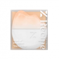
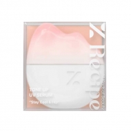
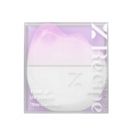
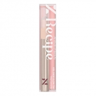
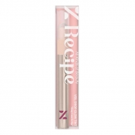
キャンペーン対象商品
©sweet
店舗販売情報
本キャンペーン商品は、オンラインストアだけでなく下記の実店舗でも4月9日(木)からお取り扱いしております。
お近くにお越しの際は、ぜひ店舗でもご覧ください。
【店舗情報】
■HMV&BOOKS SHIBUYA
〒150-0041
東京都渋谷区神南1-21-3 渋谷 modi 内 5F
営業時間 10:00~21:00
関連トピックス
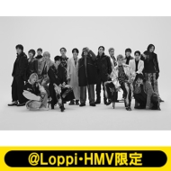
\こちらも好評開催中!/

HMV&BOOKS Onlineにて
THE RAMPAGE from EXILE TRIBE
商品販売中!
#item1, #item2, #item3, #item4, #item5, #item6, #item7, #item8, #item9, #item10, #item11, #item12, #item13, #item14, #item15, #item16{
margin-top: -60px;
padding-top: 60px;
}
.topic .topic__heading + time {
display: none;
}
h2.topic__heading {
display: none;
}
.topic__txt--page_read {
border-top: none;
padding-top: 0;
}
.main_mv {
width: 100%;
}
.main_mv img {
width: 1200px;
}
.img-sp {
display: none;
}
.ttl_h2 {
color:#fff;
padding:3px 3px;
background: #8b775d;
font-size:1.5rem;
margin:0px 0px 30px 0px;
text-align: center;
font-weight: bold;
}
.topic__heading--detail span {
font-size: 34px;
}
.font-title {
color: #232323;
font-size: 20px;
text-align: center;
}
.box1 {
background:#ffffff;
padding:15px;
}
.topic__box--recently {
padding: 0px;
margin: 0px;
}
.ttx {
font-weight: bold;
text-align: center;
font-size: 16px;
color: #231815;
padding-top:7px;
}}
p.seotext_00 {
text-decoration:underline;
text-decoration-color:#2fcab0;
}
.sp_br {
display: none;
}
.pc_br {
display: block;
}
.img_box{
max-width:600px;
margin: 0 auto;
padding-bottom: 20px;
}
.img_box2{
max-width:400px;
margin: 0 auto;
display :block;
padding: 30px 0px;
}
.topic__txt {
font-size: 16px;
max-width: 600px;
text-align: left;
padding: 10px 0px;
line-height: 1.8;
letter-spacing: 0.1px;
margin: 0 auto;
}
.p-card__txt--evaluation {
display: none;
}
.p-card__txt--price {
margin-top: -10px;
}
.p-card__txt--product {
display: block !important;
height: auto !important;
}
#hmv .p-card__txt--brand{
pointer-events: none;
}
.item_list {
display: flex;
padding: 0px 0px 20px 0px;
width: 100%;
list-style-type: none;
margin: 0 auto;
flex-wrap: wrap;
}
.item_list p{
font-weight: bold;
font-size: 12px;
text-align: left;
margin-top: 7px;
color: #aa4c4c;
background: url(http://img.hmv.co.jp/hybridimage/news/images/24/0111/501/body_174133.png) no-repeat left center;
background-size: 16px;
padding: 8px 0px 8px 22px;
}
.item_in {
max-width: 1000px;
margin: 0 auto;
}
.fes_btn {
margin: 1.5%;
width: 17%;
}
.fes_btn img {
width: 170px;
}
.fes_ttl {
font-size: 30px;
color: #87632f;
}
.topic__txt--recently ul {
display: flex;
padding: 0px;
width: 100%;
list-style-type: none;
margin: 0 auto;
justify-content: flex-start;
}
.goods_in {
width: 36%;
margin-bottom: 40px;
margin-right: 1%;
}
.goods_in img {
width: 400px;
}
.product__img img {
max-width: 40%;
max-height: 40%;
}
.swiper-button-prev {
left: 25% !important;
}
.swiper-button-next {
right: 22% !important;
}
.btn_cg {
color:#f8f7f5;
padding:5px 5px;
background:rgb(137, 77, 70);
margin:0 auto;
max-width: 340px;
padding: 12px;
border-radius: 20px;
}
.btn_cg p {
text-align: center;
color: #fff;
text-decoration: none;
font-size: 14px;
}
.brand_box {
display: flex;
flex-wrap: wrap;
list-style: none;
padding: 0px;
max-width: 1000px;
margin: 0 auto;
}
.brand {
width: 18%;
margin: 1%;
}
@media screen and (max-width: 980px){
.img-pc {
display: none;
}
.main_mv img {
width: 100%;
}
.img-sp {
display: block;
}
.ttl_h2 {
font-size: 1.3rem;
}
.topic__heading--detail span {
font-size: 24px;
}
.sp_br {
display: block;
}
.pc_br {
display: none;
}
.img_box, .img_box2{
max-width:100%;
}
.topic__txt {
font-size: 14px;
}
.topic__txt--product_detail em {
margin: 0px;
}
.c-heading--page {
margin-bottom: 10px;
}
.topic__txt--product_detail strong {
margin: -10px 0px 10px 0px;
}
.fes_btn {
width: 27%;
margin: 3%;
}
.fes_btn img {
width: 100%;
}
.item_list {
justify-content: flex-start !important;
}
.fes_ttl {
font-size: 20px;
}
.topic__txt--recently ul {
flex-wrap: wrap;
}
.goods_in {
width: 49%;
margin-bottom: 10px;
margin-right: 0;
}
.goods_in:nth-child(odd) {
margin-right: 1%;
}
.goods_in img {
width: 100%;
}
.product__img img {
max-width: 100%;
max-height: 100%;
}
.swiper-button-prev {
left: 27px !important;
}
.swiper-button-next {
right: 0px !important;
}
.brand {
width: 29%;
margin: 2%;
}
.brand img {
max-width: 100%;
}
}
@media screen and (max-width: 430px){
.topic__txt--recently ul {
justify-content: flex-start !important;
padding: 0px;
}
.fes_btn {
margin-right: 2%;
width: 29%;
}
.fes_btn:nth-child(3n) {
margin-right: 0px;
}
.fes_btn img {
width: 100%;
}
.item_list p{
font-size: 10px;
}
.brand {
width: 40%;
margin: 5%;
}
.item_list p{
font-size: 10px;
margin-top: 7px;
background-size: 10px;
padding: 0px 0px 0px 12px;
}
}
body {
margin: 0;
}
body::before {
content: "";
position: fixed;
inset: 0; /* top/left/right/bottom をまとめて指定 */
z-index: -1;
background-image: url("https://img.hmv.co.jp/hybridimage/news/images/26/0325/501/body_103403.jpeg");
background-repeat: no-repeat; /* ← 繰り返し停止 */
background-position: center top;
background-size: cover; /* ← 画面全体をカバー(はみ出しあり) */
}


