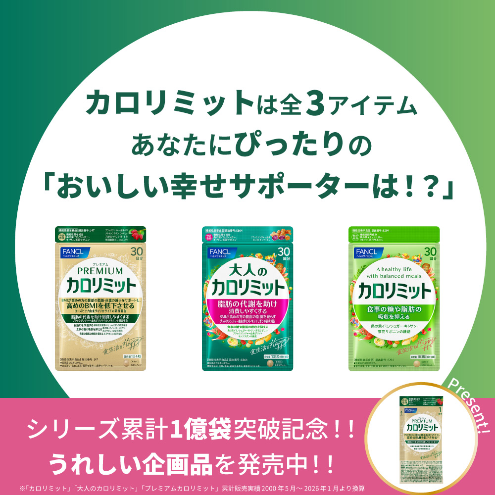
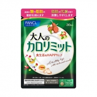
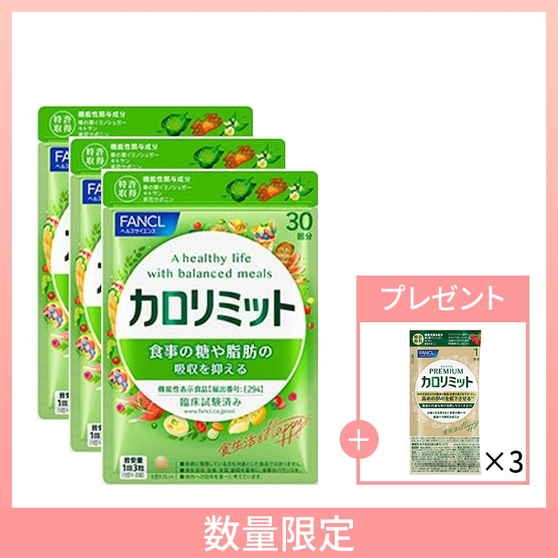
ファンケル カロリミットシリーズ【プレミアムカロリミットサンプル付きのお得なセットも】
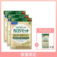
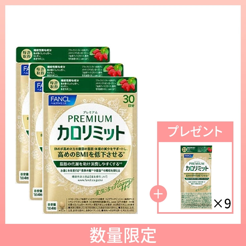
期間限定!3袋セットご購入の方に
プレミアムカロリミットのサンプル(9日分)をプレゼント!
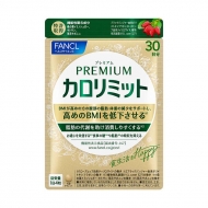
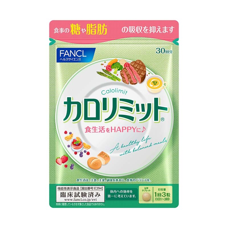
単品はこちら
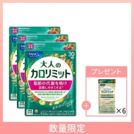
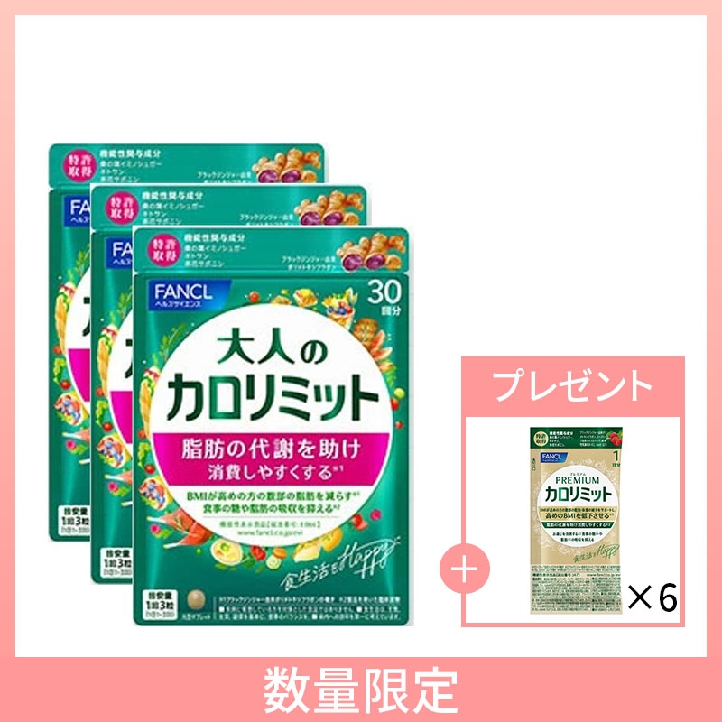
期間限定!3袋セットご購入の方に
プレミアムカロリミットのサンプル(6日分)をプレゼント!
単品はこちら
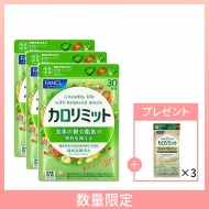
期間限定!3袋セットご購入の方に
プレミアムカロリミットのサンプル(3日分)をプレゼント!
単品はこちら

.topic .topic__heading + time {
display: none;
}
h2.topic__heading {
display: none;
}
.topic__txt--page_read {
border-top: none;
}
.img-sp {
display: none;
}
.main_mv {
width: 100%;
}
.main_mv img {
width: 1200px;
}
h3{
font-size: 16px;
color: #e86c8a !important;
font-family: "Noto Sans JP", "Hiragino Kaku Gothic ProN", "Hiragino Sans", "Yu Gothic", Meiryo, sans-serif;
text-align: center;
font-weight: bold;
}
h4{
font-size: 16px;
font-weight: normal !important;
color: #373737 !important;
font-family: "Noto Sans JP", "Hiragino Kaku Gothic ProN", "Hiragino Sans", "Yu Gothic", Meiryo, sans-serif;
text-align: center;
}
h5{
font-size: 13px;
font-weight: normal !important;
color: #373737 !important;
font-family: "Noto Sans JP", "Hiragino Kaku Gothic ProN", "Hiragino Sans", "Yu Gothic", Meiryo, sans-serif;
text-align: start;
}
.topic__heading--detail em {
font-size: 18px;
padding: 8px 0px;
letter-spacing: 0px;
}
.box1 {
background: url(https://img.hmv.co.jp/hybridimage/news/images/26/0219/501/body_172005.png);
padding: 50px;
}
.box2 {
background-color: #f0ead8;
padding: 50px;
}
.box3 {
background-color: #d8eae6;
padding: 50px;
}
.box4 {
background-color: #d3e0cb;
padding: 50px;
}
.box5 {
background: url(https://img.hmv.co.jp/hybridimage/news/images/26/0219/501/body_172005.png);
padding: 50px;
}
.box6 {
background: linear-gradient(60deg, #ff76b7, #fb9ac8);
padding: 50px;
}
.box__in{
max-width: 640px;
background-color: #fff;
margin: 0 auto;
padding: 10px 0;
border-radius: 0 0 50px 50px;
}
.item_s {
margin: 0 auto;
max-width: 640px;
padding: 14px 20px;
color: #333;
font-size: 13px;
background: #f7f7f7;
}
.sp_br {
display: none;
}
.pc_br {
display: block;
}
.space {
margin-right: 6px;
color: #373737 !important;
}
.img_box{
max-width:140px;
margin: 0 auto;
display :block;
padding: 10px 0px;
}
.img_box2{
max-width:640px;
margin: 0 auto;
display :block;
}
.sample1 {
font-size: 16px;
color: #646153;
text-align: center;
}
.sample2 {
font-size: 16px;
color: #646153;
text-align: center;
}
.p-card__txt--evaluation {
display: none;
}
.item_in {
max-width: 1000px;
margin: 0 auto;
}
.topic {
max-width: 540px;
}
.topic__txt--recently ul {
display: flex;
padding: 0px 0px 20px 0px;
width: 100%;
list-style-type: none;
margin: 0 auto;
flex-wrap: wrap;
justify-content: space-between;
}
.goods_in {
width: 45%;
margin-bottom: 20px;
}
.goods_in img {
width: 300px;
border: 1px solid #eee;
}
.item__name {
font-size: 1.4rem;
text-align: left;
color: #333333;
font-weight: normal;
padding: 5px 0px 3px 0px;
}
.item__price {
font-size: 1.3rem;
text-align: left;
color: #333333;
font-weight: normal;
}
.movie-wrap {
position: relative;
padding-top: 56.25%;
}
.movie-wrap iframe {
position: absolute;
top: 0;
left: 0;
width: 100%;
height: 100%;
}
@media screen and (max-width: 980px){
.l-section {
padding: 0;
}
.img-pc {
display: none;
}
.img-sp {
display: block;
}
.main_mv img {
width: 100%;
}
h3 {
font-size: 12px; /* スマホのとき小さくする */
}
h4 {
font-size: 12px; /* スマホのとき小さくする */
}
h5 {
font-size: 10px; /* スマホのとき小さくする */
}
.topic__heading--detail em {
font-size: 14px
}
.sp_br {
display: block;
}
.pc_br {
display: none;
}
.space {
margin-right: 0;
}
.img_box,{
max-width:50%;
padding: 10px 0px;
}
.img_box2{
max-width:100%;
}
.item_s {
padding: 8px;
font-size: 12px;
margin-top: 30px;
}
.topic {
margin: 0 auto;
}
.topic__txt--product_detail em {
margin: 0px;
padding: 10px 20px;
}
.c-btn--topic {
margin-bottom: 30px !important;
}
.topic__txt--product_detail strong {
margin: -10px 0px 10px 0px;
}
.topic__txt {
margin-top: 10px;
}
.topic__txt a {
font-size: 15px;
}
.topic__img--box {
height: 180px;
width: 180px;
align-items: normal;
}
.topic__img img {
max-height: 100%;
max-width: 100%;
}
.topic__txt--recently ul {
width: 90%;
}
.goods_in {
width: 48%;
}
.goods_in:nth-child(odd) {
margin-right: 4%;
}
.goods_in img {
width: 100%;
}
.item__name {
font-size: 1.1rem;
}
.item__price {
font-size: 1.0rem;
}
.box1, .box2, .box3, .box4, .box5, .box6 {
padding: 40px 10px;
}
.box__in{
max-width: 100%;
border-radius: 0 0 30px 30px;
}
}
@media screen and (max-width: 430px){
.topic__txt--recently ul {
justify-content: flex-start !important;
padding: 0px;
}
}


