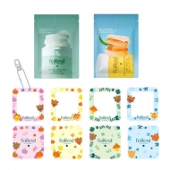
【数量限定・福袋】Happy New Year & FoRest 1st Anniversary Lucky Set
2026.01.16
ハッピーニューイヤー &
🍊アンバサダーの「あのアイデア」から生まれた話題のパッドが、お年玉プライスで登場!✨
「推し活」応援!可愛いオリジナルキーリング4種が全部ついてくる!
商品紹介
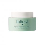
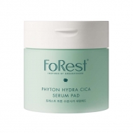
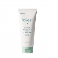
FoRest by Greenfinger日本上陸1周年&新年を記念した、とっておきの「福袋」 をご用意しました!
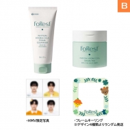
HMV POPUP STOREで販売された
FoRest by Greenfinger
「FoRest by Greenfinger」単品商品をご購入の方に「人生4カット」を先着でプレゼント!
こちらも無くなり次第終了となりますので、気になる方はお早めに✨
キャンペーン対象商品
.marker_lime {
background: linear-gradient(transparent 60%, #eeff5b 60%);
}
@media screen and (min-width: 768px){
.pc { display:block; }
.sp { display:none; }
}
@media screen and (max-width: 768px){
.pc { display:none; }
.sp { display:block; }
}
.sp_br {
display: none;
}
@media (max-width: 600px) {
.sp_br {
display: block;
}
}
「br-s
.arrow{
position: relative;
display: inline-block;
padding: 0 0 0 16px;
color: #232323;
vertical-align: middle;
text-decoration: none;
font-size: 15px;
}
.arrow::before,
.arrow::after{
position: absolute;
top: 0;
bottom: 0;
left: 0;
margin: auto;
content: "";
vertical-align: middle;
}
.sample4-5::before{
box-sizing: border-box;
width: 12px;
height: 12px;
border: 1px solid #3bbbb6;
-webkit-border-radius: 50%;
border-radius: 50%;
}
.sample4-5::after{
left: 5px;
box-sizing: border-box;
width: 3px;
height: 3px;
border: 3px solid transparent;
border-left: 3px solid #3bbbb6;
}
.steps {
/* 連番カウンター名の定義 */
counter-reset: step-counter;
/* 縦棒との位置関係に必要 */
position: relative;
/* 縦棒と連番のためのスペースを左に確保 */
padding-left: 2rem; /* 連番(1.5rem) + 余白 */
}
/* 縦棒 */
.steps:before {
content: "";
/* 幅と色 */
background-color: #d59533;
width: 2px;
/* 位置 */
position: absolute;
top: 0.7rem; /* 円のwidthの半分 */
left: 0.7rem; /* 円のwidthの半分 */
height: calc(100% - 0.7rem); /* 100% - top */
/* 連番より後ろに表示するため */
z-index: 0;
}
.steps > h3 {
/* 連番カウンターを+1する */
counter-increment: step-counter;
/* 連番カウンターを垂直方向に中央揃えで表示する */
display: flex;
align-items: center;
}
/* ①②③など連番 */
.steps > h3:before {
/* 連番カウンターの値を表示する */
content: counter(step-counter);
/* フォントと色 */
background: #d59533;
color: white;
font-size: 0.8rem;
font-weight: normal;
/* 文字を中央に表示する */
line-height: 1.5rem;
text-align: center;
/* 円で表示する */
width: 1.5rem;
height: 1.5rem;
border-radius: 1.5rem;
/* .stepsでmargin-left +2rem したぶん左に戻す */
position: absolute;
left: 0;
/* 縦棒より手前に表示するため */
z-index: 1;
}
.btn-flat-border {
display: inline-block;
padding: 0.3em 1em;
text-decoration: none;
color: #67c5ff;
border: solid 2px #67c5ff;
border-radius: 3px;
transition: .4s;
}
.btn-flat-border:hover {
background: #67c5ff;
color: white;
}
/* パソコンで見たときは"pc"のclassがついた画像が表示される */
.pc { display: block !important; }
.sp { display: none !important; }
/* スマートフォンで見たときは"sp"のclassがついた画像が表示される */
@media only screen and (max-width: 750px) {
.pc { display: none !important; }
.sp { display: block !important; }
}
.resizeimage img { width: 100%; }
/* IE */
@media screen\0 {
.steps > h3 {
position: relative!important;
top: 0!important;
left: 0;!important;
}
.steps > h3:before {
top: 0!important;
left: -32px!important;
line-height: 26px!important;
}
}
.box26 {
position: relative;
margin: 2em 0;
padding: 0.5em 1em;
border: solid 3px #dd1957;
border-radius: 8px;
}
.box26 .box-title {
position: absolute;
display: inline-block;
top: -13px;
left: 10px;
padding: 0 9px;
line-height: 1;
font-size: 19px;
background: #FFF;
color: #dd1957;
font-weight: bold;
}
.box26 p {
margin: 0;
padding: 0;
}
body {
font-size: 14px;
background: #fff;
}
a {
word-wrap:break-word;
}
.newsDetailRight {
max-width: 1000px;
margin: 0 auto;
padding: 20px 10px;
}
.steps {
counter-reset: step-counter;
position: relative;
padding-left: 2rem;
}
.steps:before {
content: "";
background-color: #d59533;
width: 2px;
position: absolute;
top: 0.7rem;
left: 0.7rem;
height: calc(100% - 0.7rem);
z-index: 0;
}
.newsDetailContent {
padding: 20px 10px;
font-size: 16px;
line-height: 1.625;
}
ul.acordion {
background: #fff;
border: 2px solid #3bbbb6;
padding: 10px !important;
max-width: 500px;
}
.newsDetailsHeadNew_h {
margin-top: 30px;
margin-bottom: 10px;
padding-left: 15px;
border-left: #f65084 4px solid;
font-size: 24px;
line-height: 1.3;
}
.contentsBlock fitTop fitLR {
padding-top: 20px;
}
.widgetBlock {
padding: 10px;
margin-bottom: 20px;
display: block;
border: #dedede 1px solid;
border-radius: 4px;
box-sizing: border-box;
background: #f9f9f9 !important;
}
.freeLink {
font-size: 16px;
}
.freeLink a {
color: #109ad7;
text-decoration: none;
}
.itemBlock08 .box .titleBox {
padding: 10px;
background-color: #f9f9f9;
border-bottom: #dedede 1px solid;
border-radius: 4px 4px 0 0;
}
.arrow:before {
transform: none;
}
.grayItemWide {
display: none;
}
.p-card__txt--evaluation {
display: none;
}
.topic__txt--product_detail strong {
margin-top: -10px;
}
.p-card__txt--price {
margin-top: -10px;
}
.p-card__txt--product {
display: block !important;
height: auto !important;
}
.topic__txt--recently {
font-size: 1.6rem;
}
.topic__txt a {
font-size: 1.4rem;
}
@media screen and (max-width: 980px){
.newsDetailsHeadNew_h {
font-size: 18px;
}
.itemBlock08 {
clear: both;
margin: 15px 0 0;
}
.itemBlock08 .box {
display: block;
border: #dedede 1px solid;
border-radius: 4px;
box-sizing: border-box;
margin-bottom: 20px;
}
.itemBlock08 .box .bodyBox {
display: block;
padding: 10px;
border-radius: 0 0 4px 4px;
}
.bodyBox a {
color: #109ad7;
text-decoration: none;
}
.topic__txt--product_detail em {
margin-bottom: 0px;
}
.topic__box--container{
margin-top: -20px
}
}
.pr4 {
display: flex;
list-style: none;
max-width: 1000px;
margin: 0 auto;
padding: 40px 0px;
justify-content: space-evenly;
}
.pr4 li img{
max-width: 220px;
}
.pr4 li p{
display: -webkit-box;
overflow: hidden;
-webkit-box-orient: vertical;
-webkit-line-clamp: 2;
width: 220px;
color: #232323;
font-size: 14px;
letter-spacing: -0.2px;
padding-top: 10px;
}
.img-sp {
display: none;
}
.topic .topic__heading + time {
display: none;
}
h2.topic__heading {
display: none;
}
.topic__txt--page_read {
border-top: none;
padding-top: 0;
}
.main_mv {
width: 100%;
}
.main_mv img {
width: 1200px;
}
.wrap_event {
max-width: 600px;
margin: 0 auto;
}
.ttl {
color:#fff;
padding:5px 5px;
background: #07556d;
font-size:20px;
margin:0px 0px 10px 0px;
text-align: center;
font-weight: bold;
}
.font-title {
text-align: center;
font-weight: bold;
color: #f64e83;
font-size: 20px;
padding-bottom: 5px;
margin: 40px 0px 10px 0px;
}
.cp_info, .cp_info_2 {
max-width: 600px;
margin: 0 auto;
font-size:17px;
color: #333;
text-align: center;
line-height: 2;
letter-spacing: -0.6px;
font-weight: bold;
}
.cp_info_2 {
font-size:16px;
letter-spacing: -0.6px;
}
.box1 {
background:#ffffff;
padding:15px;
}
.topic__box--recently {
padding: 0px;
margin: 0px;
}
.sp_br {
display: none;
}
.pc_br {
display: block;
}
.img_box{
max-width:800px;
margin: 0 auto;
display :block;
text-align: center;
}
.img_box2{
max-width:600px;
margin: 0 auto;
display :block;
padding: 20px 0px;
text-align: center;
}
.topic__heading--detail span {
font-size: 34px;
}
.p-card__txt--evaluation {
display: none;
}
.p-card__txt--price {
margin-top: -10px;
}
.p-card__txt--product {
display: block !important;
height: auto !important;
}
#hmv .p-card__txt--brand{
pointer-events: none;
}
.item_in {
max-width: 1000px;
margin: 0 auto;
}
.topic__txt__2 {
max-width: 600px;
text-align: left;
margin: 0 auto;
padding: 10px 0px;
font-size: 15px;
color: #333;
line-height: 2.2rem;
}
.topic__txt__3 {
border: #dedede 1px solid;
padding: 14px;
border-radius: 4px;
box-sizing: border-box;
background: #f9f9f9 !important;
}
.topic__txt__3 a {
color: #109ad7;
text-decoration: none;
}
.item_s {
margin: 0 auto;
max-width: 700px;
padding: 14px 20px;
color: #333;
font-size: 12px;
border: 2px solid #efd2d7;
}
.title_icon {
background: #fff;
padding: 1px 2%;
border-radius: 14px;
font-weight: bold;
margin: 0 auto;
font-size: 1.5rem;
color: #f65084;
display: block;
width: 120px;
}
.title_icon2 {
color: #9223bc;
}
.btn_cg {
color:#f8f7f5;
padding:5px 5px;
background: #83b9b5;
margin:0 auto;
max-width: 340px;
padding: 12px;
border-radius: 20px;
}
.btn_cg p {
text-align: center;
color: #fff;
text-decoration: none;
font-size: 14px;
}
.o_topics {
max-width: 600px;
background: #f9f9f9;
}
.o_topics ul {
display: flex;
width: 100%;
list-style-type: none;
margin: 0 auto;
flex-wrap: wrap;
justify-content: space-around;
}
.goods_in {
width: 25%;
}
.goods_in_2 {
width: 70%;
}
.goods_in img {
width: 200px;
border: 1px solid #eee;
}
.item__name {
font-size: 1.4rem;
text-align: left;
color: #333333;
font-weight: normal;
padding: 5px 0px 3px 0px;
text-decoration: underline;
}
@media screen and (max-width: 980px){
.ttl {
font-size:17px;
}
.font-title {
margin-top: 30px;
font-size: 18px;
}
.img-pc {
display: none;
}
.img-sp {
display: block;
}
.main_mv img {
width: 100%;
}
.topic__heading--detail span {
font-size: 24px;
}
.sp_br {
display: block;
}
.pc_br {
display: none;
}
.img_box{
max-width:100%;
}
.img_box2{
max-width:90%;
padding: 0;
}
.cp_info {
font-size: 15px;
}
.cp_info_2 {
font-size: 14px;
}
.topic__txt--product_detail em {
margin: 0px;
}
.c-heading--page {
margin-bottom: 10px;
}
.topic__txt--product_detail strong {
margin: -10px 0px 10px 0px;
}
.topic__txt a {
font-size: 15px;
}
.topic__img img{
max-height: 180px;
max-width: 180px;
}
.brand {
width: 29%;
margin: 2%;
}
.brand img {
max-width: 100%;
}
.topic__txt__2 {
font-size: 14px;
}
.item_s {
padding: 8px;
font-size: 13px;
margin-top: 16px;
}
.wrap_event {
width: 100%;
}
.title_icon {
margin: 0 auto;
width: 40%;
text-align: center;
font-size: 1.3rem;
}
.goods_in:nth-child(odd) {
margin-right: 4%;
}
.goods_in img {
width: 100%;
}
.item__name {
font-size: 1.1rem;
}
.o_topics ul {
justify-content: space-around;
}
}


