スキンケア商品 10%クーポン還元!【12/22(月)まで】
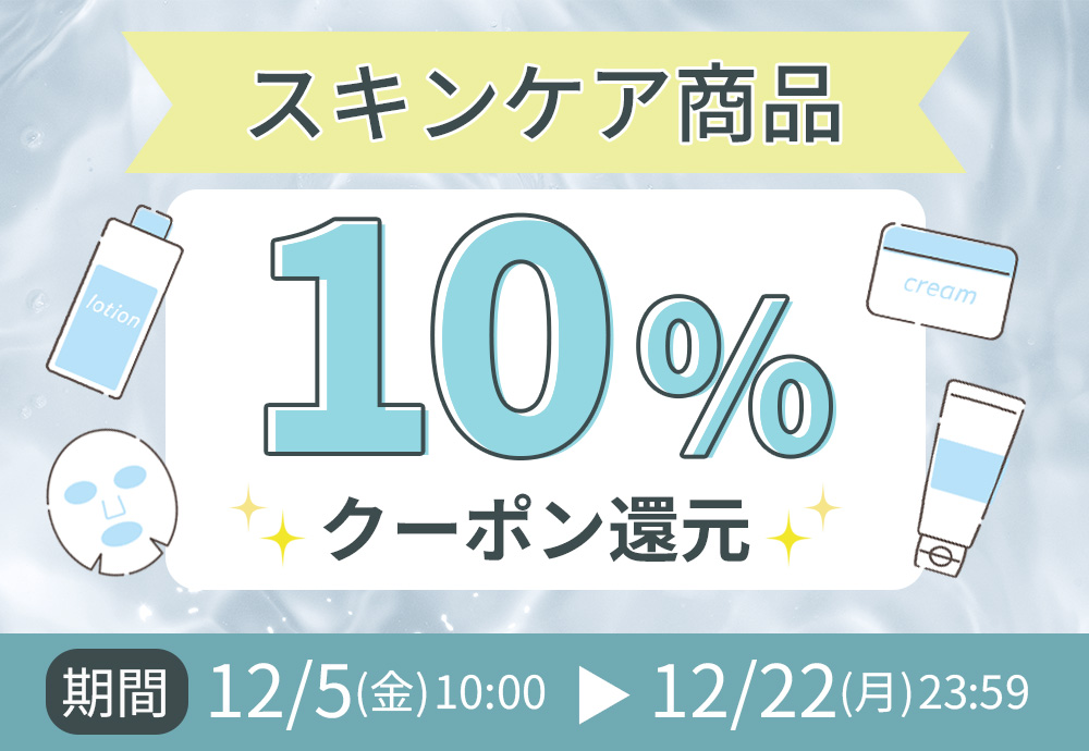
スキンケア商品キャンペーン
morecos+でスキンケア商品をご購入いただくと、 ご購入金額の税抜金額に対して
10%分のクーポンをプレゼント!
※一部対象外商品がございます。
※本キャンペーンは予告なく早期終了する場合もございます。予めご了承ください。
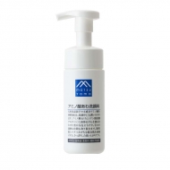
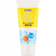
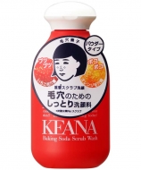
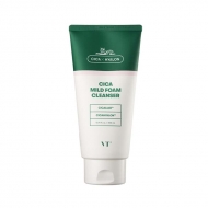
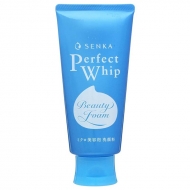
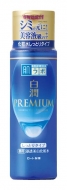
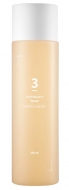
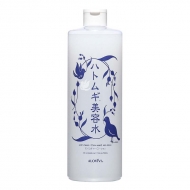
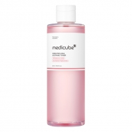
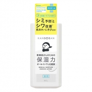
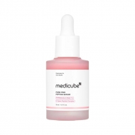
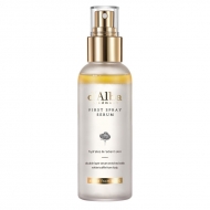
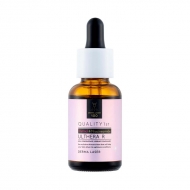
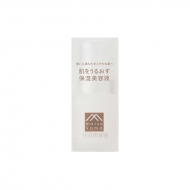
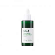
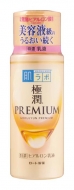
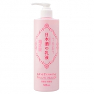
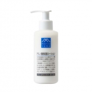
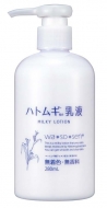
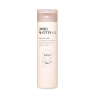
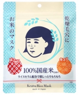
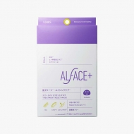
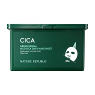
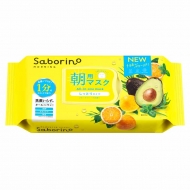
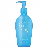
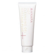
おすすめ商品
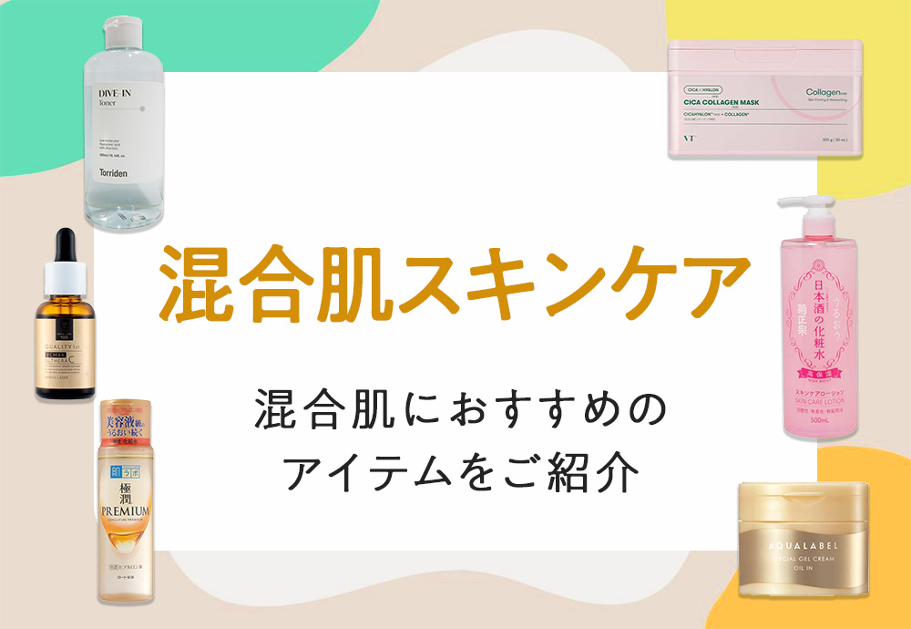
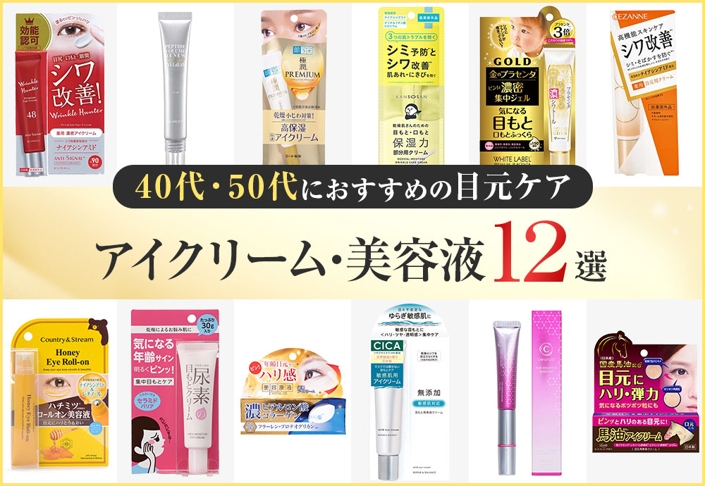
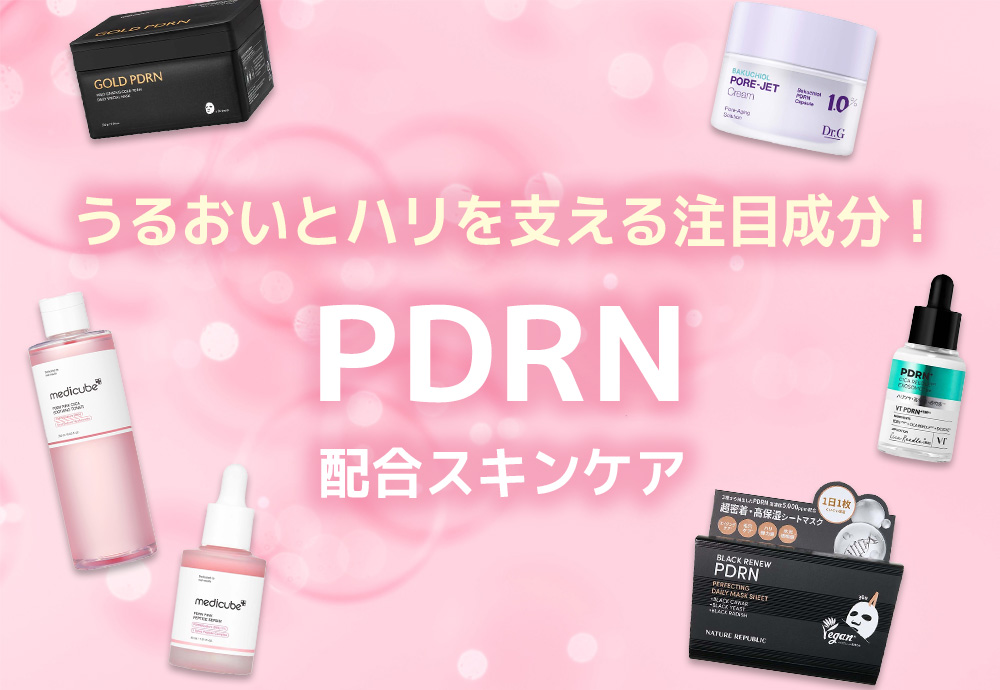
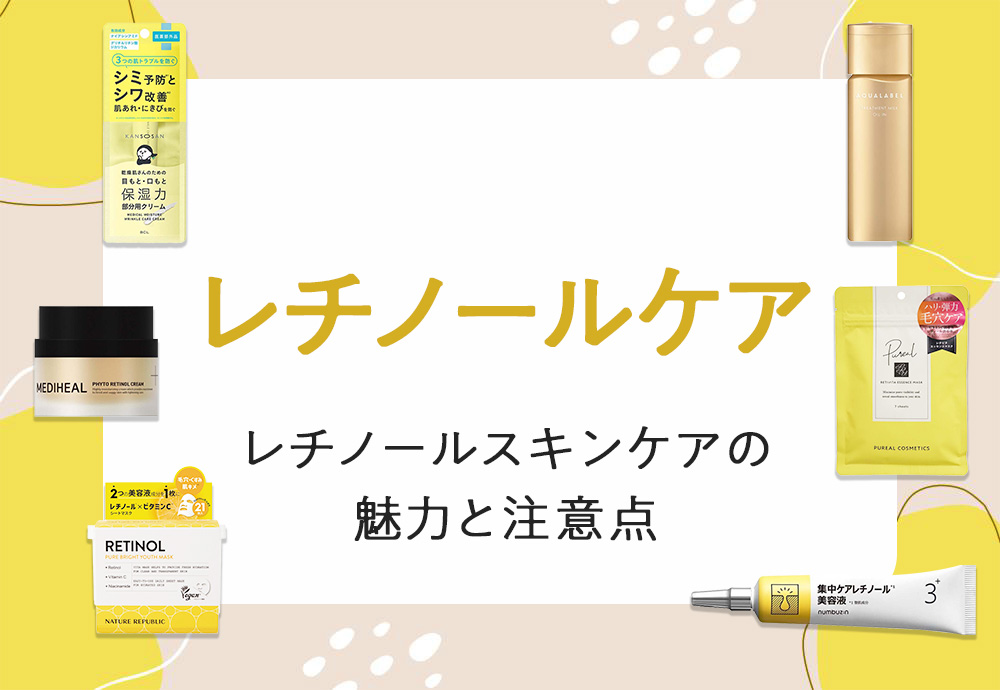
おすすめの特集
キャンペーン詳細
morecos+でスキンケア商品をご購入いただくと、ご購入金額の税抜金額に対して10%分のクーポンをプレゼント!
【購入条件】
■morecos+で取り扱い中のスキンケア商品をご購入
【クーポン付与金額】
スキンケア商品の税抜出荷金額の10%分(スペシャルクーポン/クーポン/ポイント利用の場合は、利用後の税抜金額が対象)
【実施期間】
2025年12月5日 (金) 10:00 ~ 2025年12月22日 (月) 23:59
【対象商品】
商品ページに本キャンペーン情報のご案内がある商品
※一部商品はキャンぺーン対象外となります。
対象外の商品には、下記のご案内が表示されておりません。
必ず商品ページ内の記載をご確認ください。

【キャンペーン適用条件】
・キャンペーンのご利用にはローソンWEB会員のアカウントが必要になります。
新規会員登録はこちらから(無料)
・キャンペーン期間中であれば、お一人様何度でもキャンペーンをご利用いただけます。
【クーポンに関するQ&A】
・morecos+とHMV&BOOKS onlineで販売するコスメ、CD、DVD、書籍、グッズ等のご購入時に、ご利用いただける電子クーポンになります。
▶クーポンに関するQ&Aはこちら
▼ その他注意事項 ※必ずご確認ください
【クーポン仕様】
・付与金額:税抜出荷金額の10%分(スペシャルクーポン/クーポン/ポイント利用の場合は、利用後の税抜金額が対象)
・クーポン種類:まとめて使えるクーポン ※10枚まで同時にご利用可能
・クーポン利用期間:付与日 ~ 2026/3/31(火)
【クーポンの加算について】
・クーポンの加算は「キャンペーン対象商品の出荷時」に行います。
※お受取り方法にコンビニ受取/代引き受取をご指定の場合、お受取り完了後翌々日中の付与となります。
・お支払いにスペシャルクーポン/クーポン/ポイントをご利用いただいた場合
クーポンの加算は、商品代金からスペシャルクーポン/クーポン/ポイント利用額を差し引いた残額(税抜)に対して行われます。
【要確認事項】
・キャンペーン対象は2026/1/5(月)までの出荷が条件です。
※いかなる理由であっても出荷日のキャンペーン条件を満たさなくなった場合は、キャンペーン適用外となります。
・対象商品はキャンペーン期間中のみ各商品詳細ページに「資生堂商品 10%クーポン還元」と表示されておりますが、キャンペーン終了に伴い表示は削除されます。
・本キャンペーンは出荷時にキャンペーン適用の判定がされるため、商品カートおよびマイページ等アカウント内での対象商品の確認はできません。
.topic__heading2 {
background: url(http://img.hmv.co.jp/hybridimage_stg/news/images/22/0821/101/body_024301.png) no-repeat left center;
padding: 8px 0px 8px 35px;
line-height:130%;
background-size: 30px;
margin-bottom:12px;
border-bottom: 1px dotted #b5918c;
font-size:130%;
}
.guide_ttl {
margin: 30px 0px;
line-height: 1;
text-align: center;
color: #333;
font-weight: 600;
font-size: 26px;
}
h3, h4 {
color: #ad021a;
line-height: 1.8;
text-align: center;
font-size: 1.8rem;
font-weight: bold;
margin-bottom: 7px;
}
h4 {
font-size: 1.4rem;
}
.box1 {
padding:15px;
background: #fff;
max-width: 1240px;
margin: 0 auto;
}
.img800 {
display: block;
margin: 0 auto;
max-width: 840px;
}
.pr4 {
display: flex;
list-style: none;
justify-content: center;
max-width: 1200px;
margin: 0 auto;
padding: 0px;
justify-content: space-between;
}
.pr4 li img{
max-width: 90%;
}
.img_box{
max-width:400px;
margin: 0 auto;
}
.img_box2{
max-width:600px;
margin: 0 auto;
padding-bottom: 20px;
}
.sp_br, .pc_br2 {
display: none;
}
.pc_br, .sp_br2 {
display: block;
}
.p-card__txt--product {
display: block !important;
height: auto !important;
}
.p-card__txt--evaluation {
display: none;
}
.p-card__txt--price {
margin-top: -10px;
}
.topic__box--recently {
margin: 0px;
padding: 0px;
}
@media screen and (max-width: 980px){
.index {
margin-right: -20px!important;
margin-left: -20px!important;
margin-bottom: -20px !important;
}
.guide_ttl{
font-size: 22px;
}
.img_box, .img_box2,{
max-width:100%;
}
.sp_br, .pc_br2 {
display: block;
}
.pc_br, .sp_br2 {
display: none;
}
.pr4 {
flex-wrap: wrap;
padding: 0px 4%;
}
.pr4 li {
width: 48%;
margin-bottom: 20px;
}
.pr4 li img{
max-width: 100%;
}
.img800 {
max-width: 100%;
}
h4 {
font-size: 16px;
}
}
@media screen and (min-width: 961px) {
.l-content {
max-width: 1260px;
}
}
@media screen and (min-width: 961px) {
.newsDetailWidget.kaku2 {
width: 16.8%;
margin-right: 4%;
margin-bottom: 60px;
}
.newsDetailWidget.kaku2 .item .info{
display: grid;
grid-template-rows: repeat(4, auto);
}
.newsDetailWidget.kaku2 .item .info .itemCategory{
display: none;
}
.newsDetailWidget.kaku2 .item .info .name{
grid-row: 1;
}
.newsDetailWidget.kaku2 .item .info .name a{
font-size: 14px;
font-weight: bold;
color: #231815;
}
.newsDetailWidget.kaku2 .item .info .title{
grid-row: 2;
}
.newsDetailWidget.kaku2 .item .info .title a{
font-size: 16px;
color: #595757;
}
.newsDetailWidget.kaku2 .item .info .rateBlock{
grid-row: 3;
}
.newsDetailWidget.kaku2 .item .info .itemPrice{
grid-row: 4;
font-size: 18px;
font-weight: bold;
color: #3e3a39;
}
}


