\無くなり次第終了/コスメ・日用品の購入に使える最大33%OFFクーポン配布中!【初めての方限定】
HMV&BOOKS onlineとmorecos+を初めてご利用の方に、
コスメ・日用品のお買い物でご利用できる
お得な3種のクーポンをプレゼント!
クーポンは500円・1,000円・1,500円の3種類でお一人様いずれか1枚まで。
無くなり次第終了のため、ご利用はお早めに!
\クーポンGETはこちらから/
ローソンWEB会員
4つのポイント
入会金、年会費等は一切かからず、
無料でご利用いただけます。
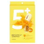
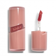
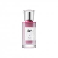
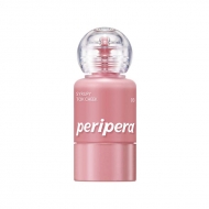
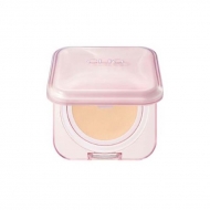
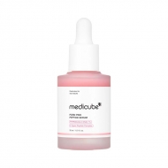
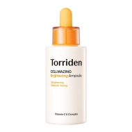
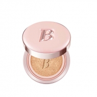
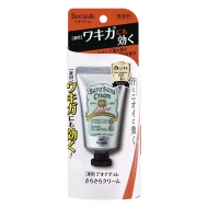
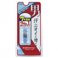
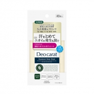
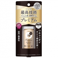
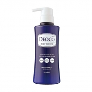
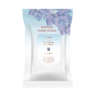
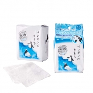
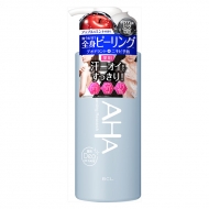
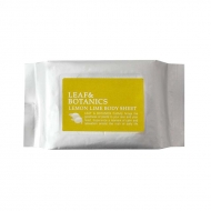
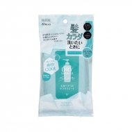
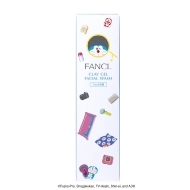
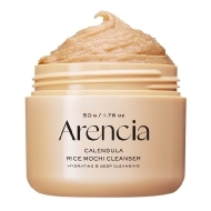
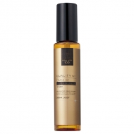
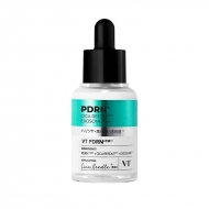
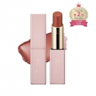
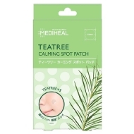
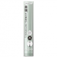
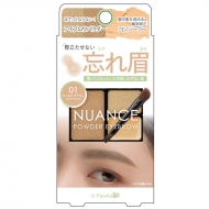
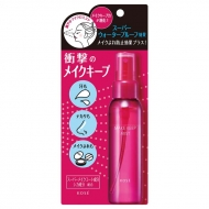
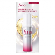
クーポン利用におすすめ商品
新商品・おすすめ商品
キャンペーン概要
キャンペーン内容
HMV&BOOKS onlineとmorecos+を初めてご利用の方に、コスメ・日用品のお買い物でご利用できるお得な3種のクーポンを先着でプレゼント!
クーポンは500円・1,000円・1,500円の3種類でお一人様いずれか1枚まで。無くなり次第終了のため、ご利用はお早めに!
⇒新規会員登録まだの方はこちら
クーポン利用期間
2025年8月31日(日)まで
クーポンご利用対象商品
コスメ通販サイトmorecos+で取り扱い中の商品
※クーポン対象外の商品が一部ございますので、各商品ページをご確認ください。
クーポンのご利用方法
1.3種類のクーポンのうち、いずれか一つのみお選びいただき「クーポンをGETする」を押す。
2.お好きな商品を選び、商品詳細ページの「カートに入れる」をクリック。
3.ショッピングカート内で「購入手続きへ進む」をクリック。
4.お支払い方法設定ページの「クーポンを利用する」欄からご利用ください。
クーポン利用 詳しくはこちら
ご注意事項
※クーポンは無くなり次第終了となります。
※当キャンペーンは、HMV&BOOKS onlineとmorecos+のご利用が初めての方が対象となります。HMV&BOOKS onlineまたはmorecos+にて購入履歴がある方は本キャンペーン対象外となりますのでご注意ください。
※クーポンは1,500円・1,000円・500円OFFの3種類ご用意しておりますが、ご利用できるのはお一人様いずれか1枚のみとなります。3種類全て取得いただいても全てご利用できませんのでご注意ください。
※クーポンのご利用はmorecos+サイト内のみ使用可能となります。一部クーポン利用対象外商品がございます。予めご了承ください。
※クーポンの併用不可となります。
※キャンペーンのご利用にはローソンWEB会員のアカウントが必要になります。
※キャンペーンの内容は予告なく変更・中止になる場合がございます。
※お預かりした個人情報はクーポン付与・個人を特定しない形での統計情報としてのみ利用し、業務委託先以外の第三者に提供することはありません。
.topic .topic__heading + time {
display: none;
}
h2.topic__heading {
display: none;
}
.topic__txt--page_read {
border-top: none;
}
.img-sp {
display: none;
}
.main_mv {
width: 100%;
}
.main_mv img {
width: 1200px;
}
.guide_ttl {
margin: 0px 0px 20px 0px;
text-align: center;
color: #333;
font-weight: 600;
font-size: 26px;
}
.topic__heading2 {
background: url(http://img.hmv.co.jp/hybridimage_stg/news/images/22/0821/101/body_024301.png) no-repeat left center;
padding: 8px 0px 8px 35px;
line-height:130%;
background-size: 30px;
margin-bottom:12px;
border-bottom: 1px dotted #b5918c;
font-size:130%;
}
h3, h4 {
color: #e00d52;
line-height: 1.8;
text-align: center;
font-size: 1.6rem;
font-weight: bold;
margin-bottom: 7px;
}
h4 {
font-size: 1.4rem;
}
.box1 {
padding:15px;
background: #fff;
max-width: 1200px;
margin: 0 auto;
}
.box2 {
padding:15px;
}
.cp_info {
max-width: 800px;
margin: 0 auto;
font-size: 20px;
color: #333;
text-align: center;
line-height: 2;
letter-spacing: -0.4px;
font-weight: bold;
}
.brand_box {
display: flex;
flex-wrap: wrap;
list-style: none;
padding: 0px;
max-width: 1140px;
margin: 0 auto;
}
.box_in {
justify-content: space-evenly;
margin-top: 30px;
}
.brand {
width: 122px;
margin: 10px;
}
.pr4 {
display: flex;
list-style: none;
justify-content: center;
max-width: 800px;
margin: 0 auto;
padding: 40px 0px;
justify-content: space-between;
}
.pr4 li img{
max-width: 190px;
}
.img_box{
max-width:260px;
margin: 0 auto;
}
.img_box2{
max-width:600px;
margin: 0 auto;
padding-bottom: 20px;
}
.sp_br, .pc_br2 {
display: none;
}
.pc_br, .sp_br2 {
display: block;
}
.box_in li {
width: 14%;
text-align: center;
list-style: none;
}
.box_in li a {
line-height: 50px;
border: 2px solid #aa4c4c;
border-radius: 4px;
font-size: 1.3rem;
display: block;
color: #aa4c4c;
text-decoration: none;
background: #fff;
}
.box_in li span {
background: url(http://img.hmv.co.jp/hybridimage/news/images/24/0111/501/body_174133.png) no-repeat left center;
background-size: 12px;
display: block;
margin-left: 10px;
}
.box_in img {
max-width: 200px;
}
.p-card__txt--product {
display: block !important;
height: auto !important;
}
.p-card__txt--evaluation {
display: none;
}
.p-card__txt--price {
margin-top: -10px;
}
.topic__box--recently {
margin: 0px;
padding: 0px;
}
.o_topics {
max-width: 1000px;
}
.o_topics ul {
display: flex;
padding: 0px 0px 20px 0px;
width: 100%;
list-style-type: none;
margin: 0 auto;
flex-wrap: wrap;
justify-content: space-between;
}
.goods_in {
width: 32%;
}
.goods_in img {
width: 300px;
border: 1px solid #eee;
}
.item__name {
font-size: 1.4rem;
text-align: left;
color: #333333;
font-weight: normal;
padding: 5px 0px 3px 0px;
}
.item__price {
font-size: 1.3rem;
text-align: left;
color: #333333;
font-weight: normal;
}
@media screen and (max-width: 980px){
.img-pc {
display: none;
}
.img-sp {
display: block;
}
.main_mv img {
width: 100%;
}
.index {
margin-right: -20px!important;
margin-left: -20px!important;
margin-bottom: -20px !important;
}
.brand {
width: 23%;
margin: 1%;
}
.box_in li {
width: 30%;
}
.brand img {
max-width: 100%;
}
.guide_ttl{
font-size: 20px;
}
.img_box, .img_box2,{
max-width:100%;
}
.sp_br, .pc_br2 {
display: block;
}
.pc_br, .sp_br2 {
display: none;
}
.pr4 {
flex-wrap: wrap;
padding: 0px 4%;
}
.pr4 li {
width: 48%;
margin-bottom: 20px;
}
.pr4 li img{
max-width: 100%;
}
.cp_info {
font-size: 15px;
}
.goods_in {
width: 100%;
margin-bottom: 20px;
}
.goods_in img {
width: 100%;
}
.item__name {
font-size: 1.1rem;
}
.item__price {
font-size: 1.0rem;
}
}
@media screen and (min-width: 961px) {
.l-content {
max-width: 1260px;
}
}
@media screen and (max-width: 600px){
.box_in {
justify-content: flex-start;
}
.box_in li {
width: 48%;
}
.box2 {
padding:10px;
}
}
@media screen and (max-width: 430px){
.o_topics ul {
justify-content: flex-start !important;
padding: 0px;
}
}


