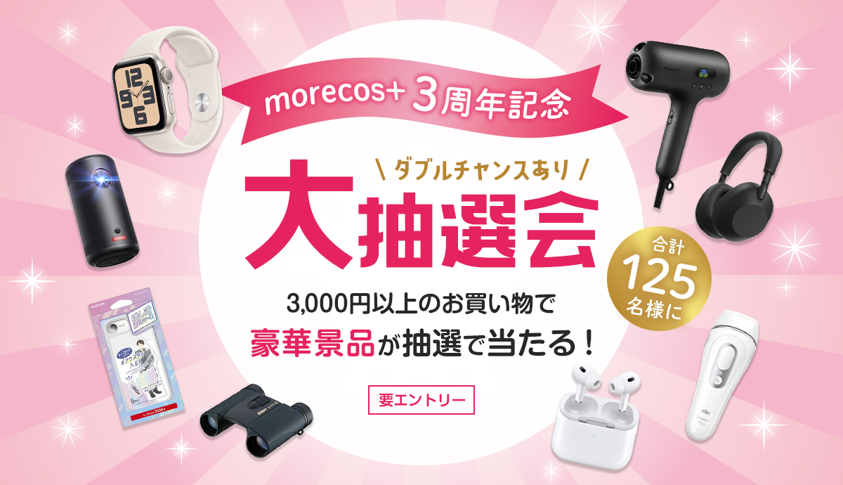
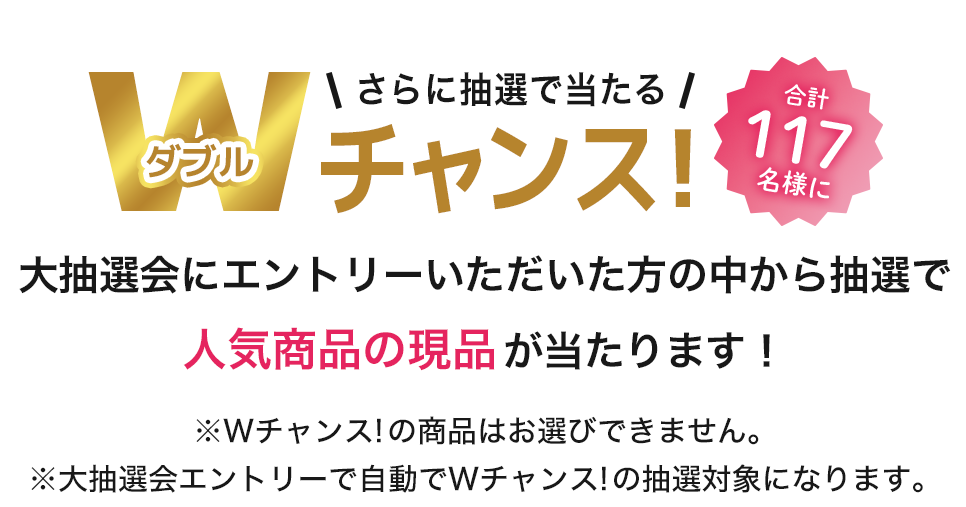
【morecos+ 3周年記念】3,000円以上のお買い物とエントリーで豪華景品が当たる大抽選会開催!
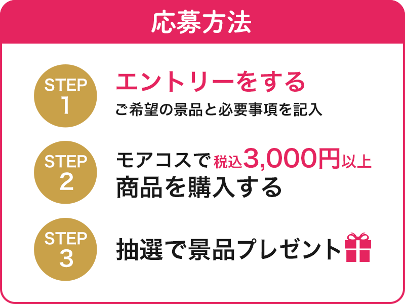
キャンペーン期間中に、税込3,000円以上のお買い物と
エントリーをしていただいた方の中から
抽選で
合計8名様に豪華景品をプレゼント!
さらにエントリーいただいた方の中から抽選で
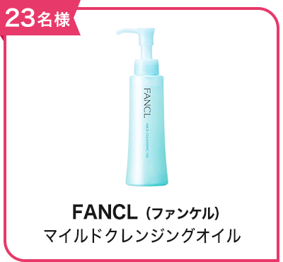
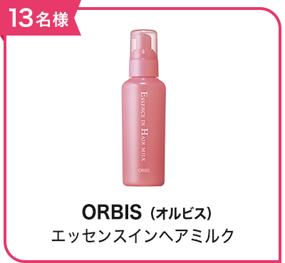
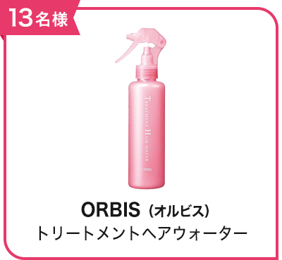
合計117名様に人気商品の現品が当たるWチャンス!
エントリーはこちら
※エントリーにはログインが必要です。
新規会員登録はこちら
※対象期間中にエントリーすれば、エントリー前のお買い物も対象となります。
キャンペーン概要
キャンペーン期間中に、税込3,000円以上のお買い物とエントリーをしていただいた方の中から抽選で合計8名様に豪華景品をプレゼント!
さらにエントリーいただいた方の中から抽選で合計125名様に人気商品の現品が当たるWチャンス!
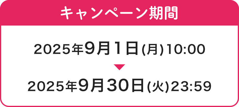
キャンペーン期間
エントリー&購入期間:2025年9月1日(月)10:00~9月30日(火)23:59
※対象期間中にエントリーすれば、エントリー前のお買い物も対象となります。
景品内容
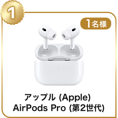
(1)アップル(Apple) AirPods Pro (第2世代) ワイヤレスイヤホン MTJV3J/A
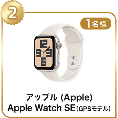
(2)アップル(Apple) Apple Watch SE(GPSモデル)MXEF3J/A
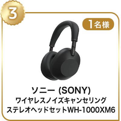
(3)ソニー(SONY)ワイヤレスノイズキャンセリングステレオヘッドセット WH-1000XM6 B ブラック
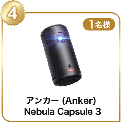
(4)アンカー(Anker) Nebula Capsule 3 モバイルプロジェクター D2425N11 ブラック
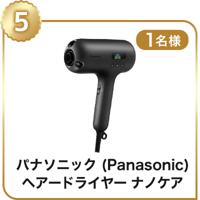
(5)パナソニック(Panasonic) ヘアードライヤー ナノケアULTIMAT EH-NC50-K
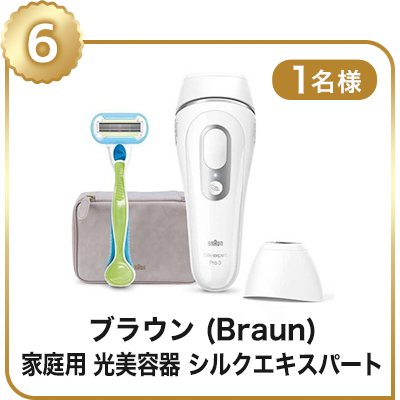
(6)ブラウン(Braun)家庭用 光美容器 シルクエキスパート PL-3138
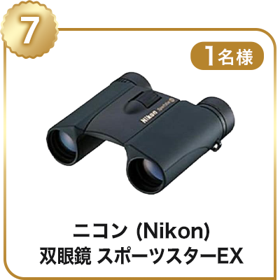
(7)ニコン(Nikon) 双眼鏡「スポーツスターEX」10X25DCF
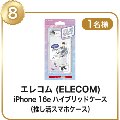
(8)エレコム(ELECOM)iPhone 16e ハイブリッドケース PM-A25SHVCFCR2
※Wチャンス!の景品はお選びできません。大抽選会エントリーで自動でWチャンス!の抽選対象になります。
当選発表
景品のお届け: 10月中を予定
※当選の発表は景品の発送をもってかえさせていただきます。
※応募者の中から厳正なる抽選のうえ、当選者を決定いたします。
※抽選や当落に関するご質問の受付は行っておりませんので、予めご了承ください。
ご注意事項
※本キャンペーンは、期間中のお会計3,000円(税込)以上を1口として抽選いたします。
※キャンペーン期間中であれば、お一人様何度でもエントリーできます。
※本キャンペーン内の重複当選はございません。
※本キャンペーンにつきましては、場合によっては変更・中止の可能性もございます。予めご了承ください。
※ご応募にはローソンWEB会員登録でのログインが必要です。
※morecos+からのご購入が対象となります。HMV店舗、HMV&BOOKS店舗、他のECショッピングモールのHMVサイト(Yahoo!ショッピング、楽天市場、Amazon、au PAY マーケット)、HMV@Loppiでの購入は対象外となります。
※ご応募に関して当社が不正と認める行為があった場合、当選を取り消しさせていただく場合があります。
※当選の権利の譲渡はできません。
※ご不在・住所不明などの理由により、景品のお受け取りが行われなかった場合、当選の権利は失効いたします。
※景品の返品・交換できません。
※お預かりした個人情報は景品の発送・個人を特定しない形での統計情報としてのみ利用し、業務委託先以外の第三者に提供することはありません。
@media screen and (min-width: 961px) {
.topic {
max-width: 800px;
}
}
.topic .topic__heading + time {
display: none;
}
h2.topic__heading {
display: none;
}
.topic__txt--page_read {
border-top: none;
}
.img-sp {
display: none;
}
.main_mv {
width: 100%;
}
.main_mv img {
width: 1200px;
}
h2 {
position: relative;
height: 48px;
background-color: #e5245f;
color: #fff;
font-size: 28px;
font-weight: normal;
text-align: center;
}
h2::before,
h2::after {
position: absolute;
content: '';
top: 0;
width: 0px;
height: 0px;
border-color: transparent #fff;
border-style: solid;
}
h2::before {
left: 0;
border-width: 25px 0px 25px 10px;
}
h2::after {
right: 0;
border-width: 25px 10px 25px 0px;
}
.topic__heading2 {
background: url(http://img.hmv.co.jp/hybridimage_stg/news/images/22/0821/101/body_024301.png) no-repeat left center;
padding: 8px 0px 8px 35px;
line-height:130%;
background-size: 30px;
margin-bottom:12px;
border-bottom: 1px dotted #b5918c;
font-size:130%;
}
.cp_info {
max-width: 800px;
margin: 0 auto;
font-size: 20px;
color: #333;
text-align: center;
line-height: 2;
letter-spacing: -0.4px;
font-weight: bold;
}
.box1 {
padding:15px;
background: #fff;
max-width: 1200px;
margin: 0 auto;
}
.img_box{
max-width:440px;
margin: 0 auto;
}
.sp_br, .pc_br2 {
display: none;
}
.pc_br, .sp_br2 {
display: block;
}
.p-card__txt--product {
display: block !important;
height: auto !important;
}
.p-card__txt--evaluation {
display: none;
}
.p-card__txt--price {
margin-top: -10px;
}
.topic__box--recently {
margin: 0px;
padding: 0px;
}
.topic__txt--recently ul {
display: flex;
padding: 0px;
width: 100%;
list-style-type: none;
margin: 0 auto;
flex-wrap: wrap;
justify-content: flex-start;
}
.goods_in, .cp_in {
width: 31%;
margin-bottom: 40px;
margin-right: 2%;
}
.goods_in img {
width: 400px;
}
.cp_in {
width: 46%;
}
.item__name {
font-size: 1.4rem;
text-align: left;
color: #333333;
font-weight: normal;
padding: 5px 0px 3px 0px;
}
.o_topics {
max-width: 800px;
}
.o_topics ul {
display: flex;
padding: 0px 0px 20px 0px;
width: 100%;
list-style-type: none;
margin: 0 auto;
flex-wrap: wrap;
justify-content: space-between;
}
@media screen and (max-width: 980px){
.img-pc {
display: none;
}
.img-sp {
display: block;
}
.main_mv img {
width: 100%;
}
h2 {
height: 32px;
font-size: 20px;
}
h2::before {
border-width: 16px 0px 16px 10px;
}
h2::after {
border-width: 16px 10px 16px 0px;
}
.index {
margin-right: -20px!important;
margin-left: -20px!important;
margin-bottom: -20px !important;
}
.img_box, .img_box2,{
max-width:100%;
}
.sp_br, .pc_br2 {
display: block;
}
.pc_br, .sp_br2 {
display: none;
}
.goods_in, .cp_in {
width: 48%;
margin-bottom: 20px;
margin-right: 0;
}
.goods_in:nth-child(odd) {
margin-right: 4%;
}
.goods_in img, {
width: 100%;
}
.cp_info {
font-size: 14px;
}
.item__name {
font-size: 1.1rem;
}
}
@media screen and (max-width: 430px){
.o_topics ul {
justify-content: flex-start !important;
padding: 0px;
}
.cp_in {
width: 100%;
margin-bottom: 20px;
}
}


