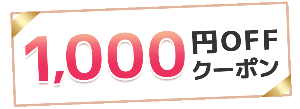
【新規会員登録キャンペーン】新規会員登録でもれなく1,000円OFFクーポンプレゼント!
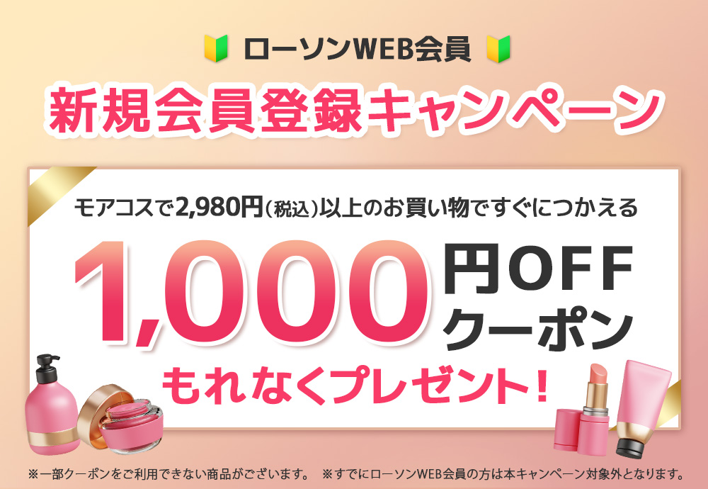
このページからローソンWEB会員の新規登録をしていただいた方に、
morecos+で2,980円(税込)以上のお買い物に
ご利用頂ける1,000円OFFクーポンをもれなくプレゼント!
クーポン取得までの流れ
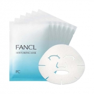
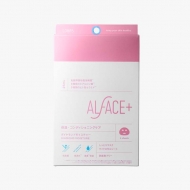
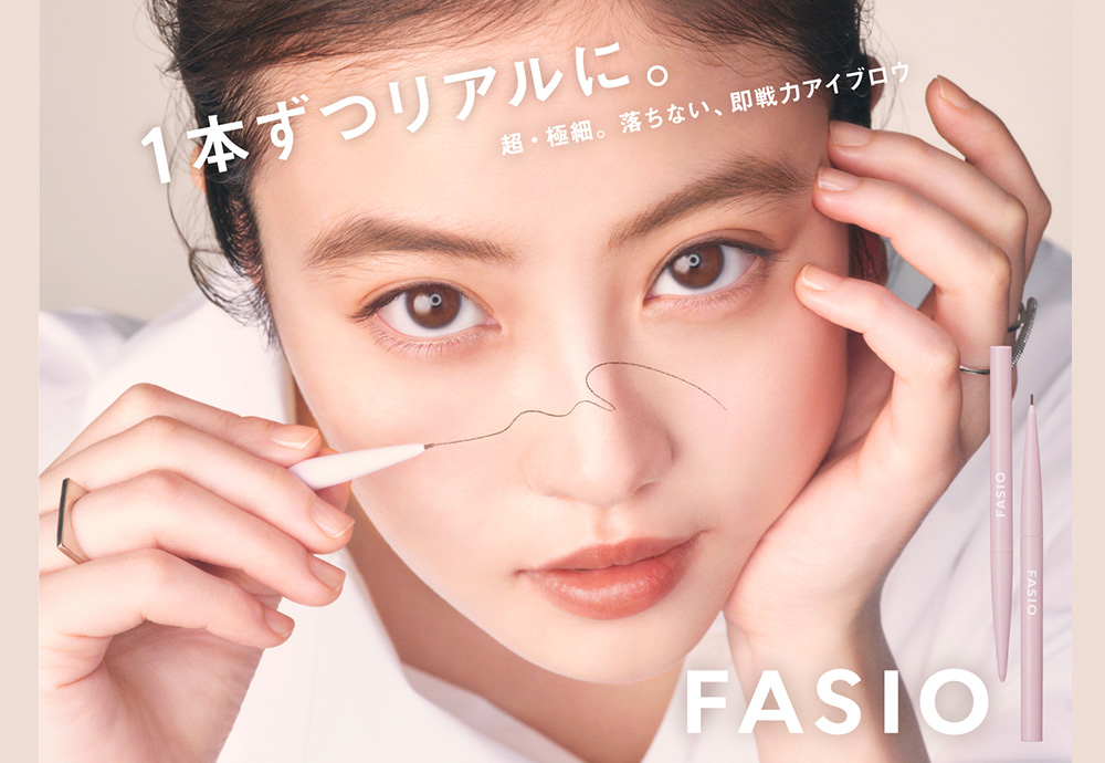
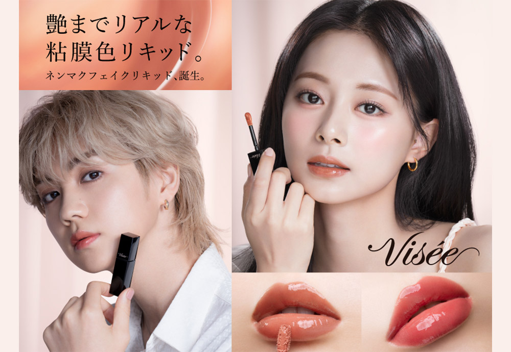
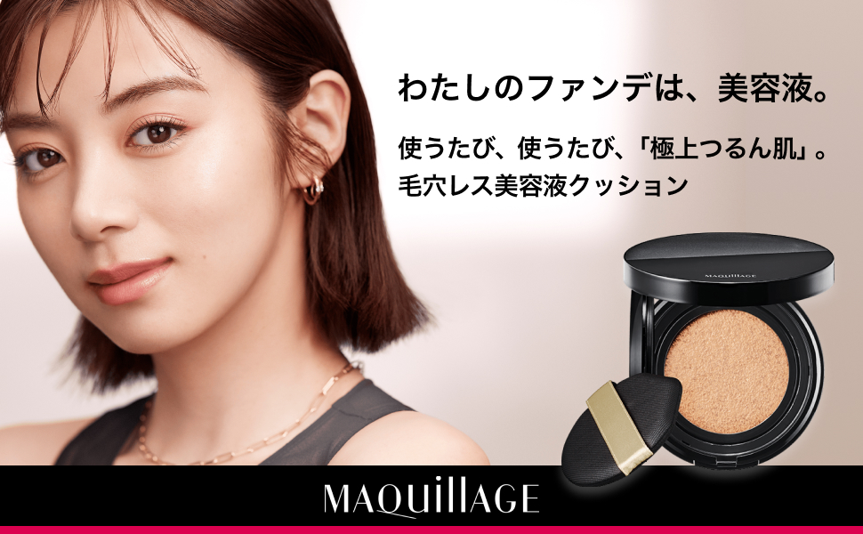
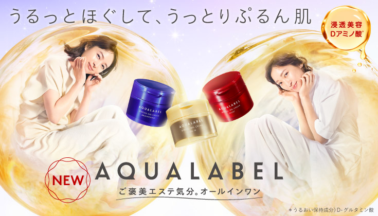
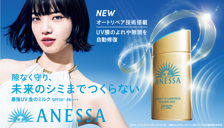
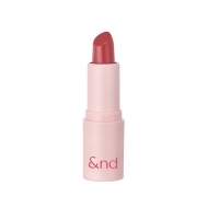
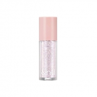
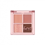
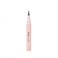
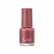
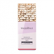
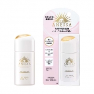
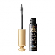
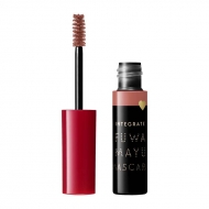
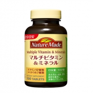
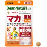
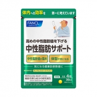
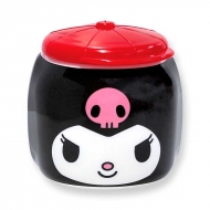
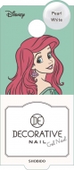
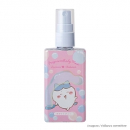
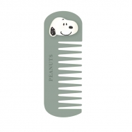
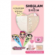
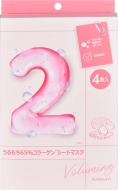
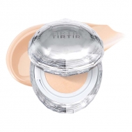
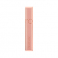
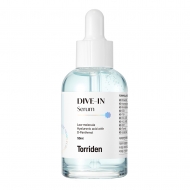
人気のおすすめ商品
アンドバイロムアンド
もっと見る
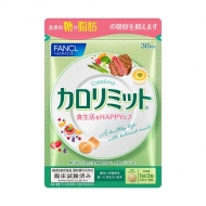
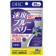
健康食品・サプリメント
もっと見る
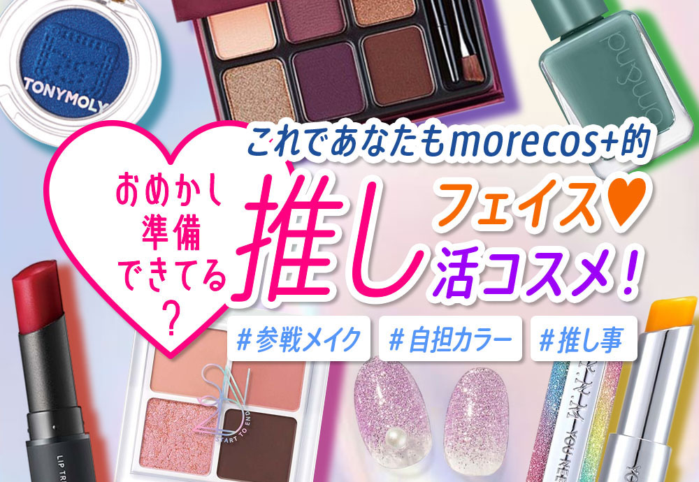
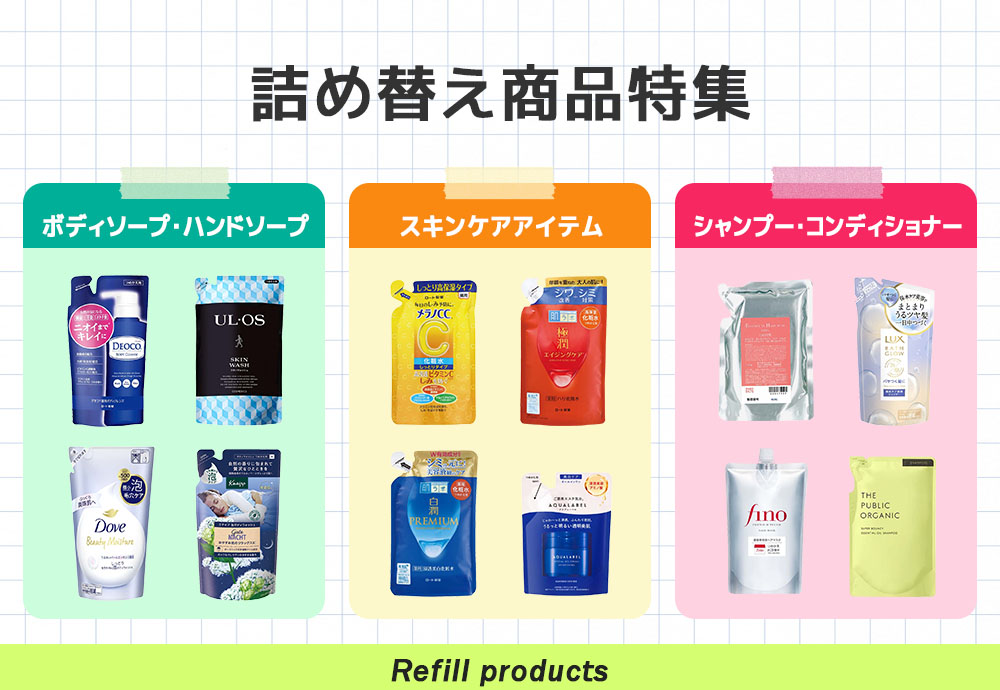
おすすめの特集
カテゴリから探す
おすすめブランド
ローソンWEB会員
4つのポイント
入会金、年会費等は一切かからず、
無料でご利用いただけます。
キャンペーン概要
キャンペーン内容
このページからローソンWEB会員の新規登録をしていただいた方に、
morecos+で2,980円(税込)以上のお買い物にご利用頂ける1,000円OFFクーポンをもれなくプレゼント!
⇒新規会員登録はこちら
利用期間
クーポン受け取りから3日
クーポンご利用対象商品
コスメ通販サイトmorecos+で取り扱い中の商品
※クーポン対象外の商品が一部ございますので、各商品ページをご確認ください。
クーポン取得方法
1.ローソンWEB会員の新規登録をする。
2.登録完了後、必ず青い「閉じる」ボタンをクリック。
3.モアコスのキャンペーンページに自動リンク後、「クーポンを受け取る」ボタンをクリック。
クーポンのご利用方法
1.新規会員登録後、ページ上部の「クーポンを受け取る」ボタンからクーポンを取得。
2.お好きな商品を選び、商品詳細ページの「カートに入れる」をクリック。
3.ショッピングカート内で「購入手続きへ進む」をクリック。
4.お支払い方法設定ページの「クーポンを利用する」欄からご利用ください。
クーポン利用 詳しくはこちら
ご注意事項
※当キャンペーンは、morecos+の「新規会員登録キャンペーン」ページからローソンWEB会員にご登録していただいた方が対象となります。
※クーポンのご利用はmorecos+サイト内のみ使用可能となります。
※一部クーポン利用対象外商品がございます。予めご了承ください。
※クーポンの併用不可となります。
※キャンペーンのご利用にはローソンWEB会員のアカウントが必要になります。
※すでにローソンWEB会員の方は本キャンペーン対象外となります。
※キャンペーンの内容は予告なく変更になる場合がございます。
※お預かりした個人情報はクーポン付与・個人を特定しない形での統計情報としてのみ利用し、業務委託先以外の第三者に提供することはありません。
.topic .topic__heading + time {
display: none;
}
h2.topic__heading {
display: none;
}
.topic__txt--page_read {
border-top: none;
}
.main_mv {
width: 100%;
}
.main_mv img {
width: 800px;
}
.guide_ttl {
margin: 30px 0px;
text-align: center;
color: #333;
font-weight: 600;
font-size: 26px;
}
.topic__heading2 {
background: url(http://img.hmv.co.jp/hybridimage_stg/news/images/22/0821/101/body_024301.png) no-repeat left center;
padding: 8px 0px 8px 35px;
line-height:130%;
background-size: 30px;
margin-bottom:12px;
border-bottom: 1px dotted #b5918c;
font-size:130%;
}
h3, h4 {
color: #e00d52;
line-height: 1.8;
text-align: center;
font-size: 1.6rem;
font-weight: bold;
margin-bottom: 7px;
}
h4 {
font-size: 1.4rem;
}
.box1 {
padding:15px;
background: #fff;
max-width: 1200px;
margin: 0 auto;
}
.box2 {
padding:15px;
}
.cp_info {
max-width: 800px;
margin: 0 auto;
font-size: 20px;
color: #333;
text-align: center;
line-height: 2;
letter-spacing: -0.4px;
font-weight: bold;
}
.brand_box {
display: flex;
flex-wrap: wrap;
list-style: none;
padding: 0px;
max-width: 1140px;
margin: 0 auto;
}
.box_in {
justify-content: space-evenly;
margin-top: 30px;
}
.brand {
width: 122px;
margin: 10px;
}
.pr4 {
display: flex;
list-style: none;
justify-content: center;
max-width: 800px;
margin: 0 auto;
padding: 40px 0px;
justify-content: space-between;
}
.pr4 li img{
max-width: 190px;
}
.img_box{
max-width:260px;
margin: 0 auto;
}
.img_box2{
max-width:600px;
margin: 0 auto;
padding-bottom: 20px;
}
.sp_br, .pc_br2 {
display: none;
}
.pc_br, .sp_br2 {
display: block;
}
.box_in li {
width: 14%;
text-align: center;
list-style: none;
}
.box_in li a {
line-height: 50px;
border: 2px solid #aa4c4c;
border-radius: 4px;
font-size: 1.3rem;
display: block;
color: #aa4c4c;
text-decoration: none;
background: #fff;
}
.box_in li span {
background: url(http://img.hmv.co.jp/hybridimage/news/images/24/0111/501/body_174133.png) no-repeat left center;
background-size: 12px;
display: block;
margin-left: 10px;
}
.box_in img {
max-width: 200px;
}
.p-card__txt--product {
display: block !important;
height: auto !important;
}
.p-card__txt--evaluation {
display: none;
}
.p-card__txt--price {
margin-top: -10px;
}
.topic__box--recently {
margin: 0px;
padding: 0px;
}
@media screen and (max-width: 980px){
.index {
margin-right: -20px!important;
margin-left: -20px!important;
margin-bottom: -20px !important;
}
.brand {
width: 23%;
margin: 1%;
}
.box_in li {
width: 30%;
}
.brand img {
max-width: 100%;
}
.guide_ttl{
font-size: 22px;
}
.img_box, .img_box2,{
max-width:100%;
}
.sp_br, .pc_br2 {
display: block;
}
.pc_br, .sp_br2 {
display: none;
}
.pr4 {
flex-wrap: wrap;
padding: 0px 4%;
}
.pr4 li {
width: 48%;
margin-bottom: 20px;
}
.pr4 li img{
max-width: 100%;
}
.cp_info {
font-size: 15px;
}
}
@media screen and (min-width: 961px) {
.l-content {
max-width: 1260px;
}
}
@media screen and (max-width: 600px){
.box_in {
justify-content: flex-start;
}
.box_in li {
width: 48%;
}
.box2 {
padding:10px;
}
}


