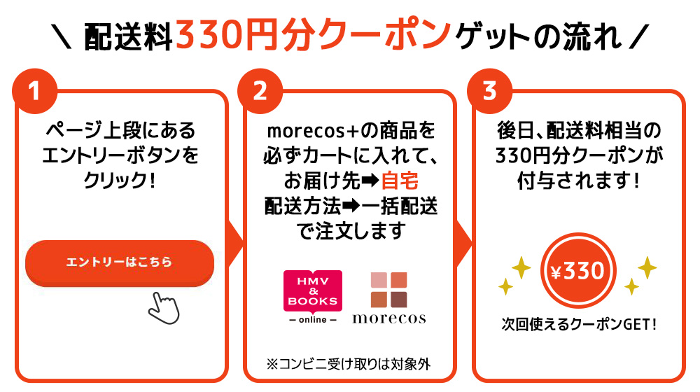
配送料実質0円!クーポンバックキャンペーン【HMV&BOOKS online×モアコス】
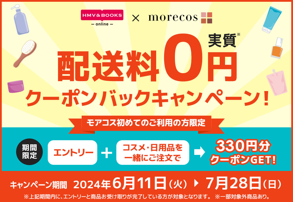
初めてmorecos+ご利用の方限定!
morecos+のコスメや日用品を1点以上ご注文いただくと、
配送料分(330円)のクーポンプレゼント!
HMV&BOOKS onlineの商品とmorecos+の商品の合わせ買いも対象となります!
※お届け先:コンビニ受取りは対象外
※一部対象外商品あり
\まずはお気軽にエントリー/
エントリーはこちら
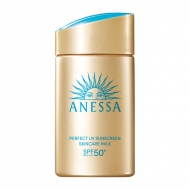
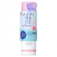
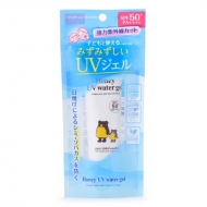
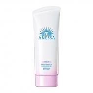
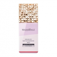
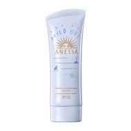
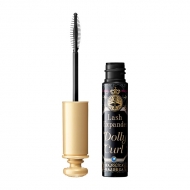
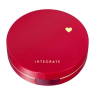
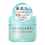
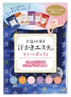
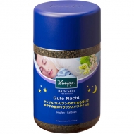
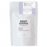
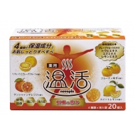
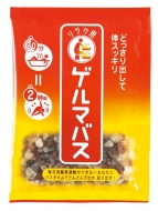
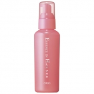
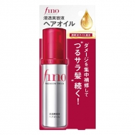
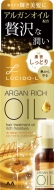
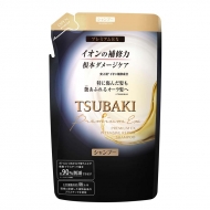
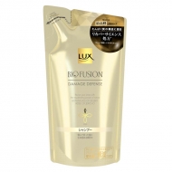
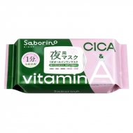
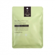
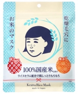
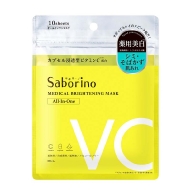
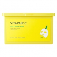
おすすめ商品
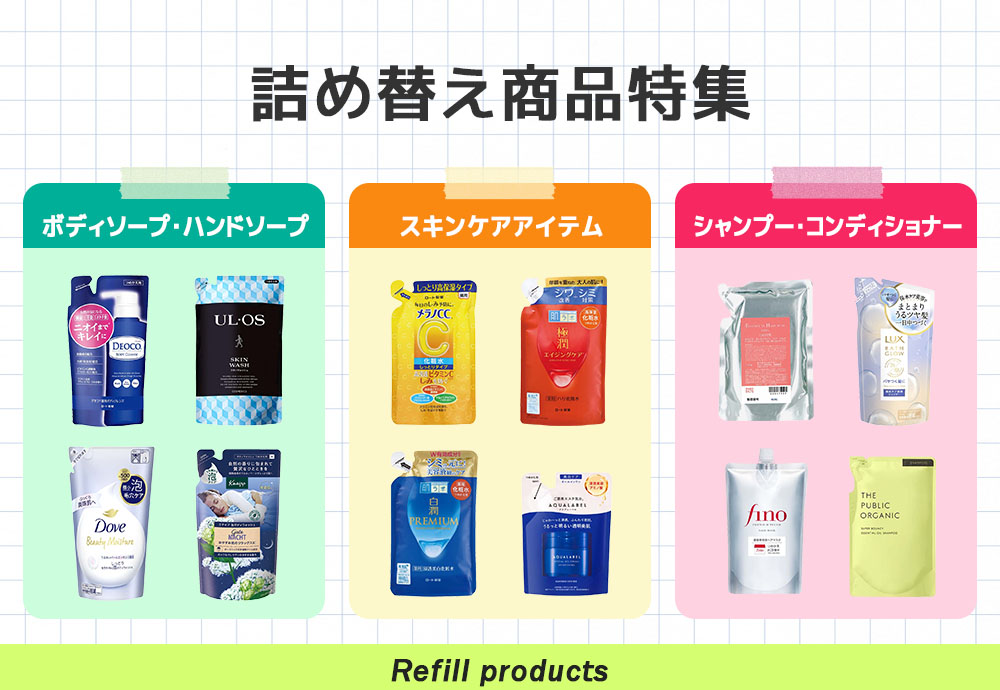
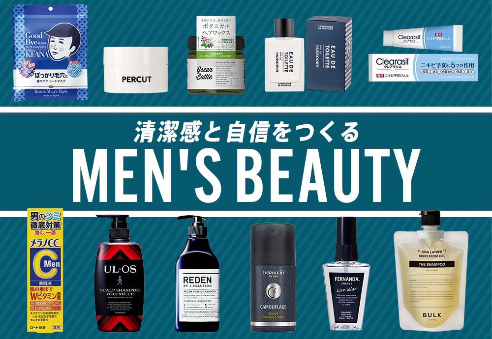
おすすめの特集
カテゴリから探す
おすすめブランド
キャンペーン概要
キャンペーン内容
morecos+を初めてのご利用の方限定!
morecos+のコスメや日用品を1点以上ご注文いただくと、配送料分(330円)のクーポンプレゼント!
HMV&BOOKS onlineの商品とmorecos+の商品の合わせ買いも対象となります!
※お届け先:コンビニ受取りは対象外
※一部対象外商品あり
キャンペーン期間
2024年6月11日(火)18:00~7月28日(日)23:59
※上記期間内に、エントリーと商品お受け取りが完了している方が対象となります。
クーポン付与予定日
2024年8月上旬
※クーポン付与日は多少前後する場合がございます。
クーポンのご確認はこちらから
クーポンの利用期限
クーポン付与以降~8月31日(土)23:59
※エントリーと商品お受け取りが完了している方が対象となります。
ご注意事項
※当キャンペーンは、2024年6月11日(火)18:00~2024年7月28日(日)23:59までにエントリーと商品お受け取りが完了している方が対象となります。
※コスメ通販サイトmorecos+の商品を初めてご注文されたお客様が対象となります。
※本キャンペーンの対象商品はmorecos+サイト内で以下の画像が表示されている商品となります。

※ご注文金額に関わらず、配送料330円(税込)と同額クーポンが後日付与されます。
※分割配送の場合は、1回目の発送のみクーポン付与対象となりますのでご注意ください。
※コンビニ受取りの場合はキャンペーン対象外となります。
※海外への配送は本キャンペーンの対象となりません。
※キャンペーンのご利用にはローソンWEB会員のアカウントが必要になります。
※キャンペーンの内容は予告なく変更になる場合がございます。
.topic__heading2 {
background: url(http://img.hmv.co.jp/hybridimage_stg/news/images/22/0821/101/body_024301.png) no-repeat left center;
padding: 8px 0px 8px 35px;
line-height:130%;
background-size: 30px;
margin-bottom:12px;
border-bottom: 1px dotted #b5918c;
font-size:130%;
}
.guide_ttl {
margin: 30px 0px;
line-height: 1;
text-align: center;
color: #333;
font-weight: 600;
font-size: 26px;
}
h3, h4 {
color: #e00d52;
line-height: 1.8;
text-align: center;
font-size: 1.6rem;
font-weight: bold;
margin-bottom: 7px;
}
h4 {
font-size: 1.4rem;
}
.box1 {
padding:15px;
background: #fff;
max-width: 1240px;
margin: 0 auto;
}
.box2 {
padding:15px;
}
.img800 {
display: block;
margin: 0 auto;
max-width: 840px;
}
.brand_box {
display: flex;
flex-wrap: wrap;
list-style: none;
padding: 0px;
max-width: 1140px;
margin: 0 auto;
}
.box_in {
justify-content: space-evenly;
margin-top: 30px;
}
.brand {
width: 122px;
margin: 10px;
}
.pr4 {
display: flex;
list-style: none;
justify-content: center;
max-width: 800px;
margin: 0 auto;
padding: 40px 0px;
justify-content: space-between;
}
.pr4 li img{
max-width: 190px;
}
.img_box{
max-width:400px;
margin: 0 auto;
}
.img_box2{
max-width:600px;
margin: 0 auto;
padding-bottom: 20px;
}
.sp_br, .pc_br2 {
display: none;
}
.pc_br, .sp_br2 {
display: block;
}
.topic__txt {
font-size: 16px;
line-height: 1.8;
}
.box_in li {
width: 14%;
text-align: center;
list-style: none;
}
.box_in li a {
line-height: 50px;
border: 2px solid #aa4c4c;
border-radius: 4px;
font-size: 1.3rem;
display: block;
color: #aa4c4c;
text-decoration: none;
background: #fff;
}
.box_in li span {
background: url(http://img.hmv.co.jp/hybridimage/news/images/24/0111/501/body_174133.png) no-repeat left center;
background-size: 12px;
display: block;
margin-left: 10px;
}
.box_in img {
max-width: 200px;
}
.p-card__txt--product {
display: block !important;
height: auto !important;
}
.p-card__txt--evaluation {
display: none;
}
.p-card__txt--price {
margin-top: -10px;
}
.topic__box--recently {
margin: 0px;
padding: 0px;
}
@media screen and (max-width: 980px){
.index {
margin-right: -20px!important;
margin-left: -20px!important;
margin-bottom: -20px !important;
}
.brand {
width: 23%;
margin: 1%;
}
.box_in li {
width: 30%;
}
.brand img {
max-width: 100%;
}
.icon_box{
width: 100%;
}
.guide_ttl{
font-size: 22px;
}
.img_box, .img_box2,{
max-width:100%;
}
.sp_br, .pc_br2 {
display: block;
}
.pc_br, .sp_br2 {
display: none;
}
.btn_cg {
max-width: 190px;
}
.btn_cg p {
font-size: 14px;
}
.pr4 {
flex-wrap: wrap;
padding: 0px 4%;
}
.pr4 li {
width: 48%;
margin-bottom: 20px;
}
.pr4 li img{
max-width: 100%;
}
.img800 {
max-width: 100%;
}
}
@media screen and (min-width: 961px) {
.l-content {
max-width: 1260px;
}
}
@media screen and (max-width: 600px){
.topic__txt {
font-size: 14px;
}
.box_in {
justify-content: flex-start;
}
.box_in li {
width: 48%;
}
h3 {
padding: 30px 0px 10px 0px;
margin: 0px;
}
.box2 {
padding:10px;
}
}


