お気に入り・欲しい物リスト 活用ガイド
お気に入り登録
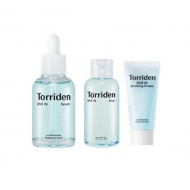
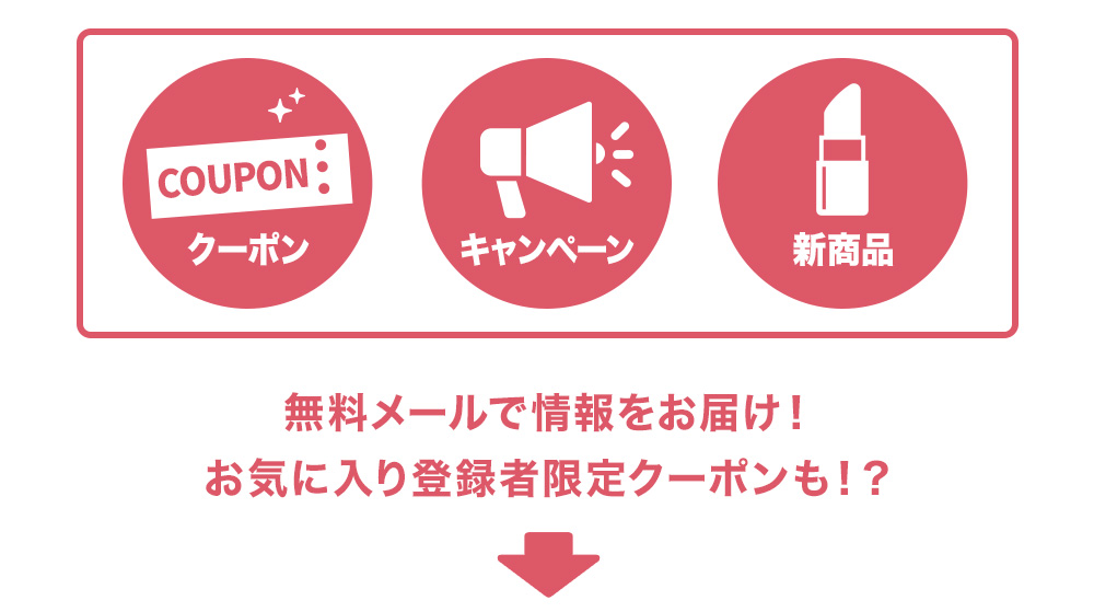
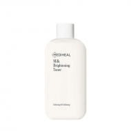
morecos+(コスメ)を
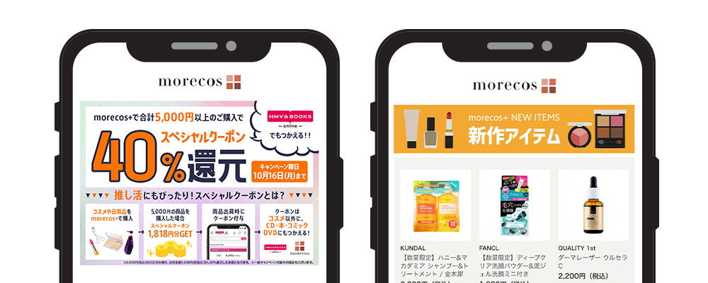
お気に入りに登録すると、
お得なクーポンやキャンペーン、
新商品の情報をメールでお届け!
\登録無料!お気軽にクリック/
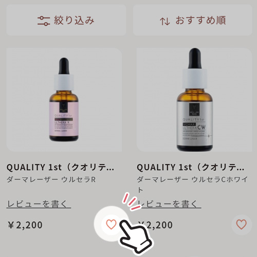
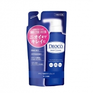
欲しい物リスト
気になっている商品を「欲しい物リスト」に追加すると、自分だけの「欲しい物リスト」ができる!
商品を比較・購入しやすいのでとても便利♪
キャンペーン時に買い忘れがなくなり、まとめてお得にお買い物ができます。
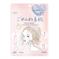
商品を欲しい物リストに追加する
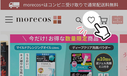
▼商品一覧
▼商品詳細
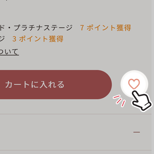
気になる商品を見つけたら「♥」マークをクリック!「欲しい物リスト」に商品を追加することができます。
商品一覧では価格の右隣、商品詳細では「カートに入れる」ボタンの右隣に「♥」マークがあります。
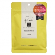
欲しい物リストを確認する
morecos+サイトの一番上の「♥」マークをクリックすると、「欲しい物リスト」に追加した商品を確認することができます。
\こちらからでも確認できます/
.oneColumn div.newsDetailWidget.kaku6 {
width: auto;
}
.oneColumn .newsDetailWidget.kaku6 .topic__favorite--info, .oneColumn .news__favorite--box .topic__favorite--info:not(:has(.topic__favorite--brand__img)) {
padding: 0;
}
.oneColumn div.newsDetailWidget.kaku6 ul li, .oneColumn .news__favorite--box ul li {
background: transparent;
}
.oneColumn .newsDetailWidget.kaku6 .news-favorite, .oneColumn .news__favorite--box .topic__favorite--info .news-favorite {
width: auto;
border: none;
padding: 0;
border-radius: 0;
background: none;
}
.topic__heading2 {
background: url(http://img.hmv.co.jp/hybridimage_stg/news/images/22/0821/101/body_024301.png) no-repeat left center;
padding: 8px 0px 8px 35px;
line-height: 130%;
background-size: 30px;
margin-bottom: 12px;
border-bottom: 1px dotted #b5918c;
font-size: 130%;
}
@media screen and (max-width: 980px) {
.index {
margin-right: -20px !important;
margin-left: -20px !important;
margin-bottom: -20px !important;
}
}
#twoColTBL {
display: block;
width: 100%;
}
.twoColumn .news__favorite--box, .oneColumn .news__favorite--box {
padding: 0 !important;
margin-left: 0;
margin-right: 0;
background-color: initial;
}
.twoColumn .c-btn.c-btn--secondary.news-favorite i, .oneColumn .c-btn.c-btn--secondary.news-favorite i {
display: none;
}
.oneColumn .c-btn.c-btn--secondary.news-favorite span {
display: inline-block;
content: url(https://img.hmv.co.jp/hybridimage_stg/news/images/22/0820/101/body_211157.png);
cursor: pointer;
width: 500px;
}
.twoColumn .c-btn.c-btn--secondary.news-favorite span {
display: inline-block;
content: url(https://img.hmv.co.jp/hybridimage_stg/news/images/22/0820/101/body_214142.png);
cursor: pointer;
width: 307px;
}
@media screen and (max-width: 600px) {
.oneColumn li, .twoColumn li {
width: auto !important;
}
.oneColumn .c-btn.c-btn--secondary.news-favorite span {
width: 100%;
/*! min-width: 600px; */
}
.oneColumn .newsDetailWidget.kaku6, .twoColumn .newsDetailWidget.kaku6 {
width: 100%;
/*! min-width: 300px; */
}
.twoColumn .c-btn.c-btn--secondary.news-favorite span {
width: 100%;
/*! min-width: 300px; */
}
}
.twoColumn .index__list--product, .oneColumn .index__list--product {
margin: 0;
}
.twoColumn .index__list--product .brand__aristdesc a, .oneColumn .index__list--product .brand__aristdesc a {
/*! font-size:0; */
/*! content: url(https://img.hmv.co.jp/hybridimage_stg/news/images/22/0820/101/body_211157.png); */
/*! display: block; */
/*! max-width:300px; */
display: none !important;
}
.twoColumn .index__list--product .brand__aristdesc img, .oneColumn .index__list--product .brand__aristdesc img {
width: 100%;
}
.twoColumn .news-favorite, .oneColumn .news-favorite {
background-color: initial;
font-size: 0;
font-weight: bold;
padding: 0;
justify-content: center;
align-items: center;
width: auto;
height: auto;
}
.twoColumn .c-btn--secondary, .oneColumn .c-btn--secondary {
border: 0px solid #894d46;
}
.twoColumn .c-btn, .oneColumn .c-btn {
/*! display: block; */
box-sizing: border-box;
text-align: center;
border-radius: 0;
}
.twoColumn .index__list--product li:not(.p-card__list--profile > li), .oneColumn .index__list--product li:not(.p-card__list--profile > li) {
margin-bottom: 0;
}
.twoColumn div.newsDetailWidget.kaku6 ul, .oneColumn div.newsDetailWidget.kaku6 ul {
display: block;
}
.twoColumn div.newsDetailWidget.kaku6 ul li, .oneColumn div.newsDetailWidget.kaku6 ul li {
width: auto;
}
.twoColumn div.newsDetailWidget.kaku6::after, .oneColumn div.newsDetailWidget.kaku6::after {
content: none;
}
.twoColumn .newsDetailWidget.kaku6, .oneColumn .newsDetailWidget.kaku6 {
background: initial;
margin-right: 0;
padding: 0;
text-align: center;
}
#twoColTBL td {
width: 50%;
}
#twoColTBL td img {
width: 40vm;
}
< !-- お気に入りリストここから -->
@media screen and (min-width: 961px) {
.l-content {
max-width: 1260px;
}
}
.p-card__txt--product {
display: block !important;
height: auto !important;
}
.guide_ttl {
margin-top: 20px;
padding-bottom: 30px;
line-height: 1;
position: relative;
text-align: center;
}
.guide_ttl span {
text-align: center;
color: #dd5868;
font-weight: 700;
font-size: 26px;
position: relative;
}
.guide_ttl::after {
content: '';
width: 80px;
height: 5px;
background: #dd5868;
position: absolute;
bottom: 0;
left: 0;
right: 0;
margin: auto;
}
h3 {
text-align: center;
font-size: 1.4rem;
color: #231f20;
margin: 10px 0px 20px 0px;
line-height: 1.4;
}
h5 {
font-size: 1.2rem;
padding-bottom: 5px;
}
.box1 {
background: #ffffff;
padding: 30px;
}
.box2 {
background: #ffffff;
padding: 15px 0px;
}
.p-card__txt--evaluation {
display: none;
}
.p-card__txt--price {
margin-top: -10px;
}
.summary {
font-size: x-large;
font-weight: 700;
color: #f8f7f5;
background-color: #c46644;
width: auto;
border-radius: 5px;
margin: 20px;
cursor: pointer;
}
.brand_box {
display: flex;
flex-wrap: wrap;
list-style: none;
padding: 0px;
max-width: 1140px;
margin: 0 auto;
}
.brand {
width: 122px;
margin: 10px;
}
.img_list {
display: flex;
list-style: none;
justify-content: center;
width: 700px;
margin: 0 auto;
padding: 0px;
}
.img_list li {
max-width: 300px;
}
.img_list li:first-child {
margin-right: 30px;
}
.list_p {
margin: 0 auto;
font-size: 14px;
padding: 15px 0px;
color: #231f20;
text-align: center;
}
.img_box {
max-width: 400px;
margin: 0 auto;
padding-bottom: 20px;
}
.img_box2 {
max-width: 600px;
margin: 0 auto;
padding-bottom: 20px;
}
.btn_cg {
color: #f8f7f5;
padding: 5px 5px;
margin: 0 auto;
max-width: 400px;
padding: 12px;
border-radius: 30px;
height: 62px;
background: white;
border: 3px solid #dd5868;
}
.btn_cg p {
text-align: center;
color: #dd5868;
text-decoration: none;
font-size: 19px;
}
.sp_br, .pc_br2 {
display: none;
}
.pc_br, .sp_br2 {
display: block;
}
.topic__txt {
font-size: 14px;
}
@media screen and (max-width: 980px) {
.brand {
width: 23%;
margin: 1%;
}
.brand img {
max-width: 100%;
}
.box1 {
padding: 15px;
}
.img_list, .icon_box {
width: 100%;
}
.img_list li:first-child {
margin-right: 10px;
}
.list_p {
text-align: left;
}
.guide_ttl span {
font-size: 20px;
}
.guide_ttl::after {
height: 4px;
width: 60px;
}
.img_box, .img_box2, {
max-width: 100%;
}
.topic__txt {
font-size: 13px;
}
.sp_br, .pc_br2 {
display: block;
}
.pc_br, .sp_br2 {
display: none;
}
}


 お気に入り登録
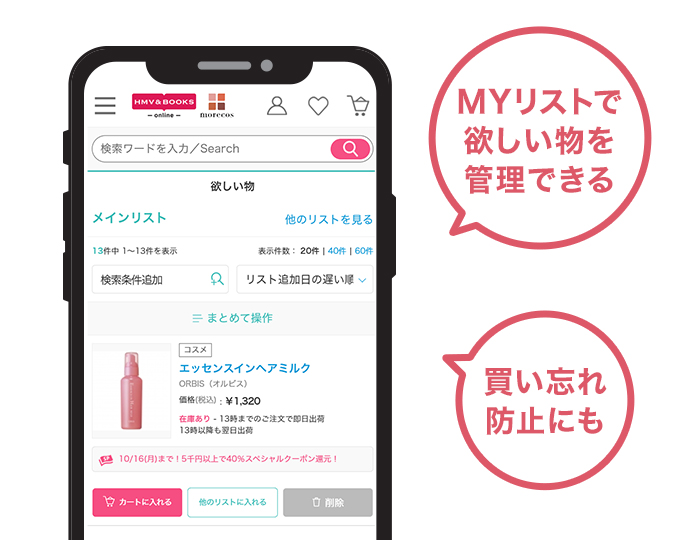

